Experimental Typography
Even since I started to express ideas visually, I have gravitated towards the power that words, and custom lettering has in expanding concepts. From the early days I used to write onto drawings and paintings, as well as use Letraset and collage as part of the process. Once I began working with computers, I was attracted to the precision that vector graphics can provide. These are some of the custom fonts I designed over the years for print and digital projects.


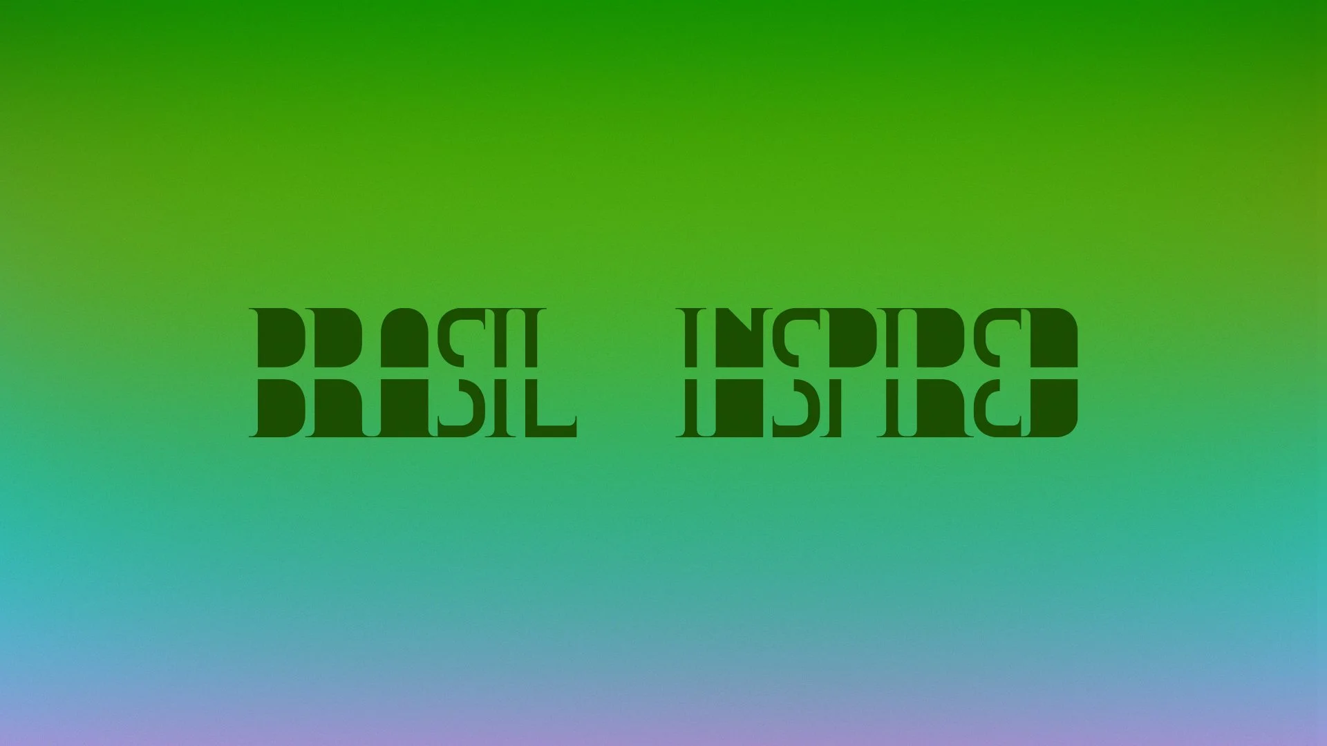
Created for “Brasil Inspired”, a book I curated for the German publisher Gestalten in 2001.


A typographic treatment for the electronica artist Diagram of Suburban Chaos.


Inspired by the topic of divinity and the relationship between good and evil, this font attempted to depict a sense of constant flow and movement, suggesting that these two opposing forces were connected and often dependent of one another.


Created for the digital magazine Shift Japan.


“Phallic Attachment” was created for a personal project.


Created for short film “Trikala” from 2001.

I often enjoyed recording my creative process. Here are some of these recordings while creating spontaneous and unplanned designs.
While visiting Chile to speak at Sudala ( www.sudala.cl ), a design conference with about 3,500 attendees, I created this clip by recording my screen while spontaneously drawing the name of the event.