Mesh Branding
When I first joined Microsoft in 2013 as a part of the HoloLens team, we were tasked with designing an immersive operating system known as Windows Holographic.
For the following five years, I delved deeper into the space of Mixed Reality, learning about immersive UX, real-time engines, hardware design, as well as storytelling and branding at a global scale.
Later, as I moved to the Office team and learned about the world of productivity and collaboration experiences, I formed a more complete idea of how those two seemingly disparate experiences could come together beautifully.
Eventually, the opportunity to re-join my old colleagues in the Mesh team was enticing, especially when a close integration with Microsoft Teams would bring so outsized potential to immersive experiences.
In this page, I share a little about the project I led in designing an icon for Mesh it its most recent incarnation. As you will read, it took into account the many other branding efforts that have come to bear since we first kicked off the redesign the icons for the Office apps.
I hope you enjoy the result.
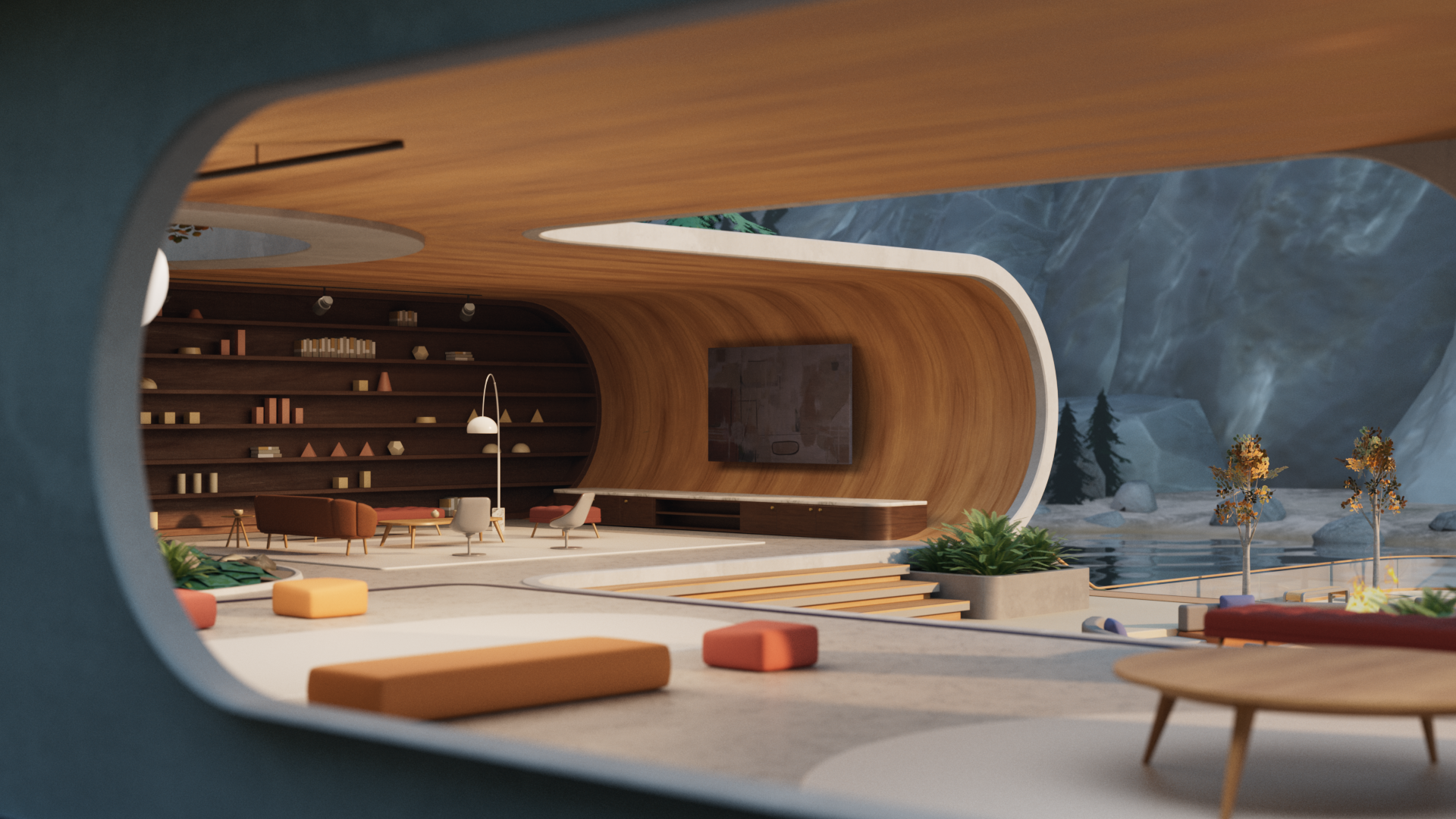
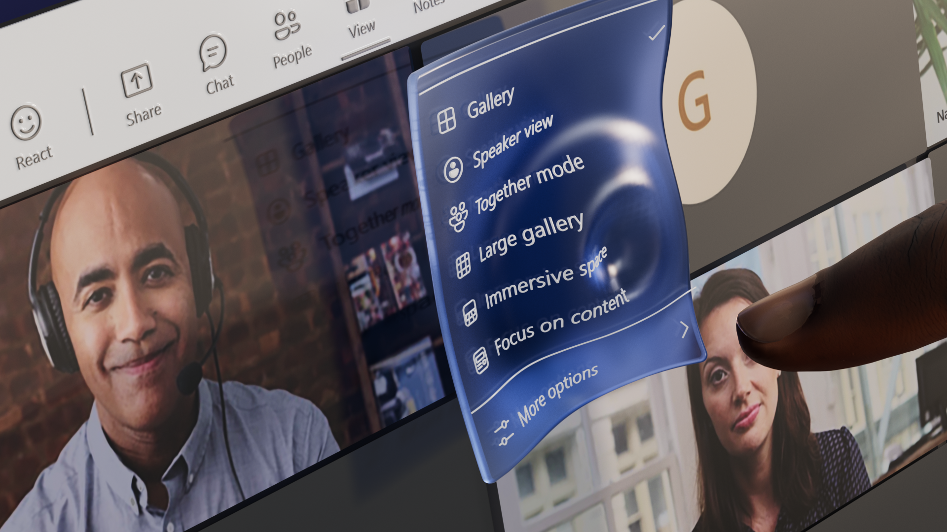
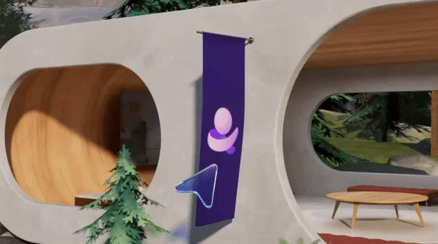
Before we go deeper into some of the creative process of designing this icon, it may be worth watching this video as it briefly illustrates some of the most critical aspects of the Mesh experience. I had the chance to steer its creative alongside the talented crew of creatives at Tendril Studio and Zelig Sound.
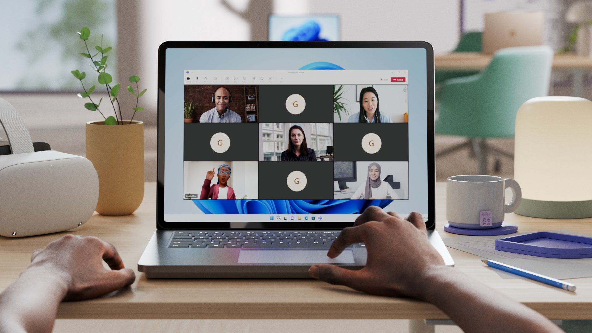
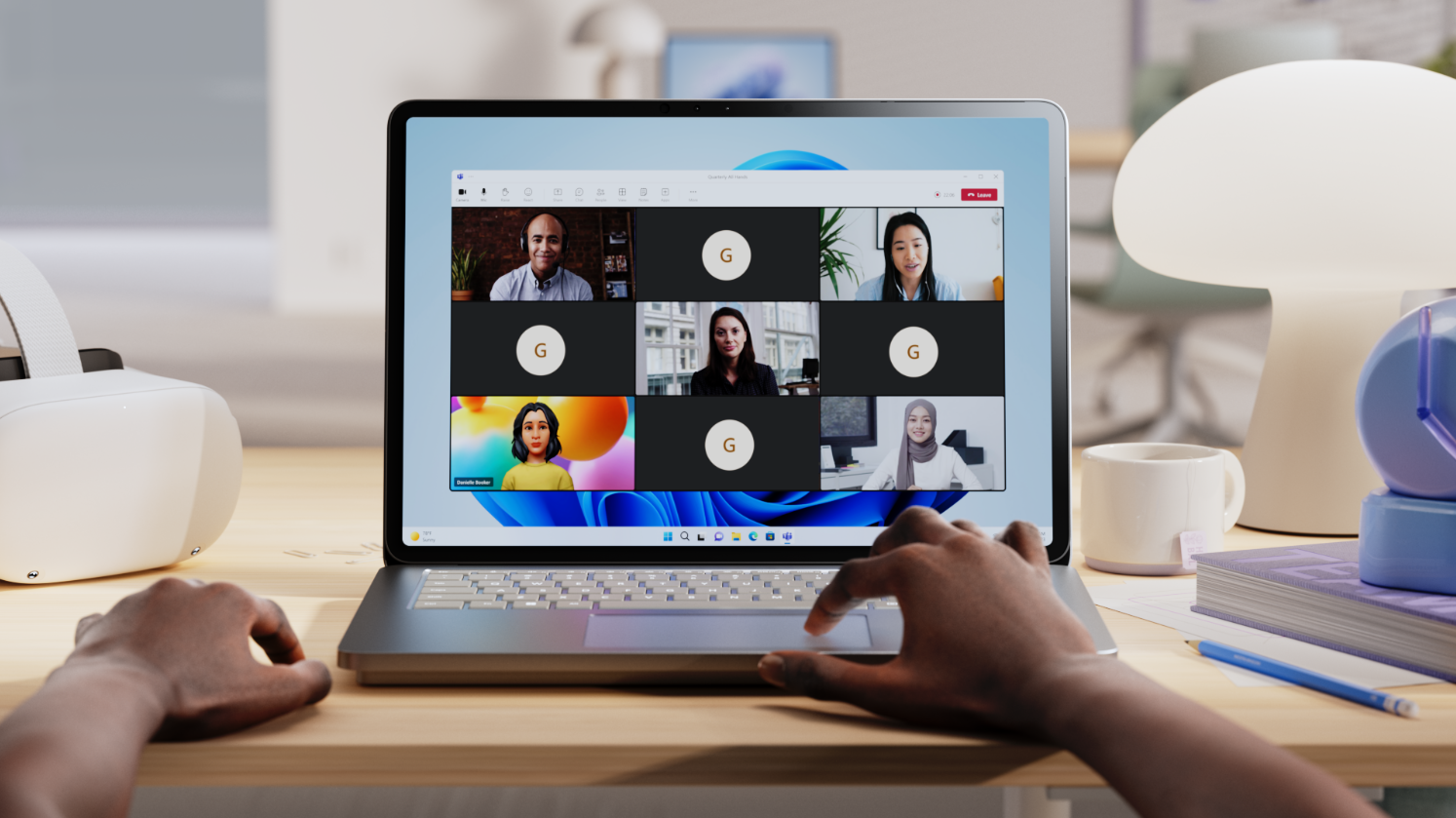
In this experience film, we wanted to, first and foremost, showcase how Mesh enables people to connect with others in an immersive way that goes beyond the limitations of a video grid and chat, which we have all become so accustomed to.
We also wanted to show off some of the ins and outs the user experience, illustrating how simple, intuitive and natural it feels to digitally connect with others in Mesh, whether or not you have a VR headset.
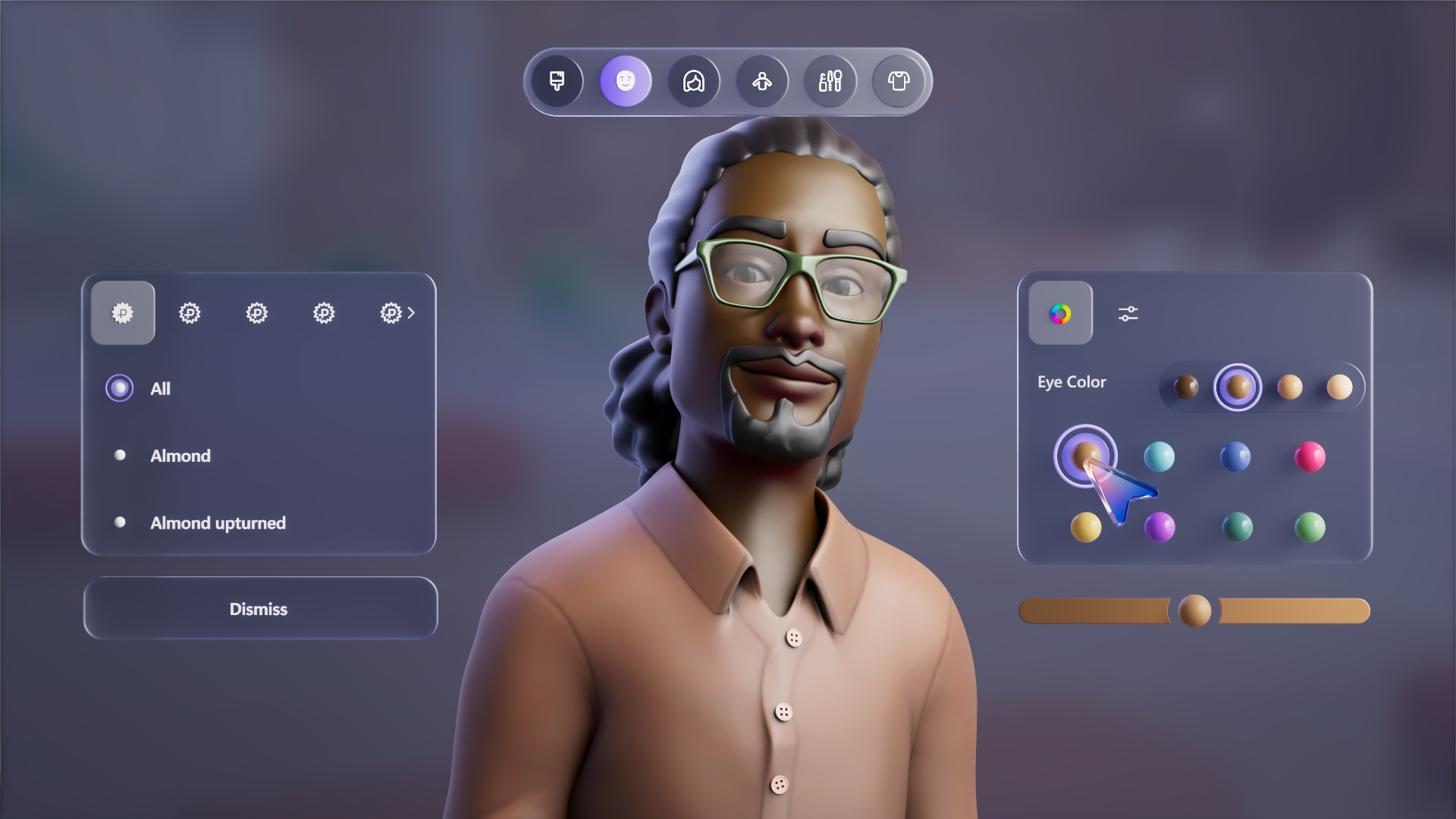
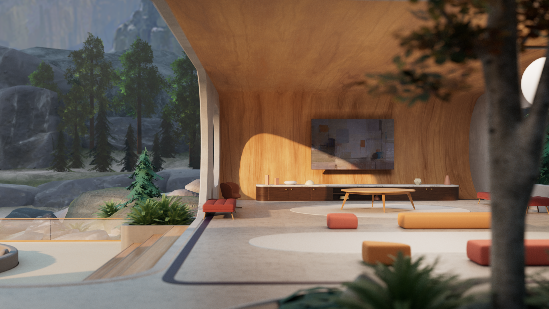
Last, but not least, we also wanted to demonstrate how Mesh empowers you to show up authentically as your highly customizable avatar. Even then, it goes without saying that the video barely scratches the surface of the endless possibilities within Mesh. But, hopefully you have a chance to try it for yourself in your next Teams meeting.

In 2018, we kickstarted a multi-year effort to redesign of all of Microsoft’s experience icons. While back then it was limited to ten Office applications, we knew that eventually other icons would need to be revisited for a truly cohesive system to emerge. Above, you can see a limited snapshot of experiences in Microsoft 365, including some of the inbox Windows apps. This new Fluent Design system direction is ultimately what the new Mesh icon needed to follow.
When we began the branding process, we sought inspiration across key themes in the experience. At the very center was a notion of Connection, which comes to life in how customers come together in the product to collaborate, learn, meet, as well as simply gather and bond with one another.
Adjacent to the concept of Connection, were other top themes of influence such as Destination and Spatiality. The first is a reminder that meeting and gathering in Mesh creates a more tangible feeling that you are arriving together at an actual destination. This comes to mind as you traverse from a regular Microsoft Teams call into a dimensional Mesh environment, giving you a clear sense of place.
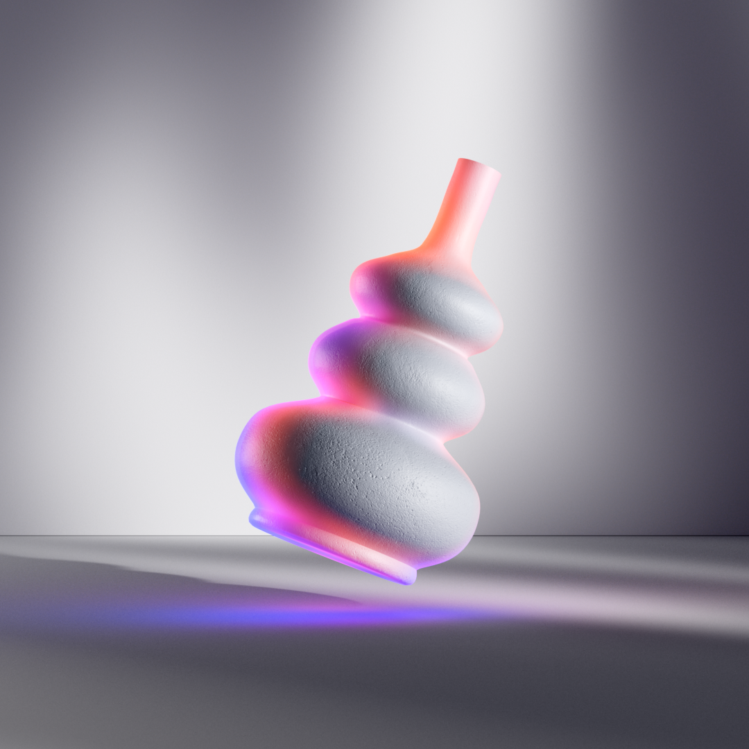
Equally, the obvious spatial qualities of Microsoft Mesh were unique aspects for us to capture in the icon. This resulted in one of the most intentionally dimensional icons in the system.


As a part of the Microsoft 365, the Microsoft Mesh brand icon needed to feel familiar to the company’s family of icons, while still contributing to its continued evolution. One that would ultimately come in the form of organic shapes and added dimensionality, paired with a vibrant palette.
Given that much of the core user experience of Mesh already leveraged tones of pink, we wanted its brand icon to feel like and extension of that palette, which led us to take note of all icons that ranged from warm pink to dark purple values.
It was under the inspiration, as well as the constraints I have described that the sketches seen below started to emerge.
In addition to the various experience influences, we were also cognizant of some of Microsoft’s brand principles, Human, Vibrant, and Dimensional, which have reflected much of the work I have directed in recent years both in product and storytelling. Unsurprisingly, they also served as a strong foundation for how we design experience icons across the whole company.


This was by far the most satisfying part of the process: freely drawing concepts. ✏️
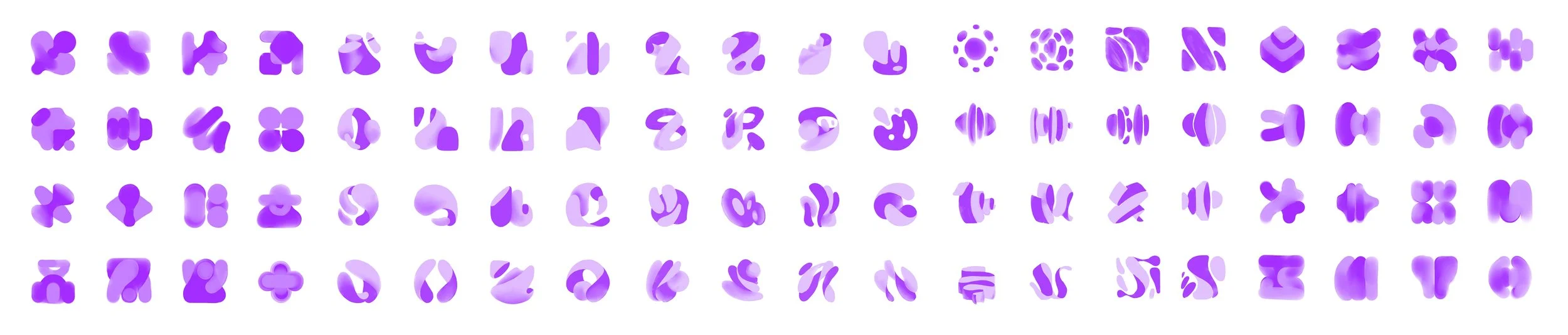
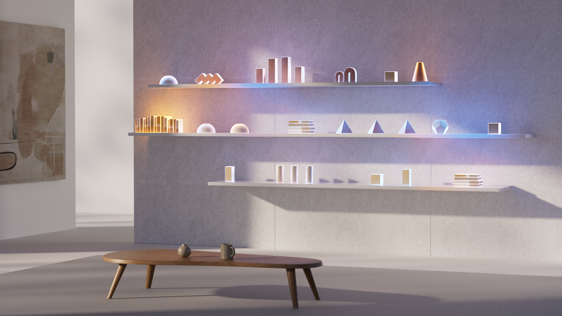
After vectorizing roughly 150 early designs (100 of which are shown here), we moved into a refinement phase, which included gathering feedback from both the team and customers.
With many icons drawn, it became clear that a variety of themes had emerged. One of the most prevalent included graphical organic depictions of simplistic worlds and spherical spaces, as well as of concepts of connection, which tended to resemble hands connecting and coming together.
Another recurring theme was an attempt to depict people, places, and things, the basic building blocks of a Mesh experience, which came in the form of clusters of abstract geometric shapes.
Last, but not least, was the theme of portals and thresholds as metaphors for visting a Mesh experience.


A snapshot of the color spectrum across Microsoft experience branding, and how Mesh fits into the system. 🎨

This is where we ultimately landed! A dynamic and dimensional loop that resembles a figure in motion, an embrace, as well as other metaphors we felt were relevant to the experience.
As seen above, we think it connects well with the system, while still signaling something new.
Here is a peek at Tendril’s behind the scenes for creating the video.


Thank you!
Please note that opinions expressed on this page are my own.
At Microsoft
Thank you to the countless colleagues who lent a hand along the way, providing feedback, helping us refine and validate our assumptions, including Adrian Melo, Alex Gough, Avery Salumbides, Barbara Kim, Cole Rise, Jason Custer, Lori Craw, Mark Swift, Navjot Virk, Nicole Herskowitz, Nora Bradshaw, Ramiro Torres, Rory Baird and many others.
At Tendril & Zelig
Thank you also to our beloved collaborators at Studio Tendril for their partnership in making this video come together in such a short time frame.
Thank you also to the incredible minds at Zelig Sound for your perpetually inspiring audio contributions to our products and stories.