Office Apps in Windows 11
With the evolution of Windows into as newly re-designed and modernized operating system, its core productivity experiences were bound to be further modernized as well. This project was intended to celebrate this step in making these apps simpler and more powerful as we had alluded to in this article about M365’s vision. To achieve this, I partnered with product teams and the creatives at Media.Work and Zelig Sound.

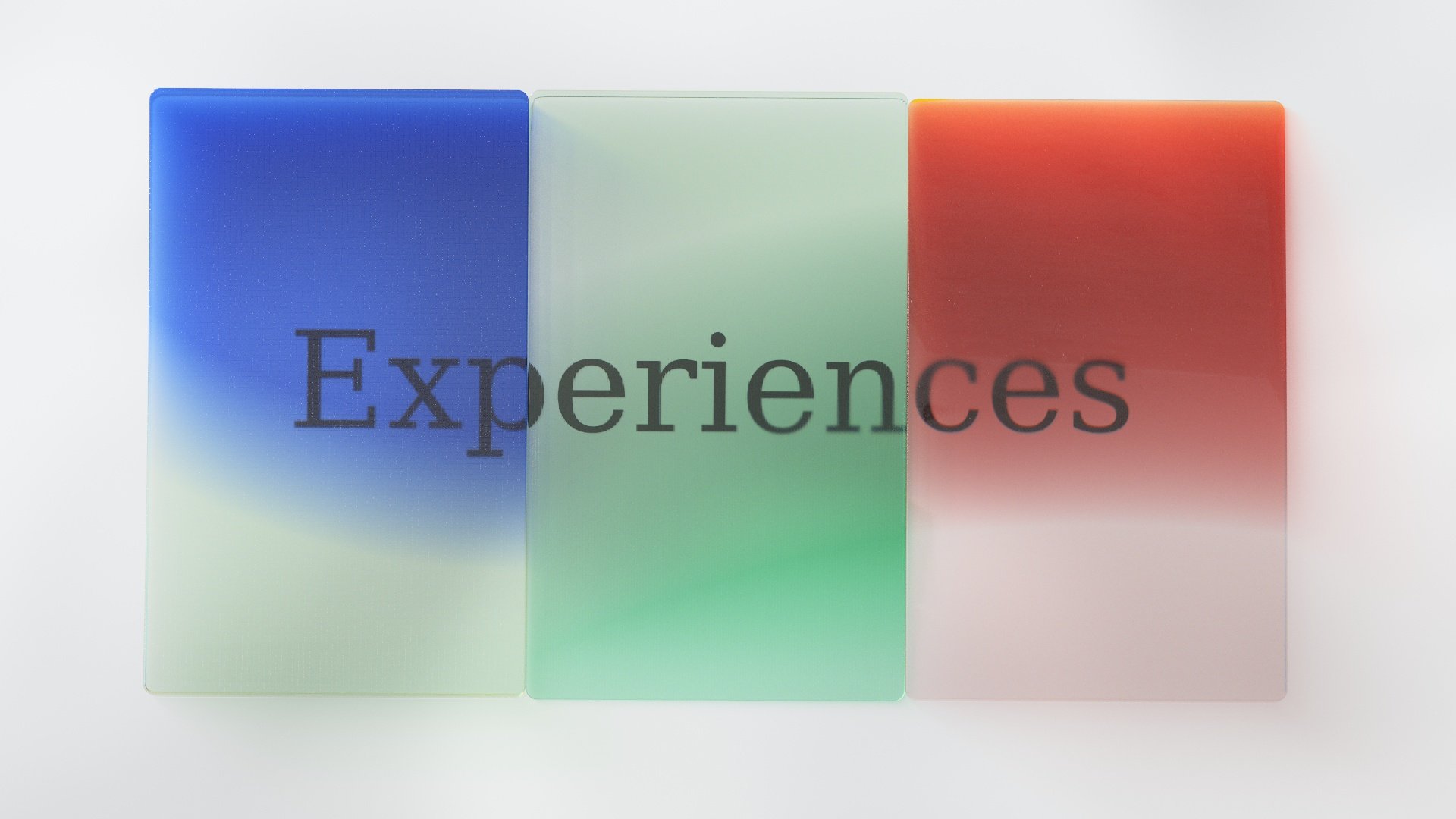
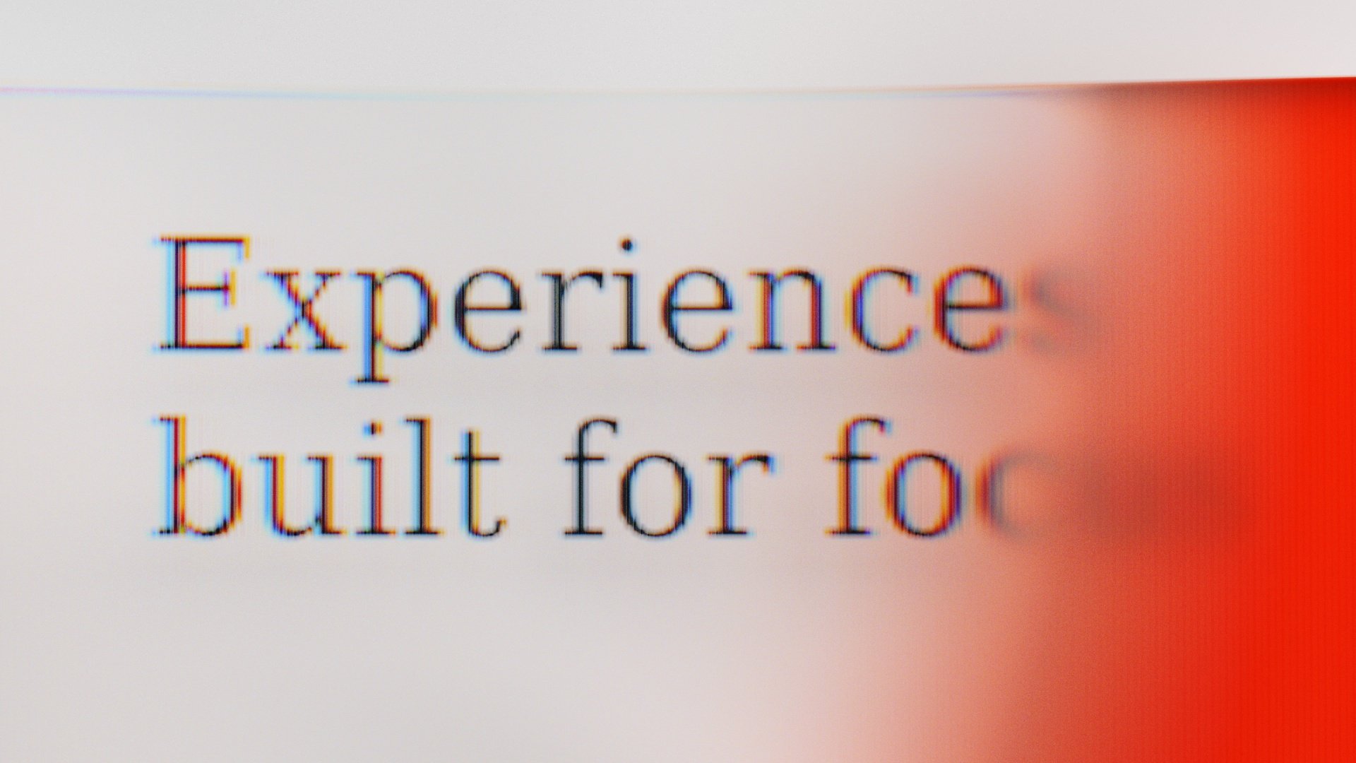
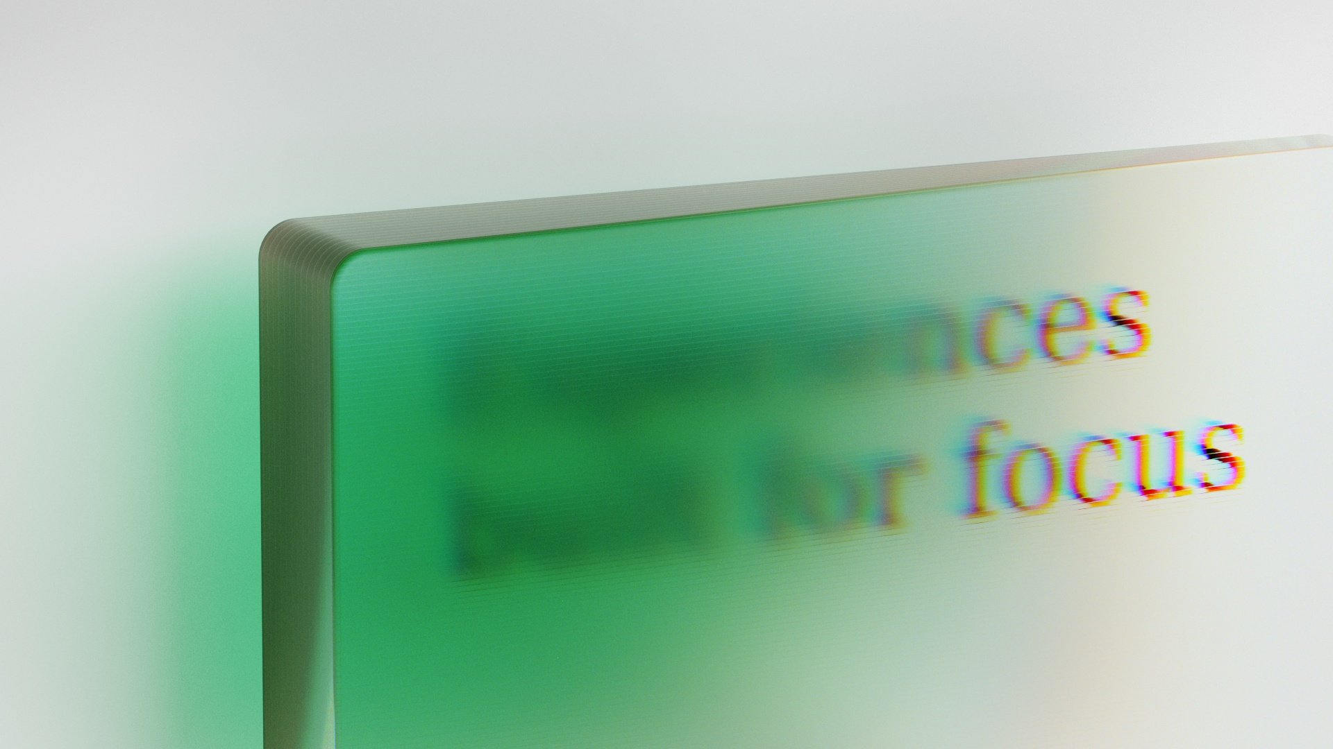
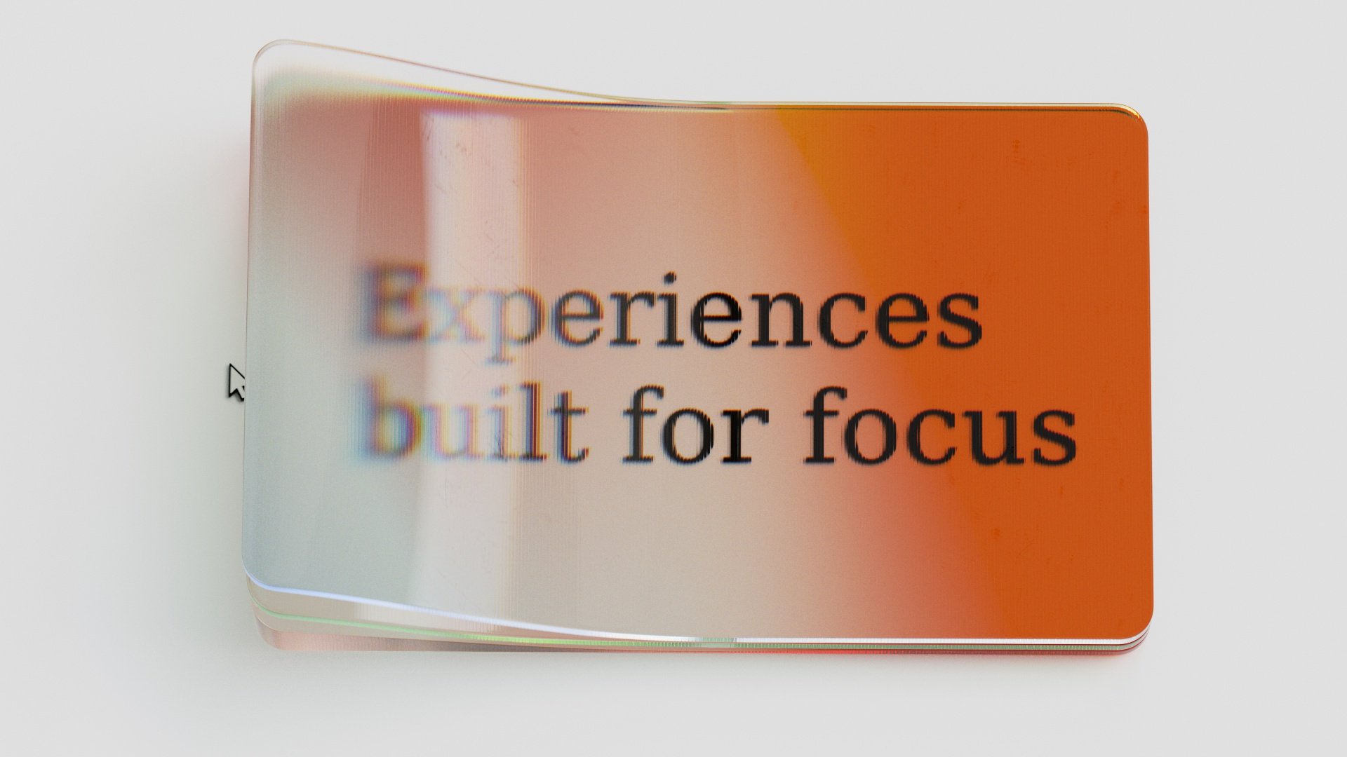
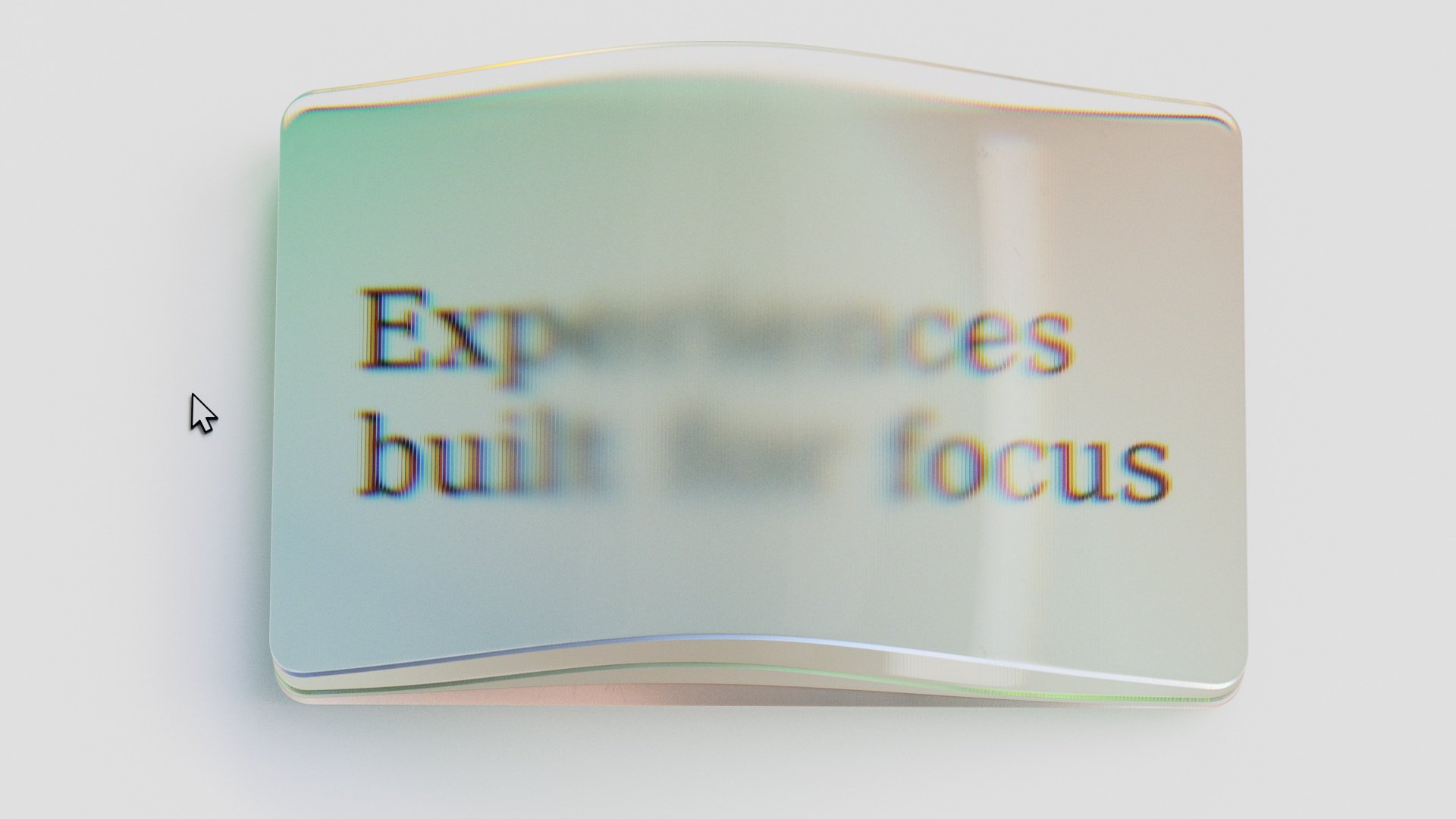
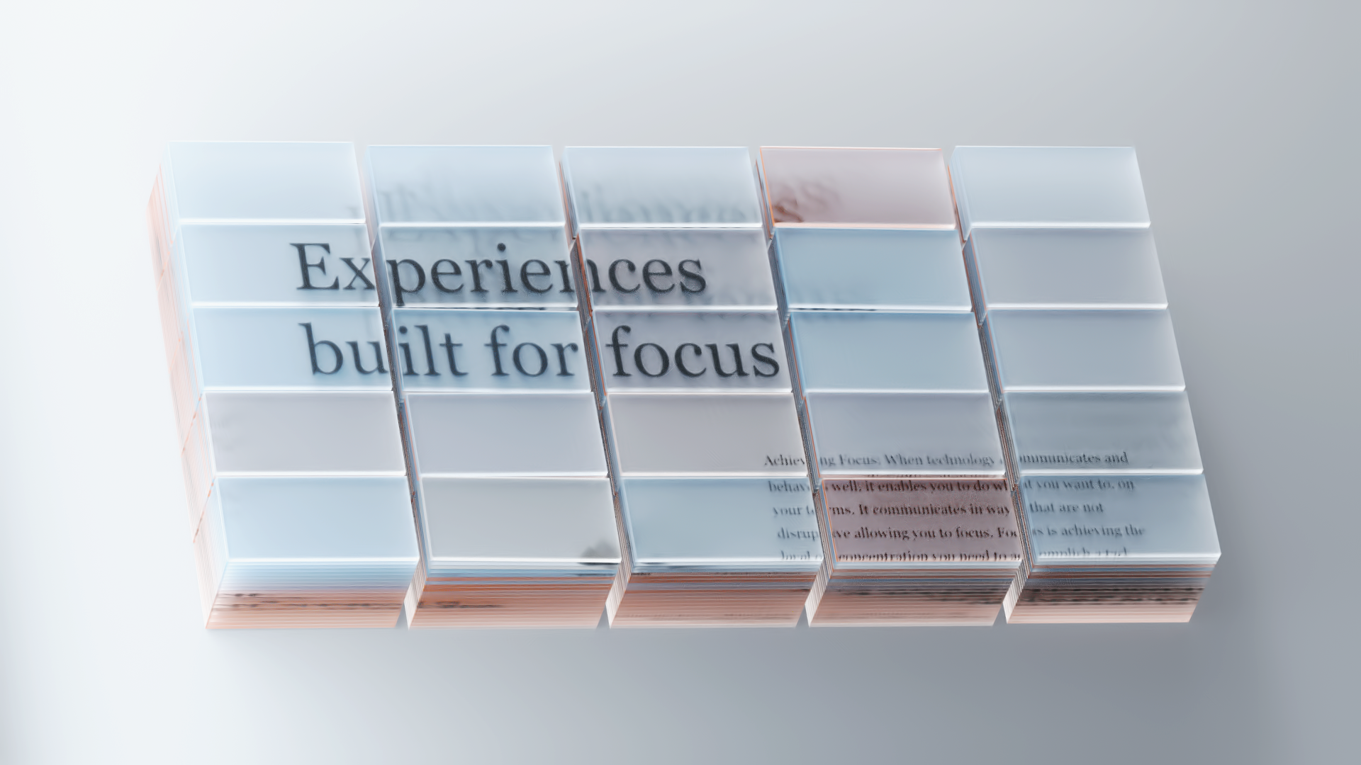
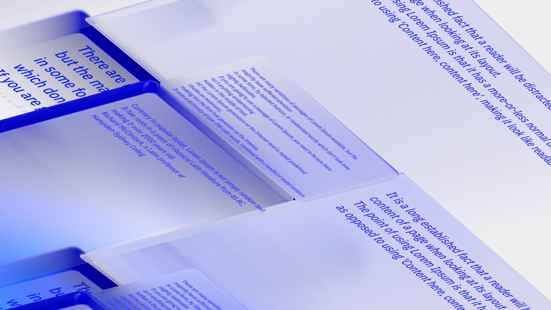
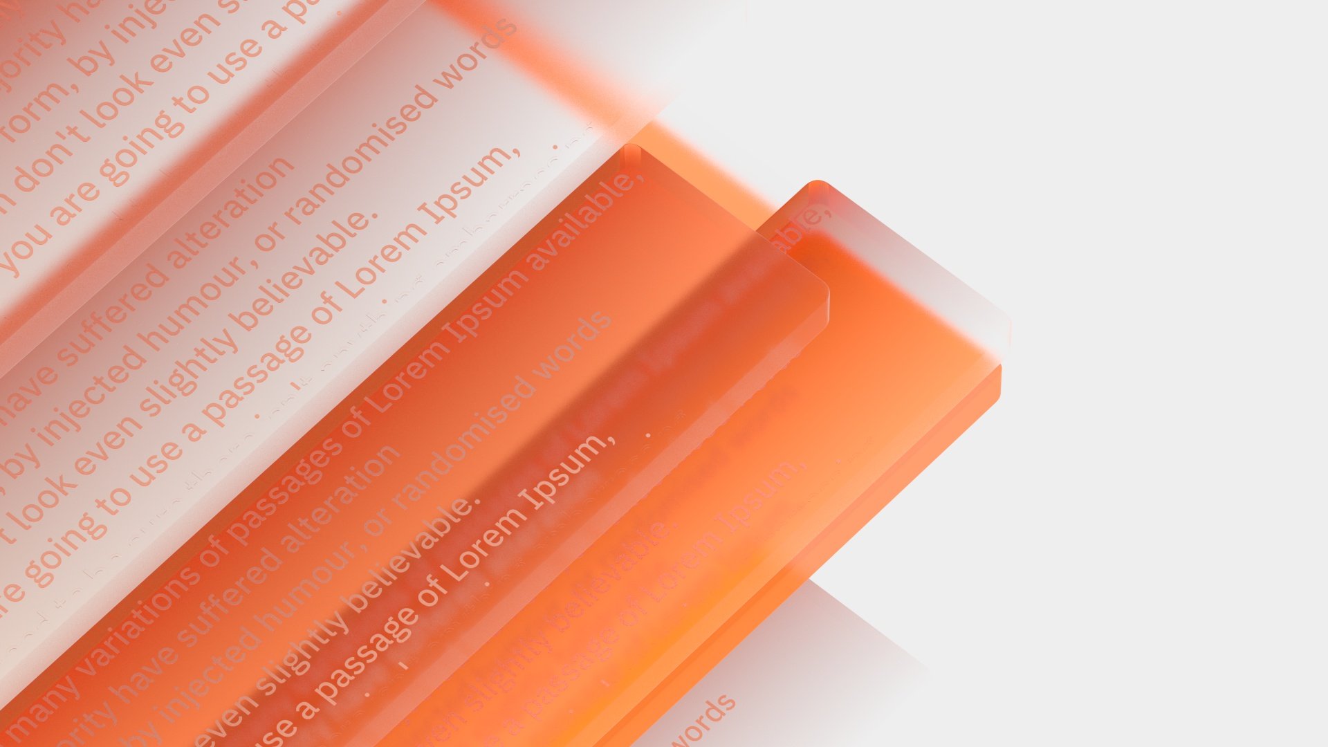
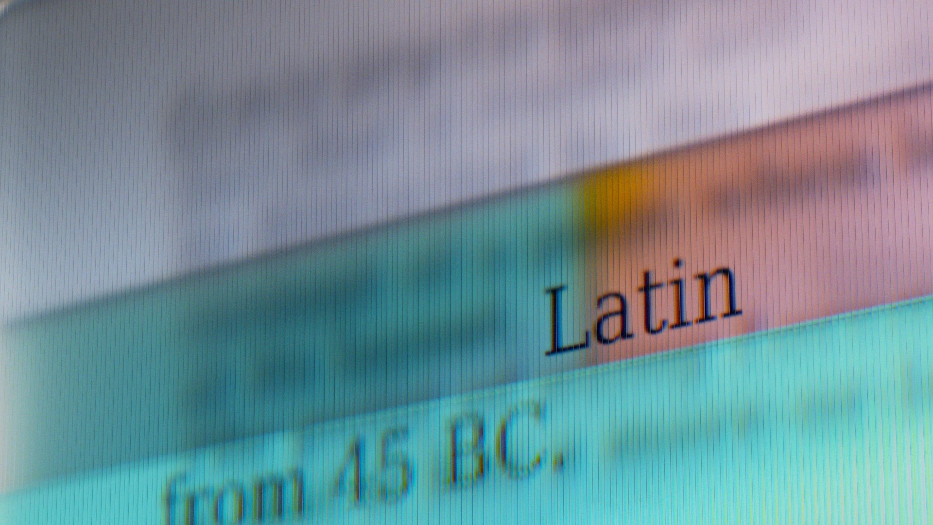
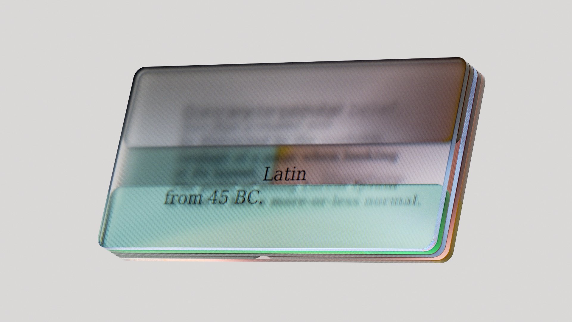
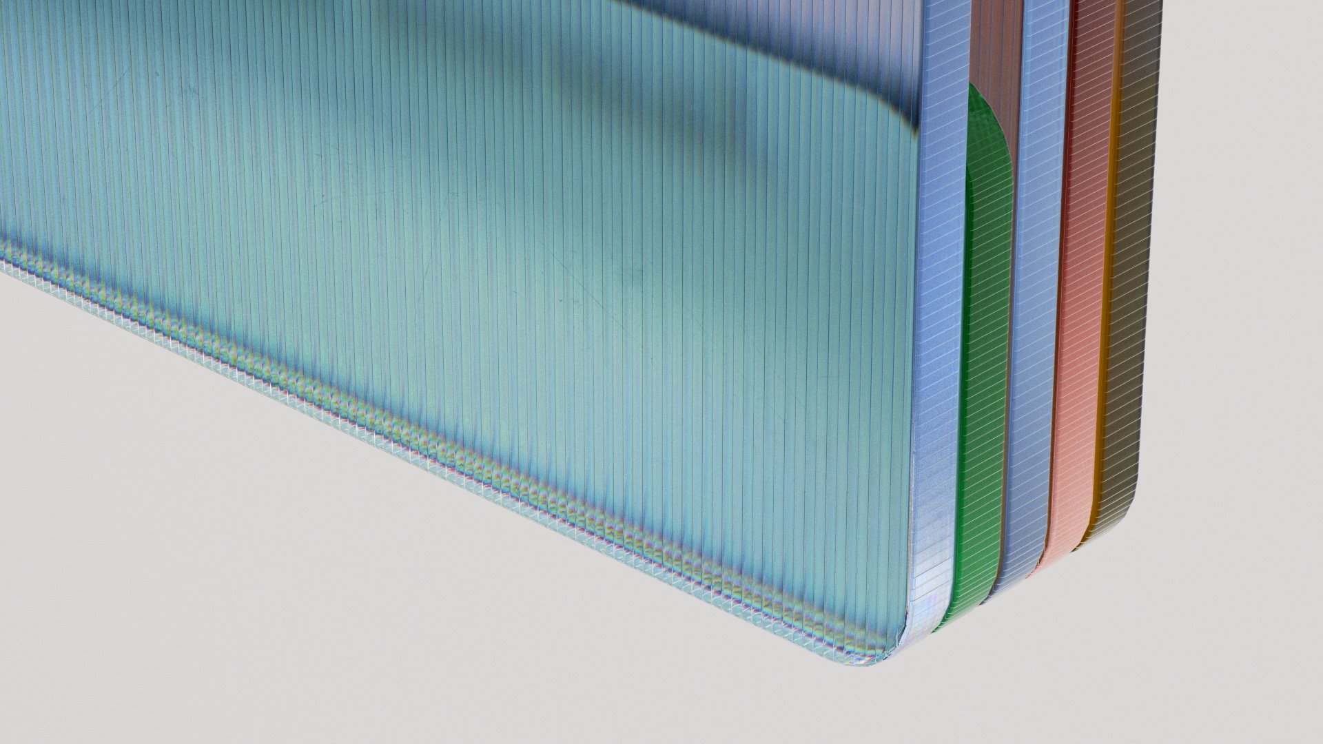
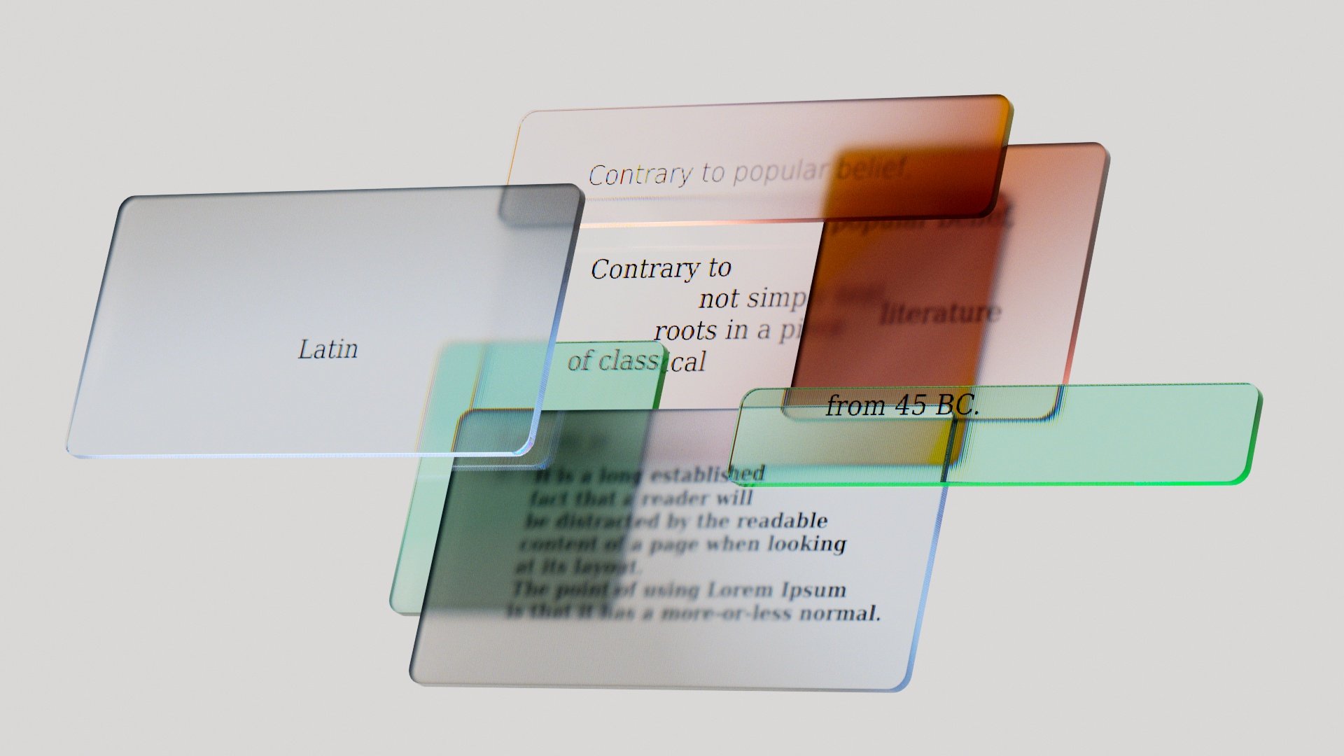
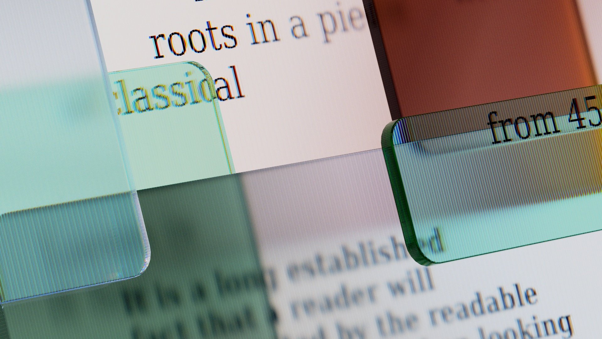
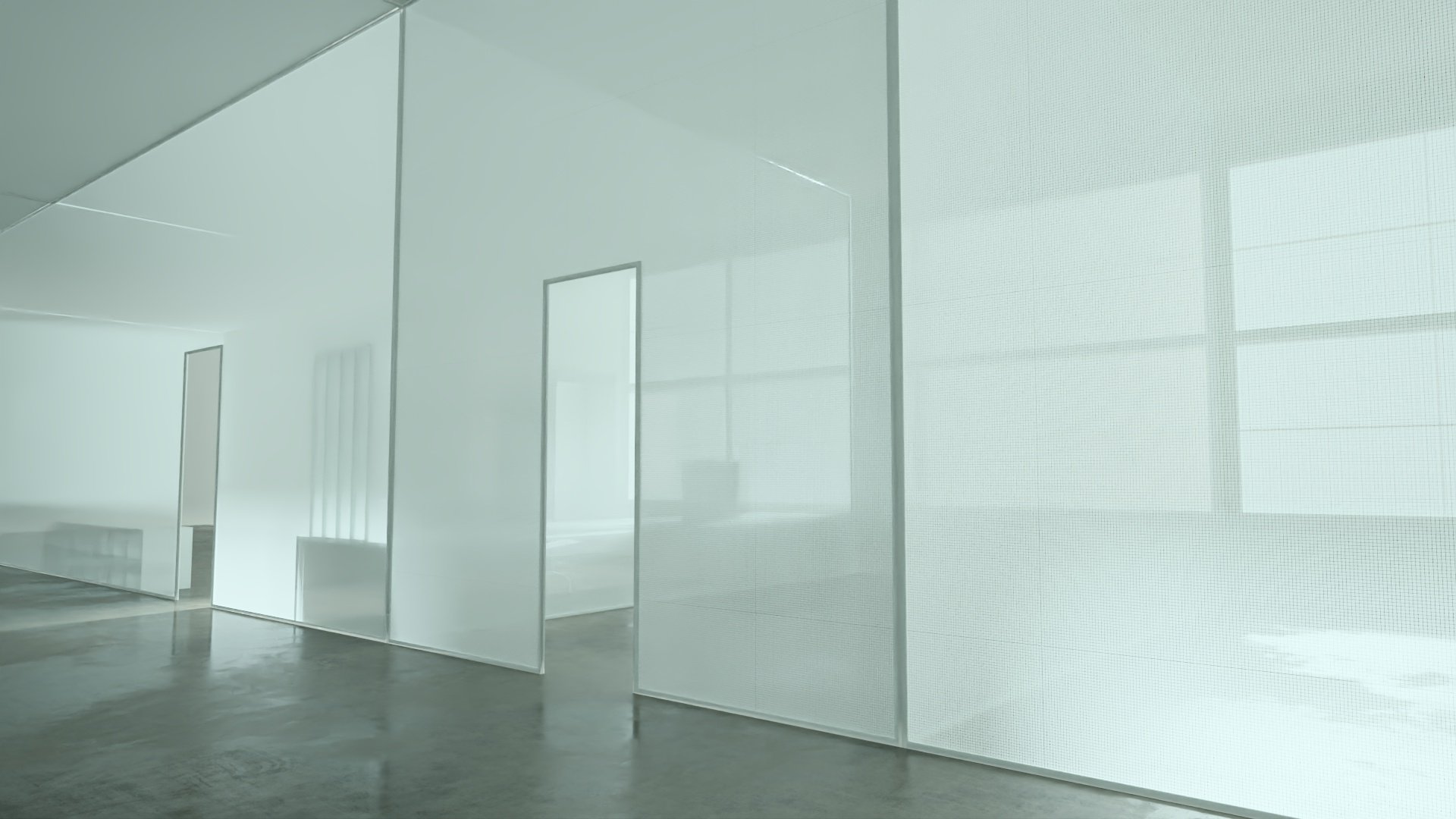
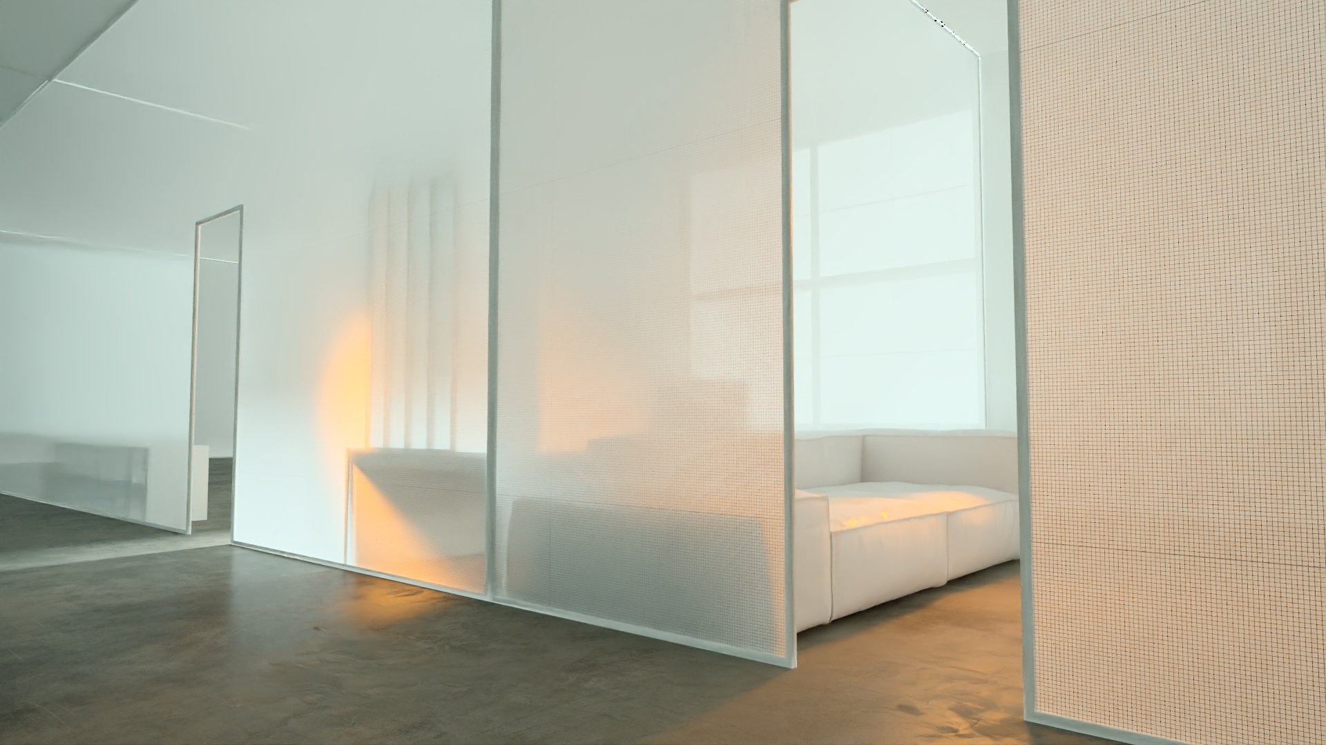
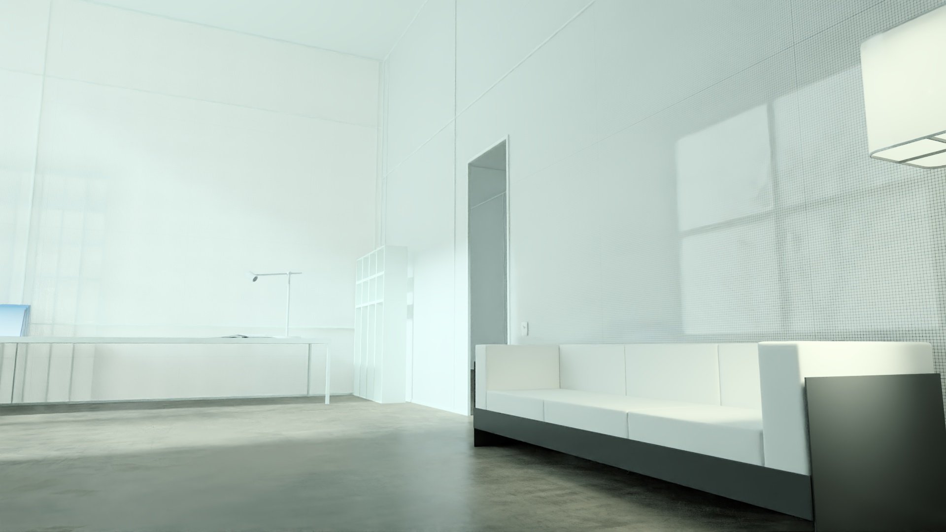
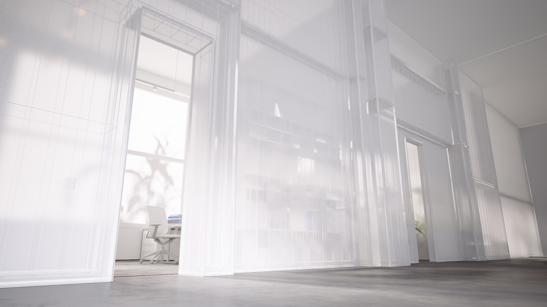
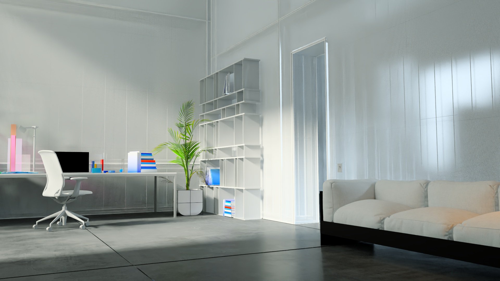
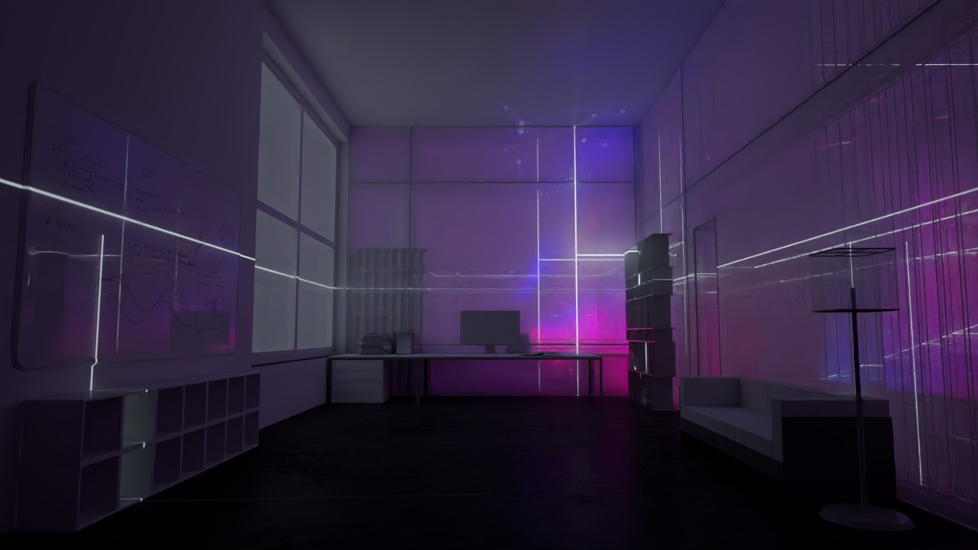
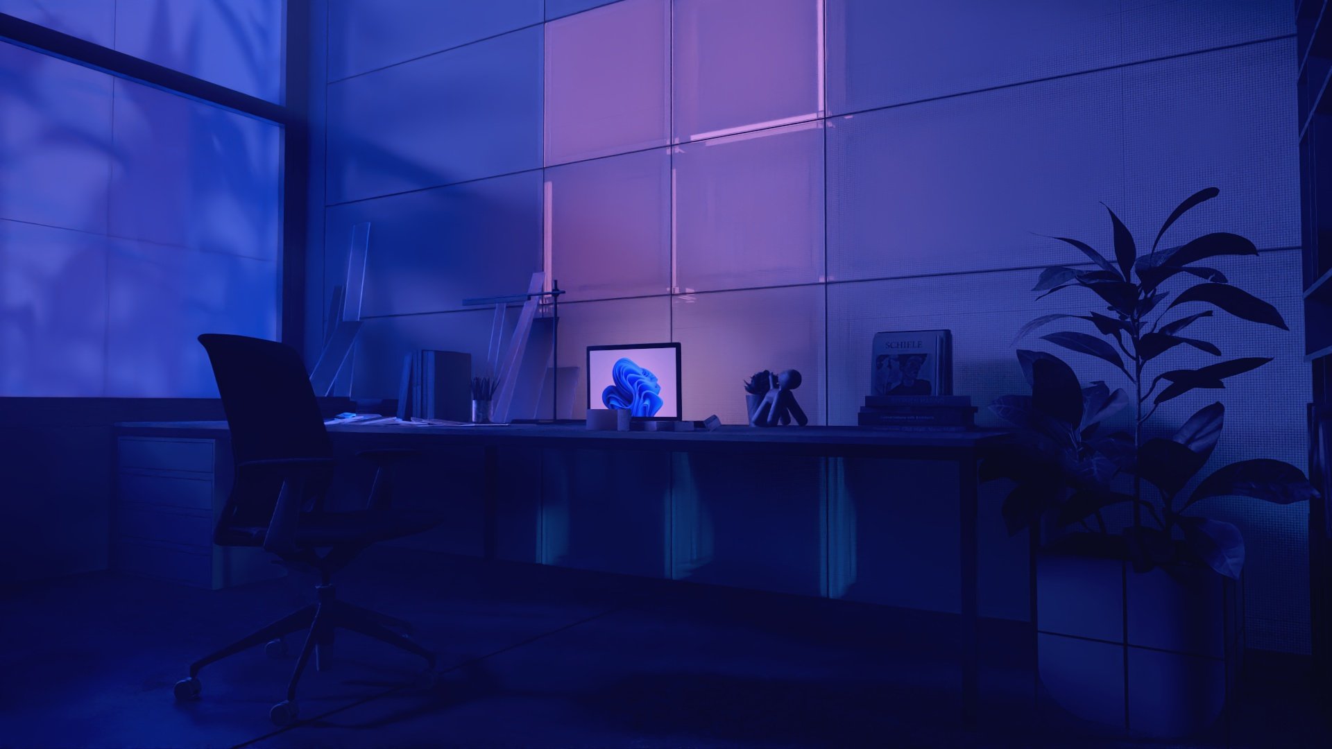
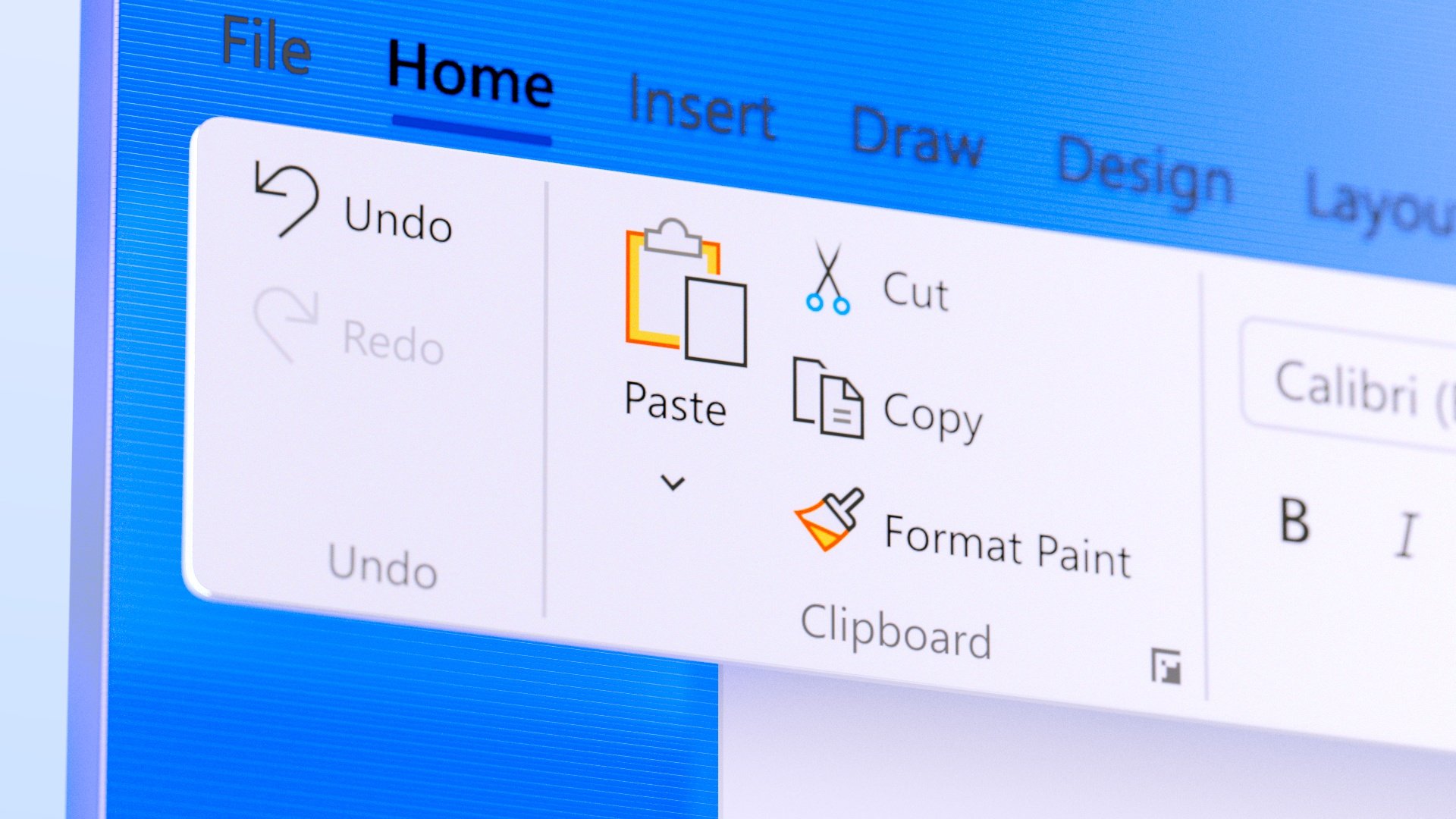
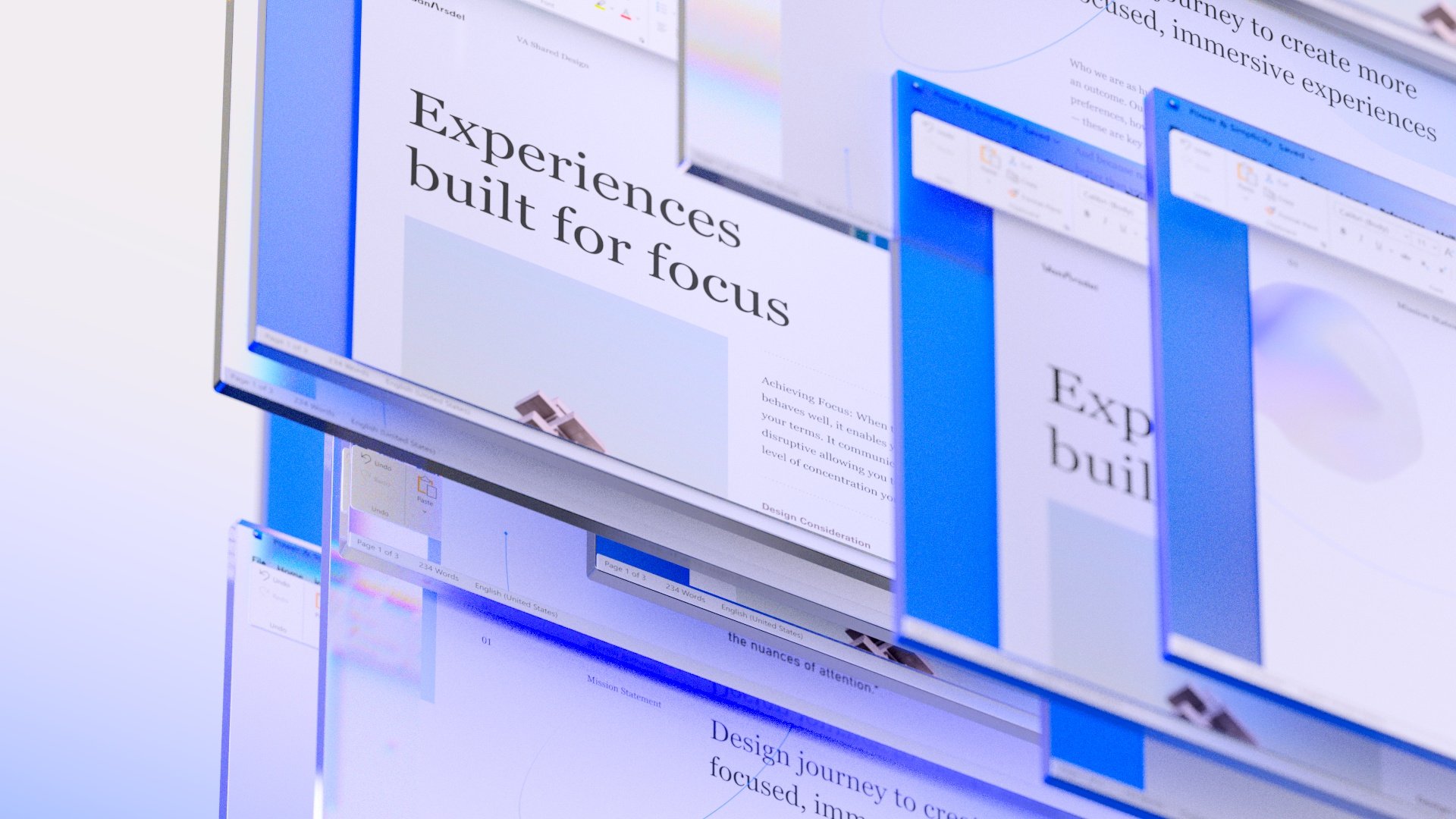
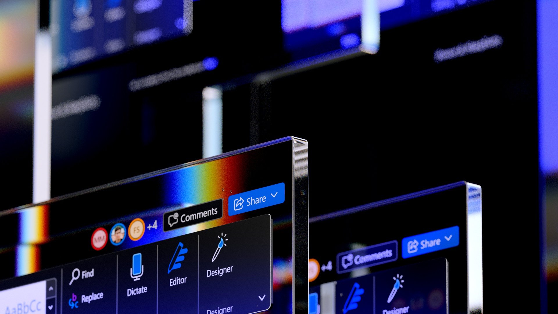
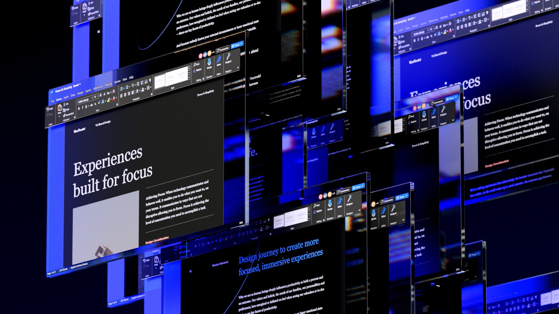
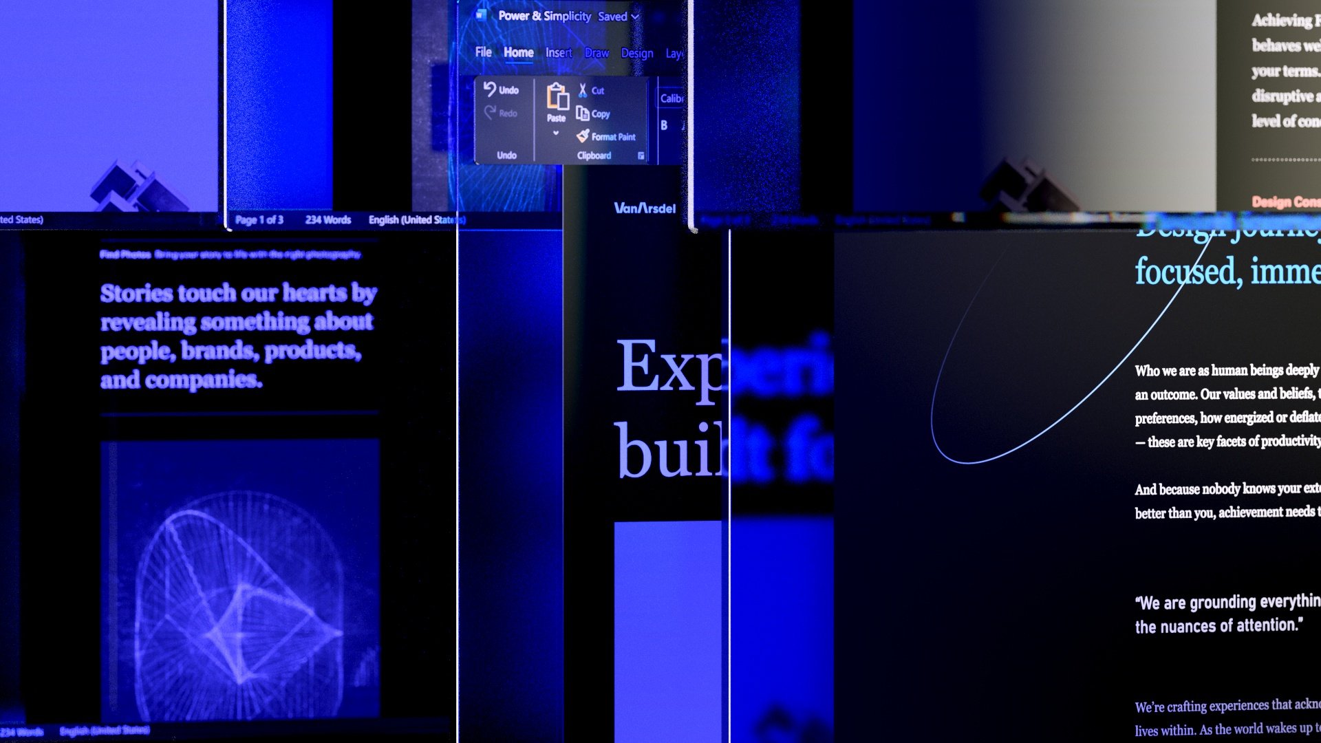
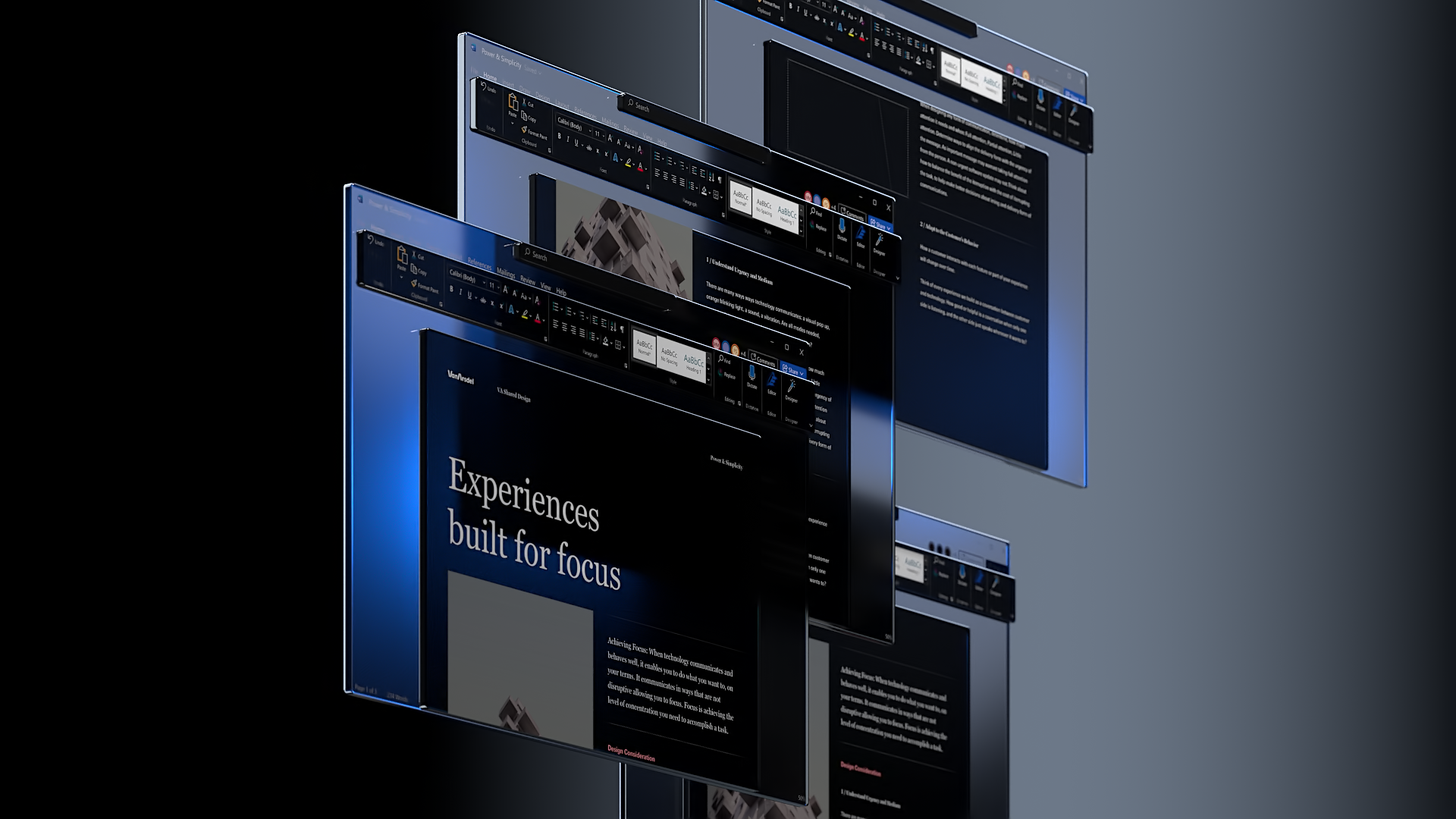
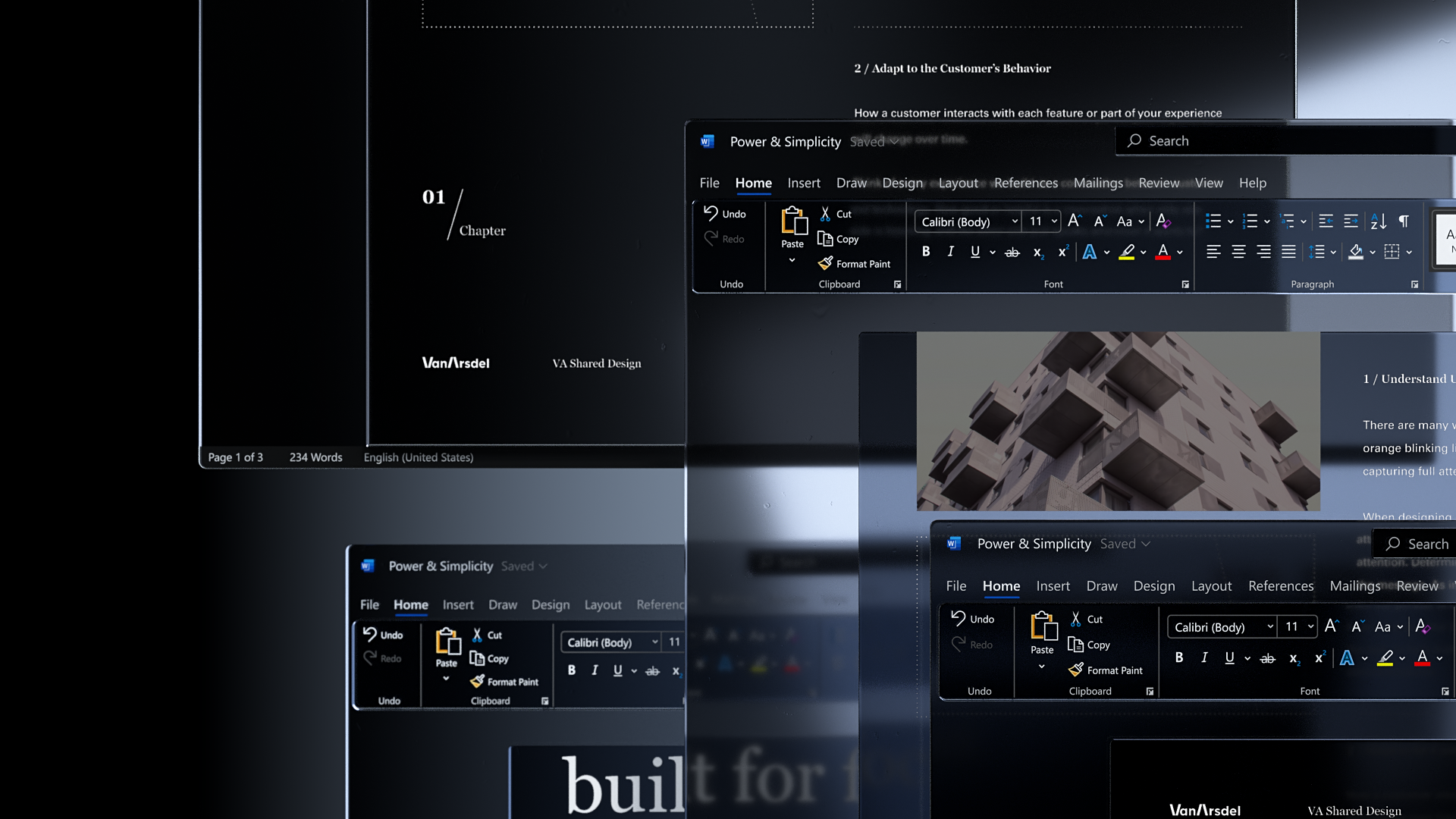
Amongst the various details we wanted to celebrate in the film was the new material quality of the chrome in Windows apps, Mica.
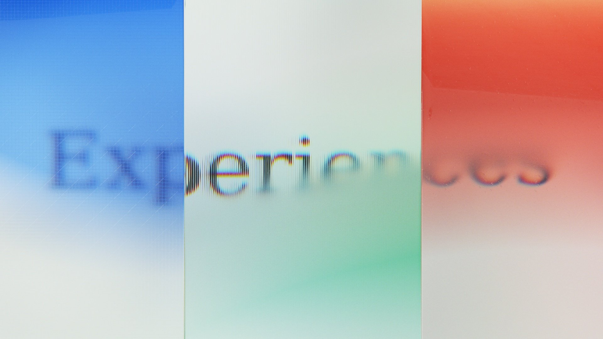
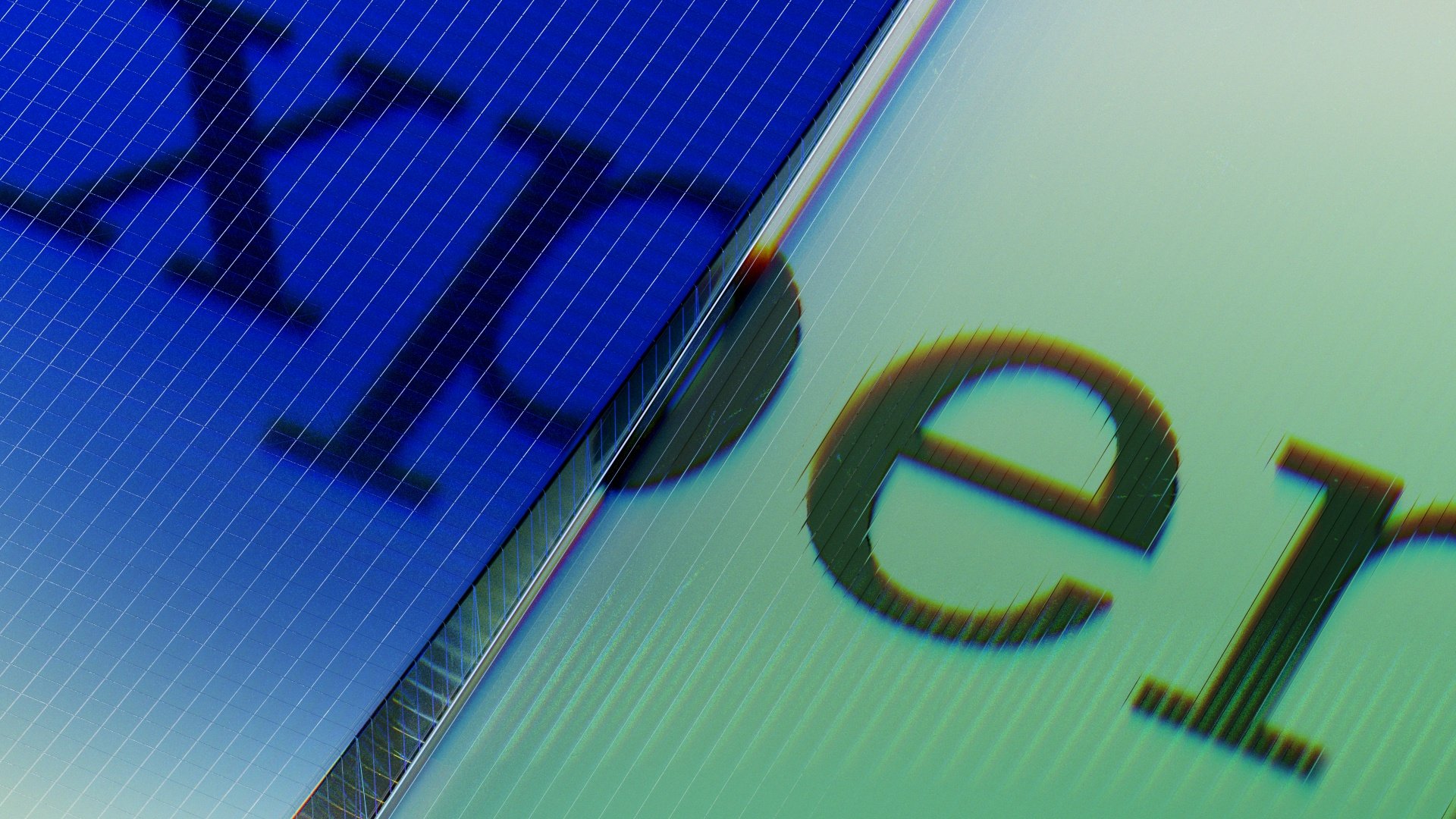
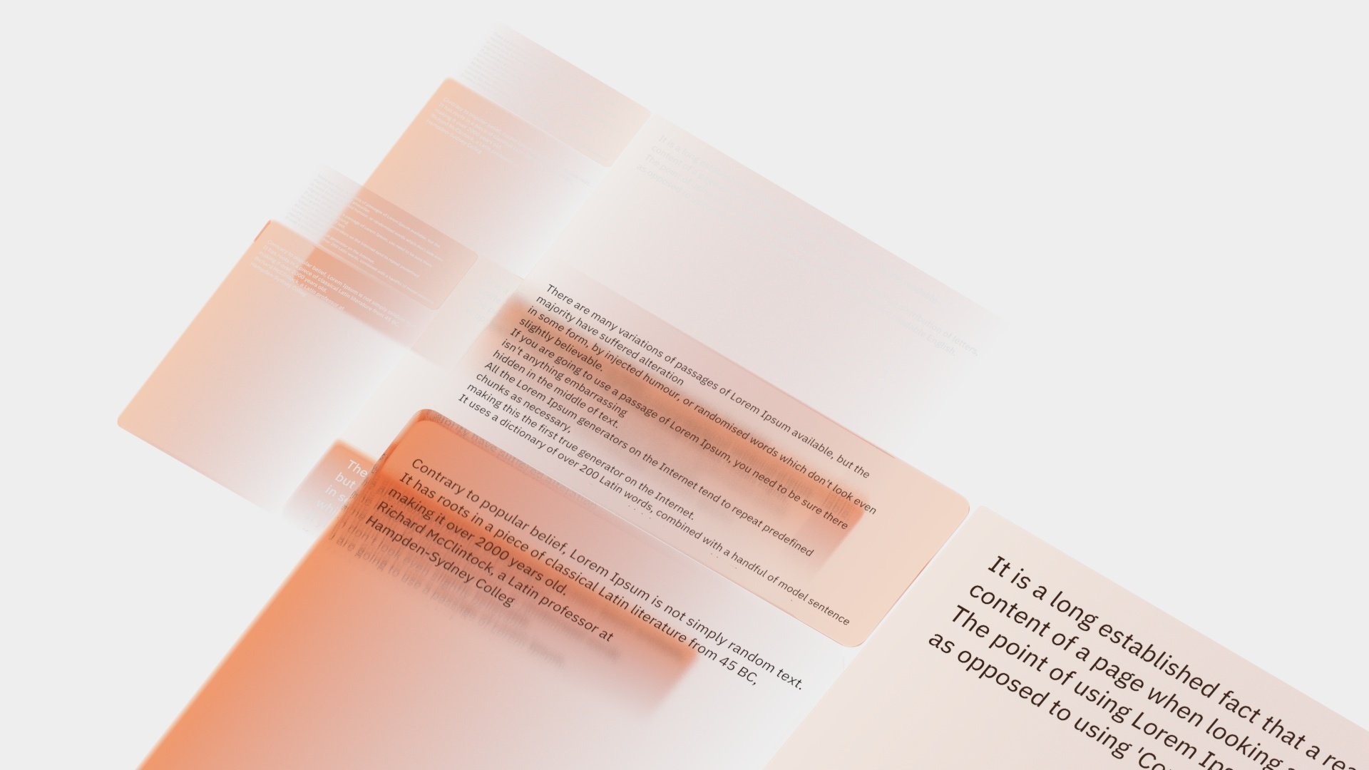
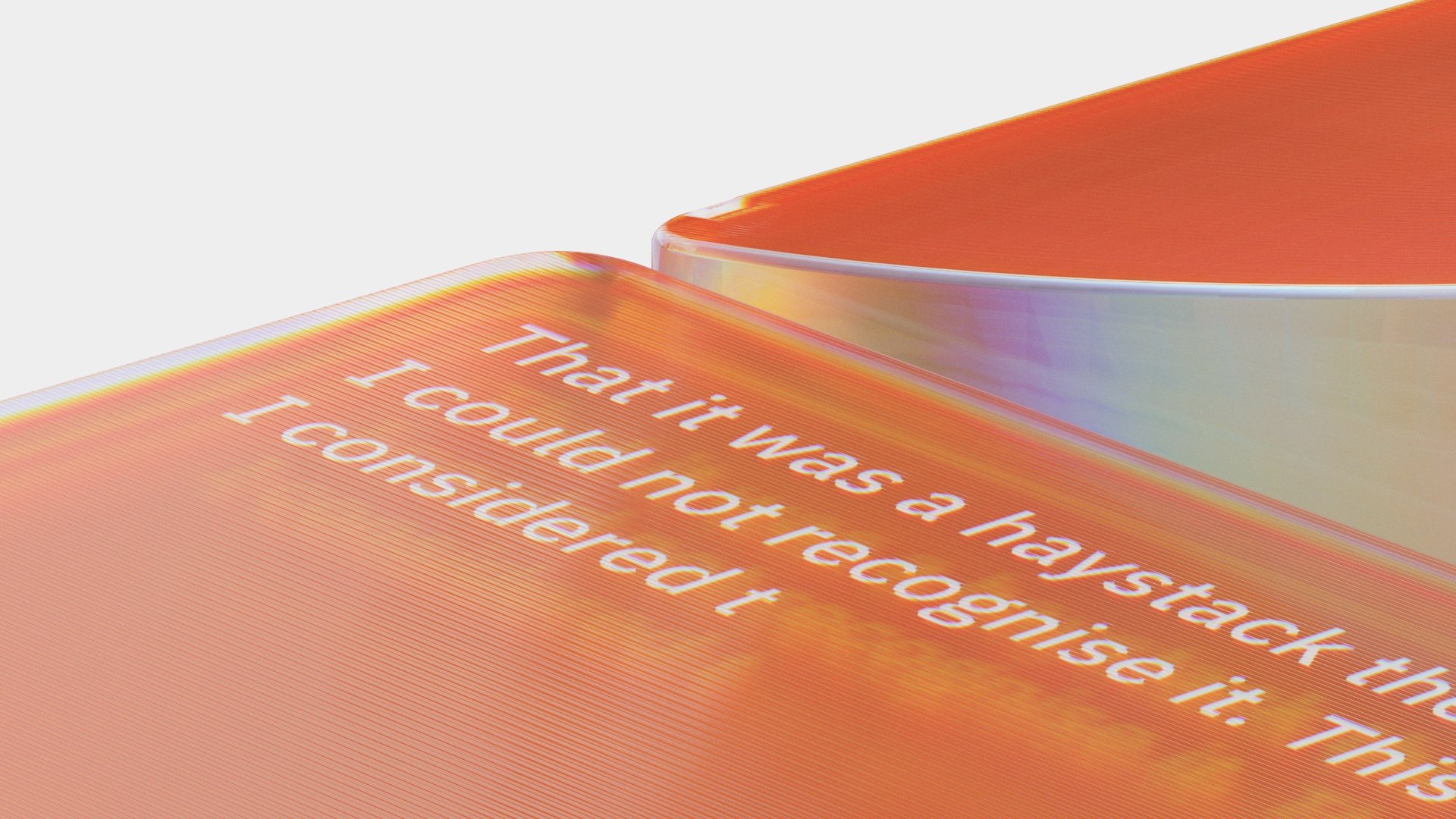
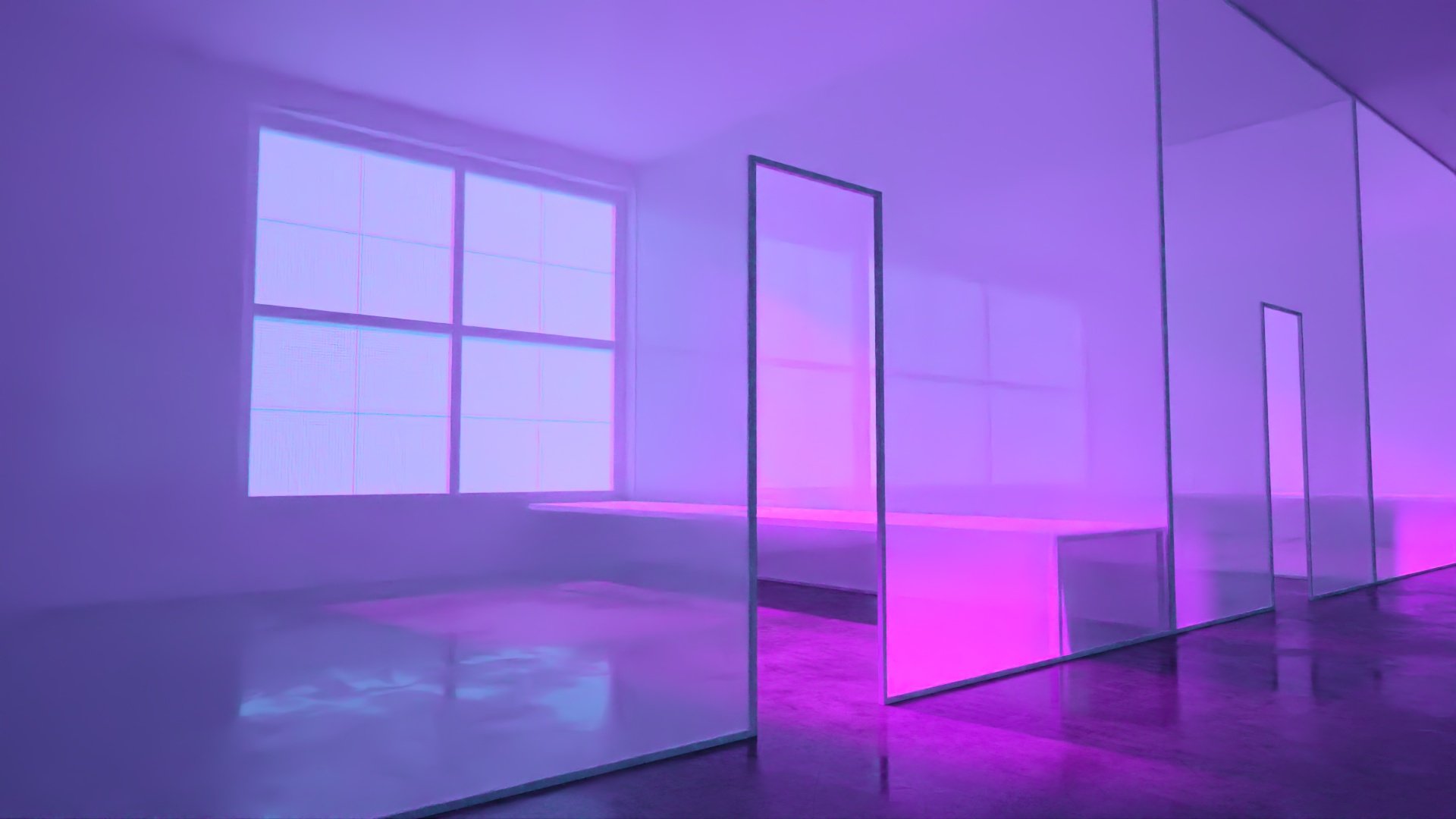
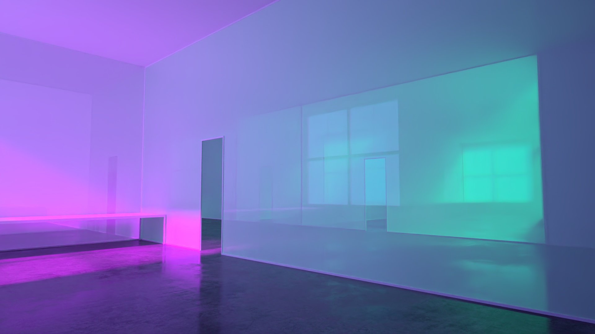
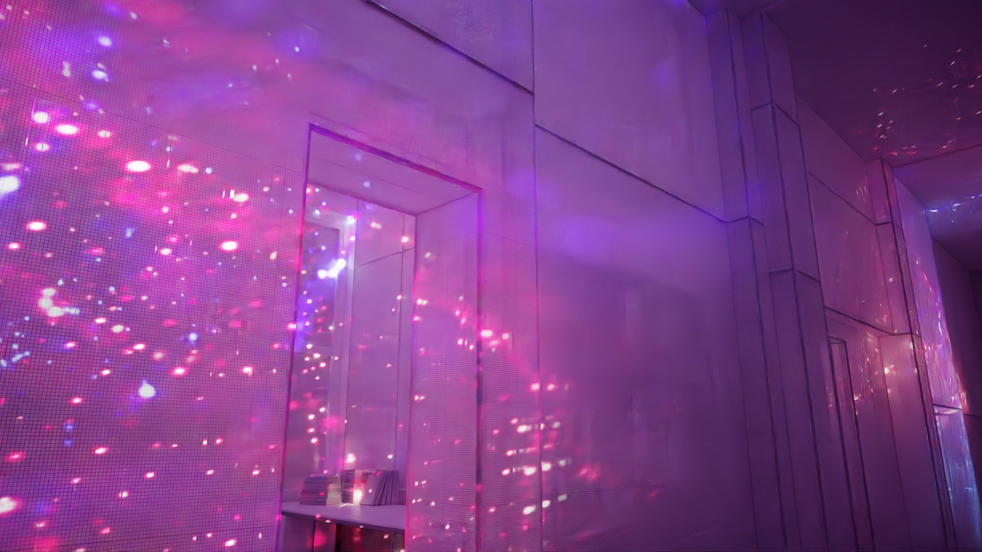
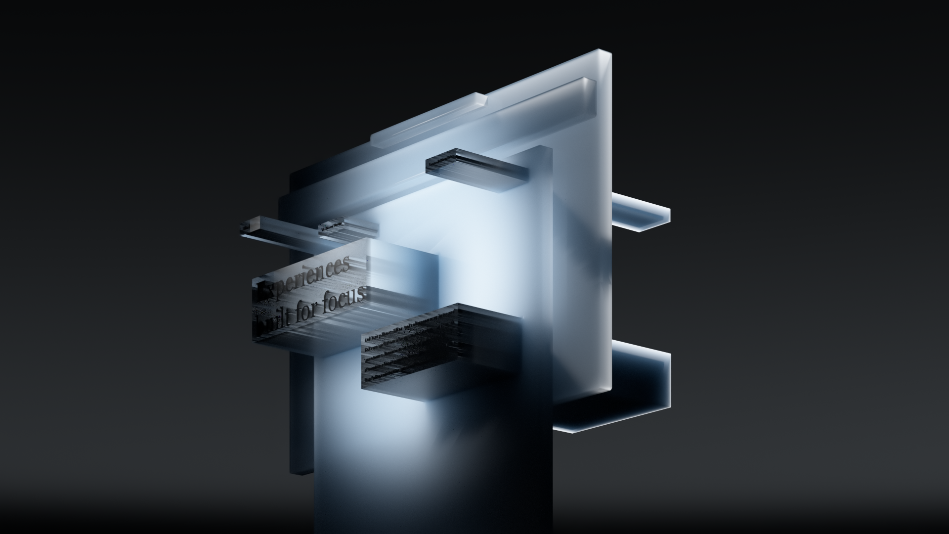
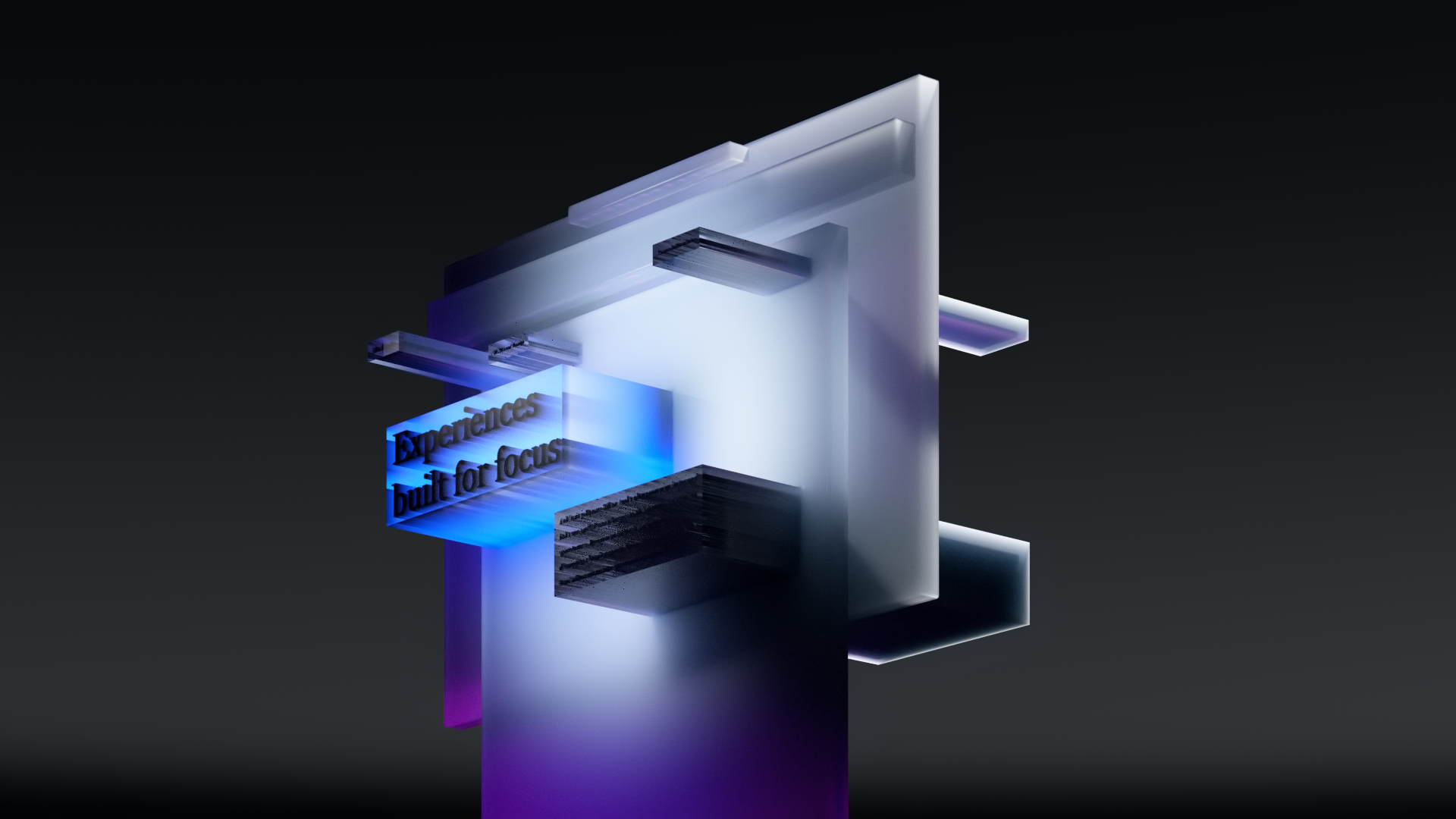
In my collaboration with the team at Media.Work, we explored lots of ways in which we could convey these new material properties. Below are some of those experiments.


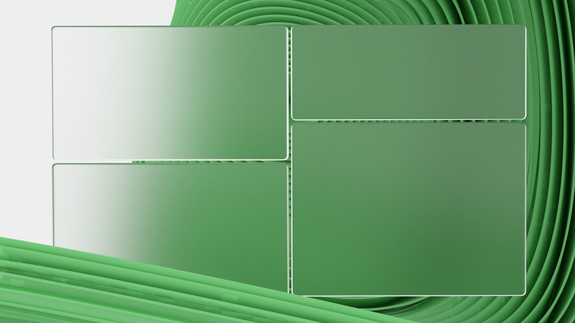
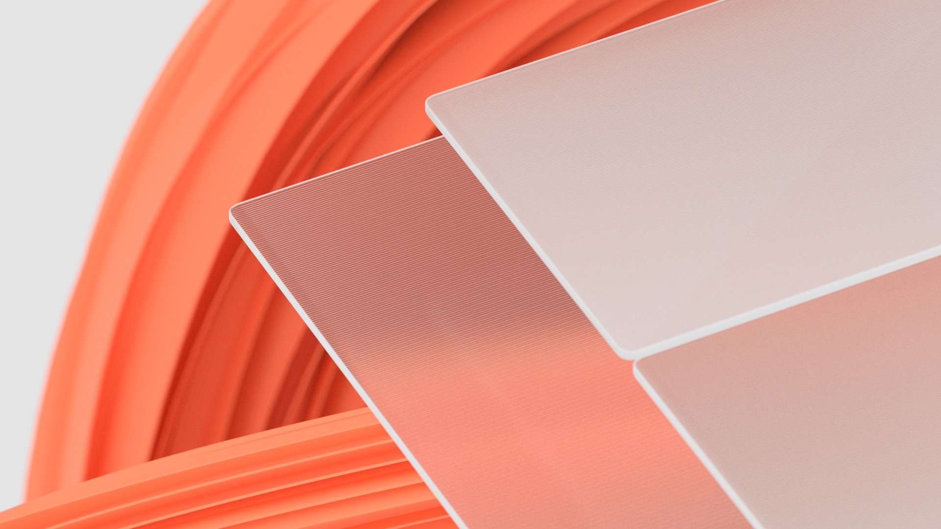

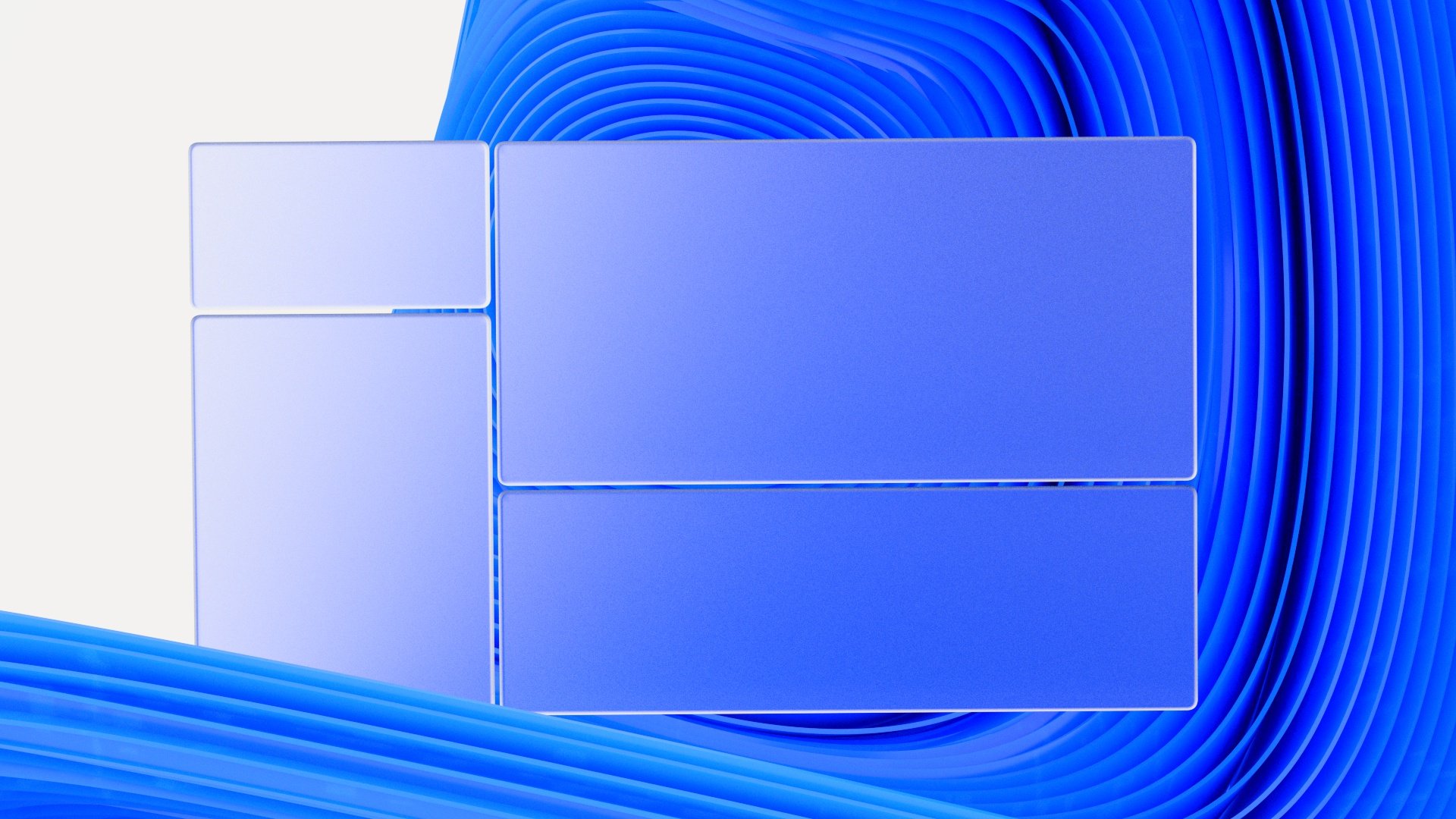


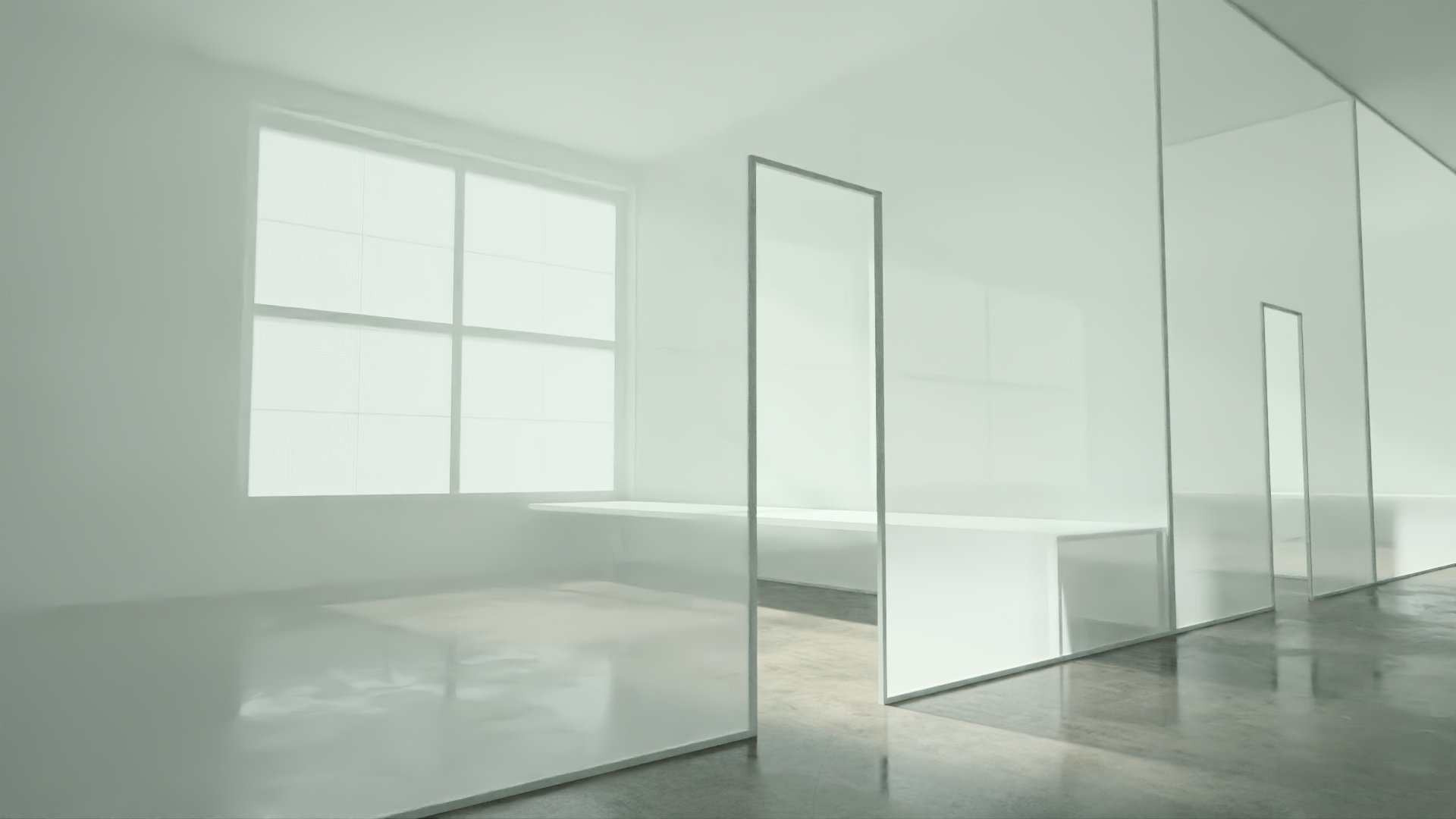
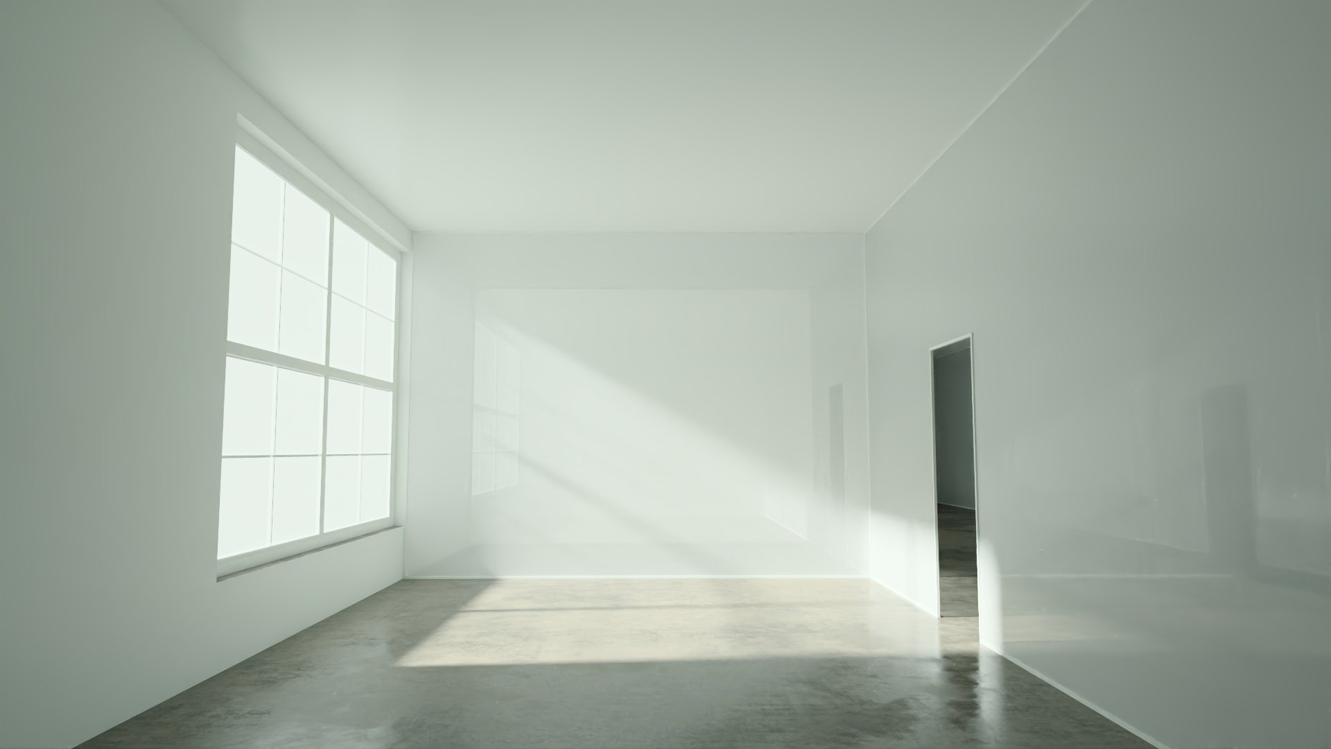
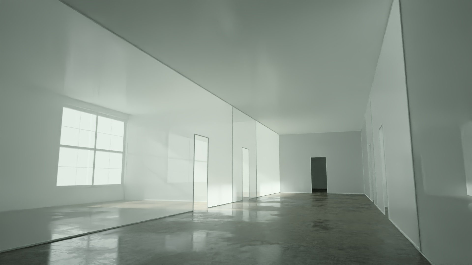
We also used the structures within the space we designed to be highly suggestive of the lines and forms found in the operating system, as well as of Microsoft’s brand.


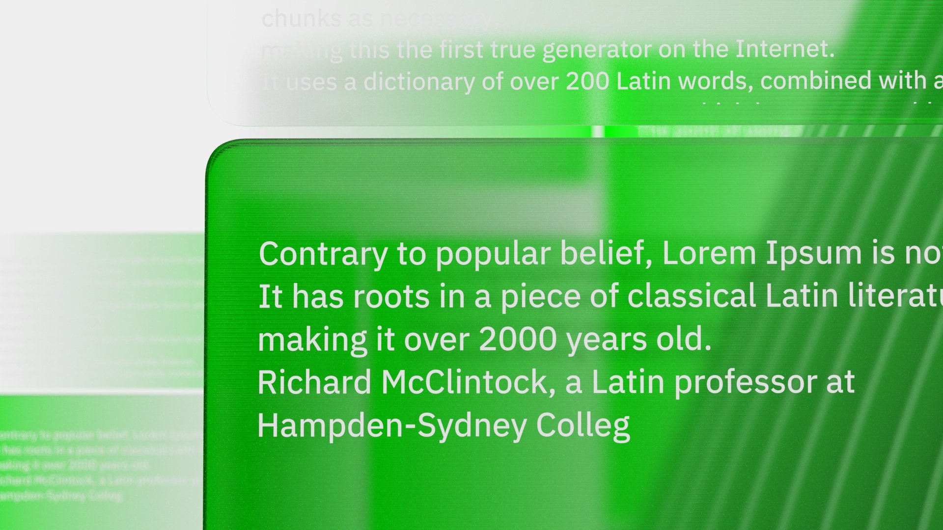
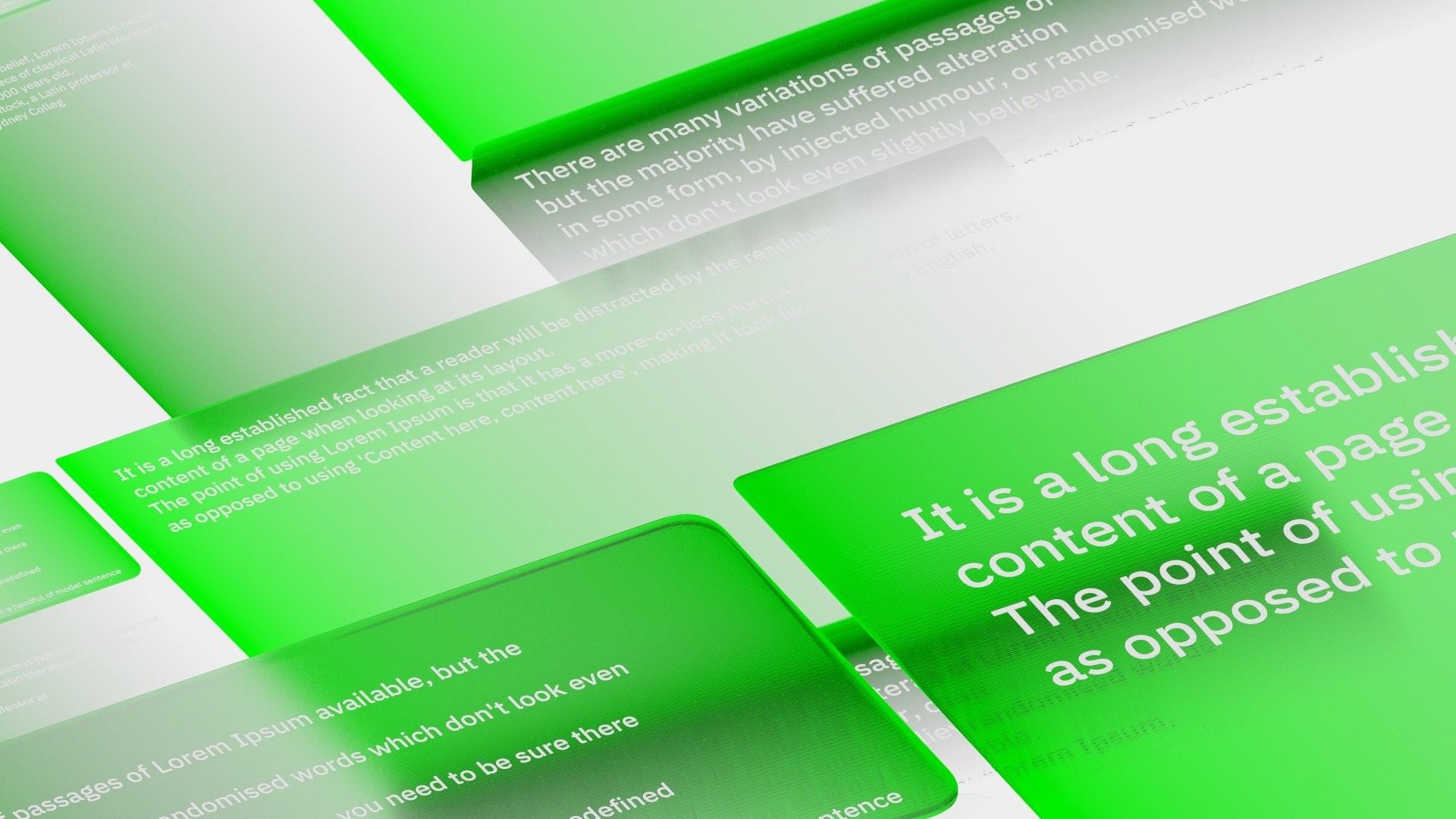
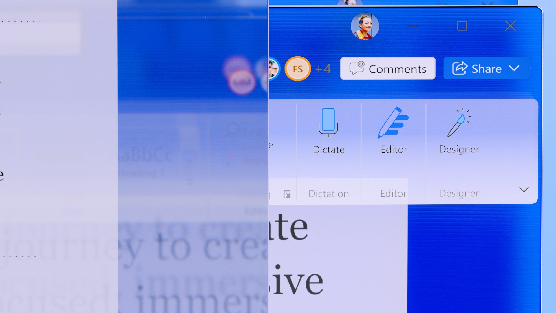
Another important new investment we wanted to showcase was the new ability for the apps to be natively controlled by Windows’ dark mode setting. This prompted us to experiment with tinted light sources that were evocative of the brand of each of the apps we were featuring.


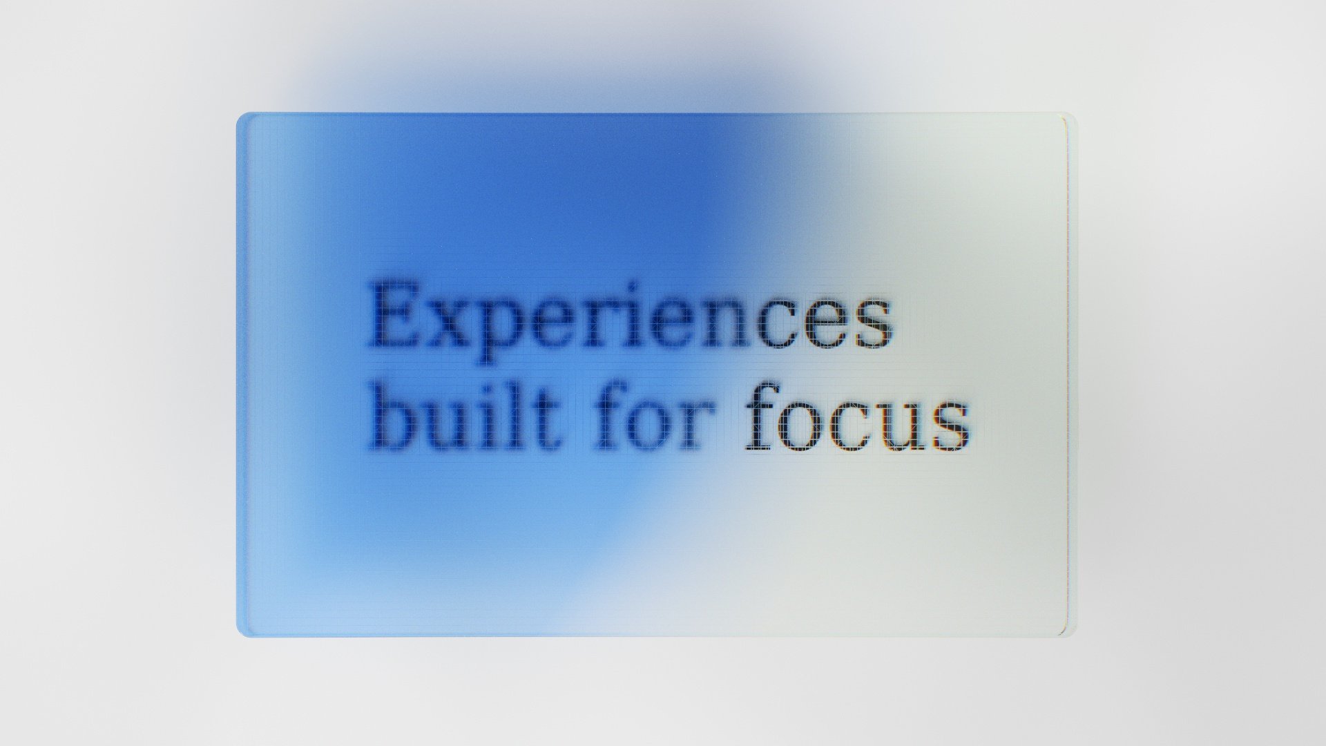
We also experimented with a variety of fun typographic moments, but ultimately went with a more minimal solution.


Thank you!
Firstly, thank you to my partners across the Office products, in Fluent Design and the Office apps design system. Most notably thank you to Sunmin Sung for her dedication to evolving the aesthetics of Office apps over the years.
Thanks also to my partners in marketing for partnering in the creation of this piece and Rachel Romano for publishing the article behind this story.
Thank you also to my partners in making this UX film a reality, the folks at Media.Work for animation and Zelig for music and sound design.