Redesigning the Office app icons to embrace a new world of work
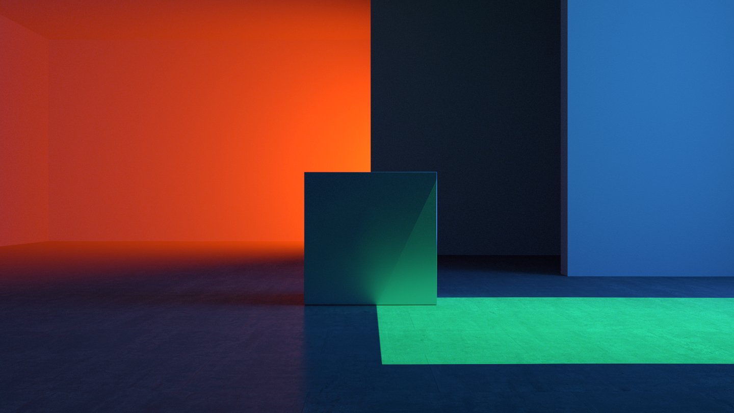
In 2018 I joined a small v-team of designers to explore a new direction for our app icons. This new aesthetic was meant to signal the change that was about to unfold in the following years, and still persists today. A change to evolver our Office suite of experiences towards a simpler and more powerful set of tools that interface with one another more seamlessly.
The following includes the result of our collective effort. Aside from contributing to multiple icon iterations, my contribution also included creating all the images seen here, as well as partnering with Studio Tendril to co-direct a UX film for the reveal of the new icons, which were ultimately designed by the very talented Becky Brown.
To learn more about our efforts, read this article on Medium.
To arrive at our final designs, we collectively explored hundreds of designs within dozens of aesthetic directions over a six month period. These ranged from more familiar evolutions of our existing designs that would make an easy transition for our customers, to more radical proposals that would require some re-learning.
Ultimately, we landed somewhere in between where each icon embodied the recognizable qualities of their heritage, and yet hinted at a new, more modern direction for the Microsoft Office suite.
To put into perspective, the image below showcases the evolution of the Microsoft Word app over a 15 year period.

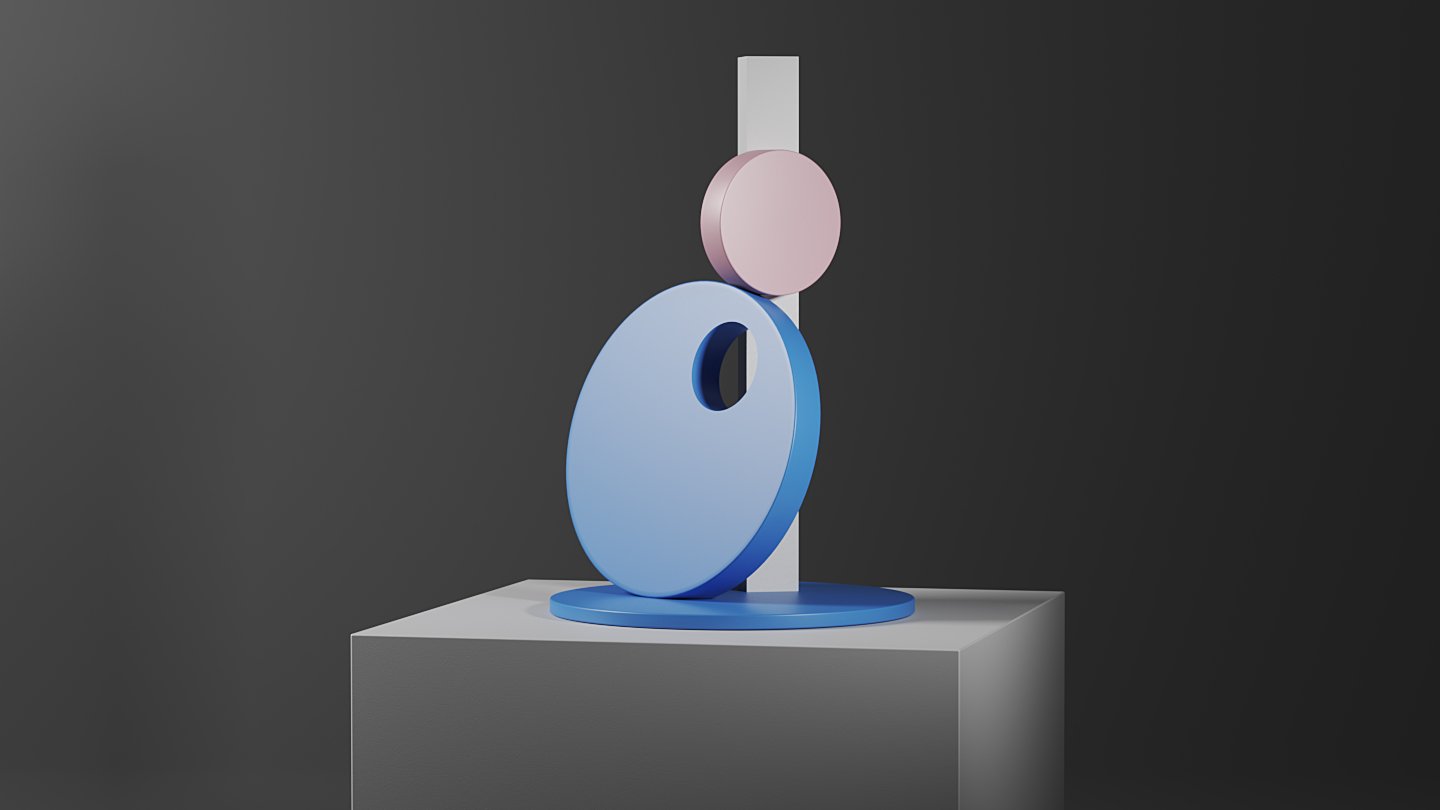
The final designs of each of the core 10 Office apps were comprised of simple geometric forms that can be recombined overtime to create new icons for the growing portfolio of experiences.


Some of my experimental renders for both Word and OneNote icons depicting their alignment to our universal icon grid.


An example of our each app icon embodies the general capabilities of the apps they represent. As seen here, Excel’s icon shapes are directly connected to it’s distinctive cell-divided interface.

In my role as Creative Director, I partnered with Tendril Studio and Zelig Sound to create this film as a celebratory mark for this new evolution of the Office apps.
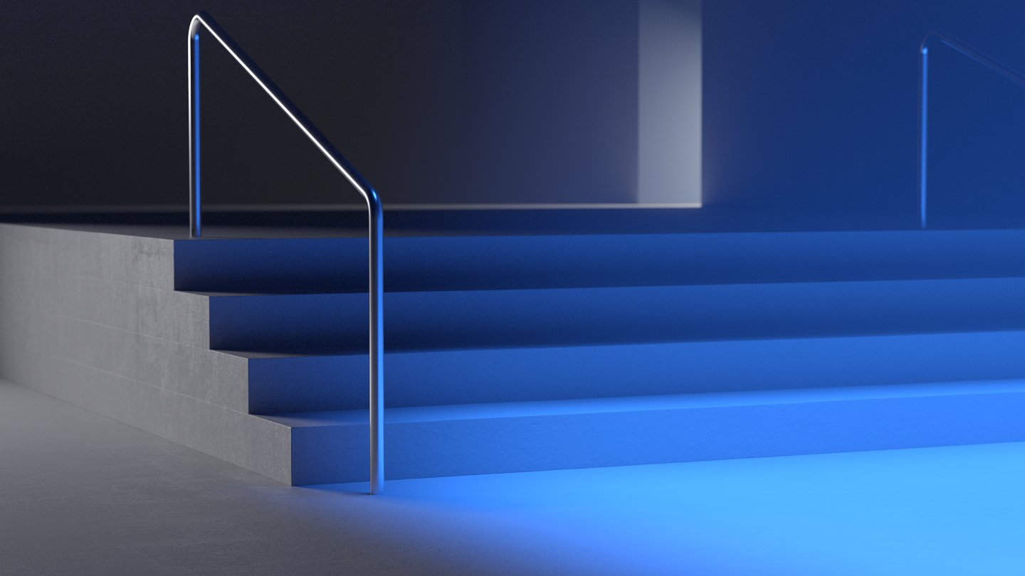
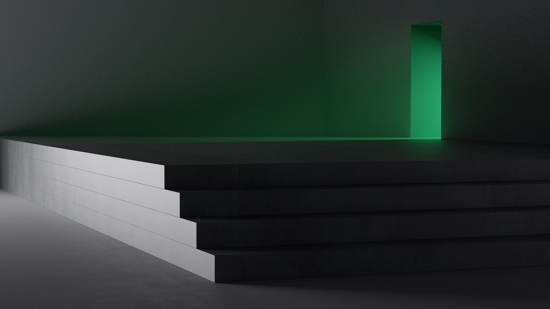
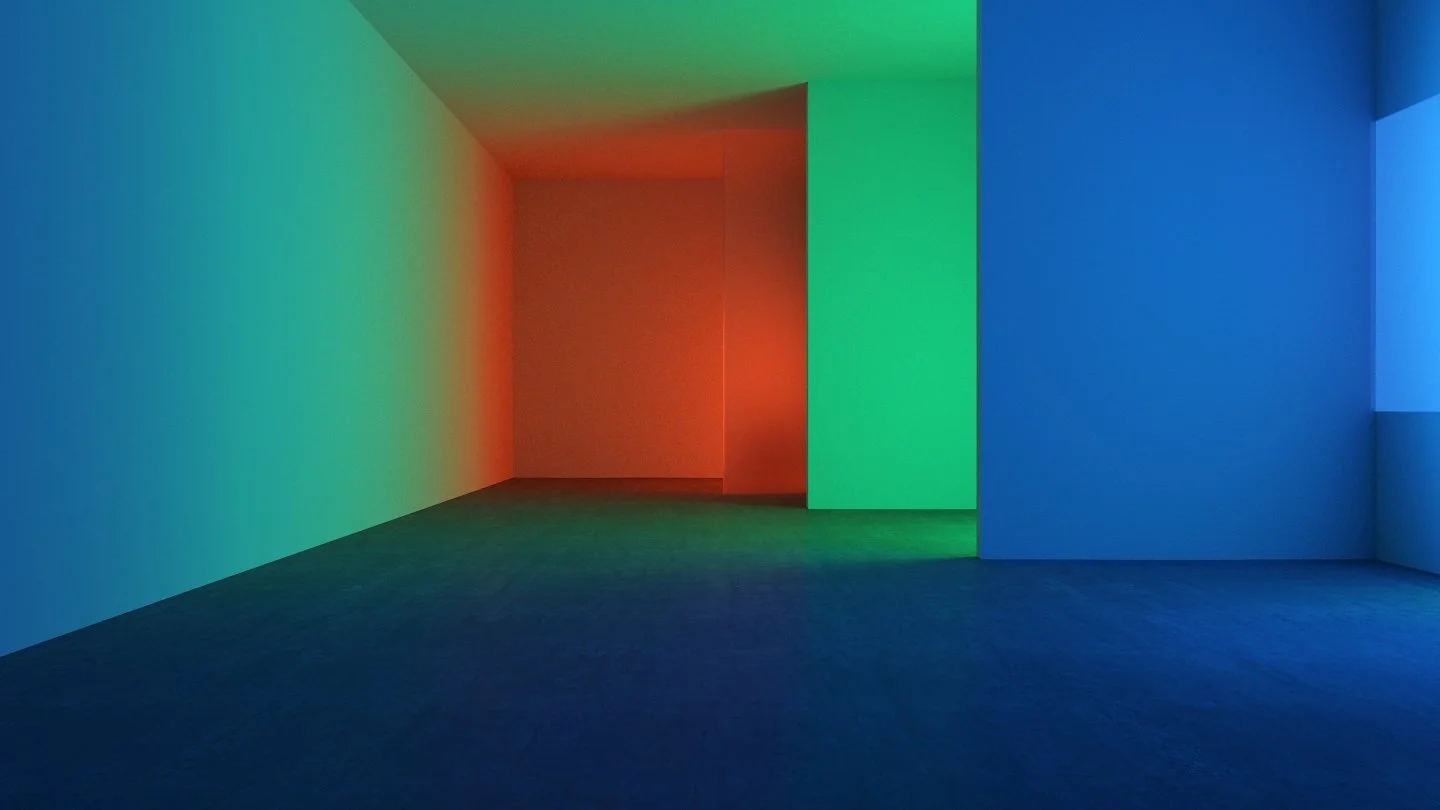
Below are many of the style frames the team created during the development.


Thank you!
Thanks to my colleagues at Microsoft that made these designs real, particularly my v-team: Austin Taylor, Becky Brown, Burns Montgomery, Jon Friedman, Laura Clark and many others that contributed along the way.