Power & Simplicity in Office
When I joined the Microsoft Office team in 2017, I was soon asked to direct a film that would help share with our customers learn about the evolution of the Office experience into a more modern and intelligent suite of products. In this article, we shared more about this transformation along with the UX film I directed (seen below).
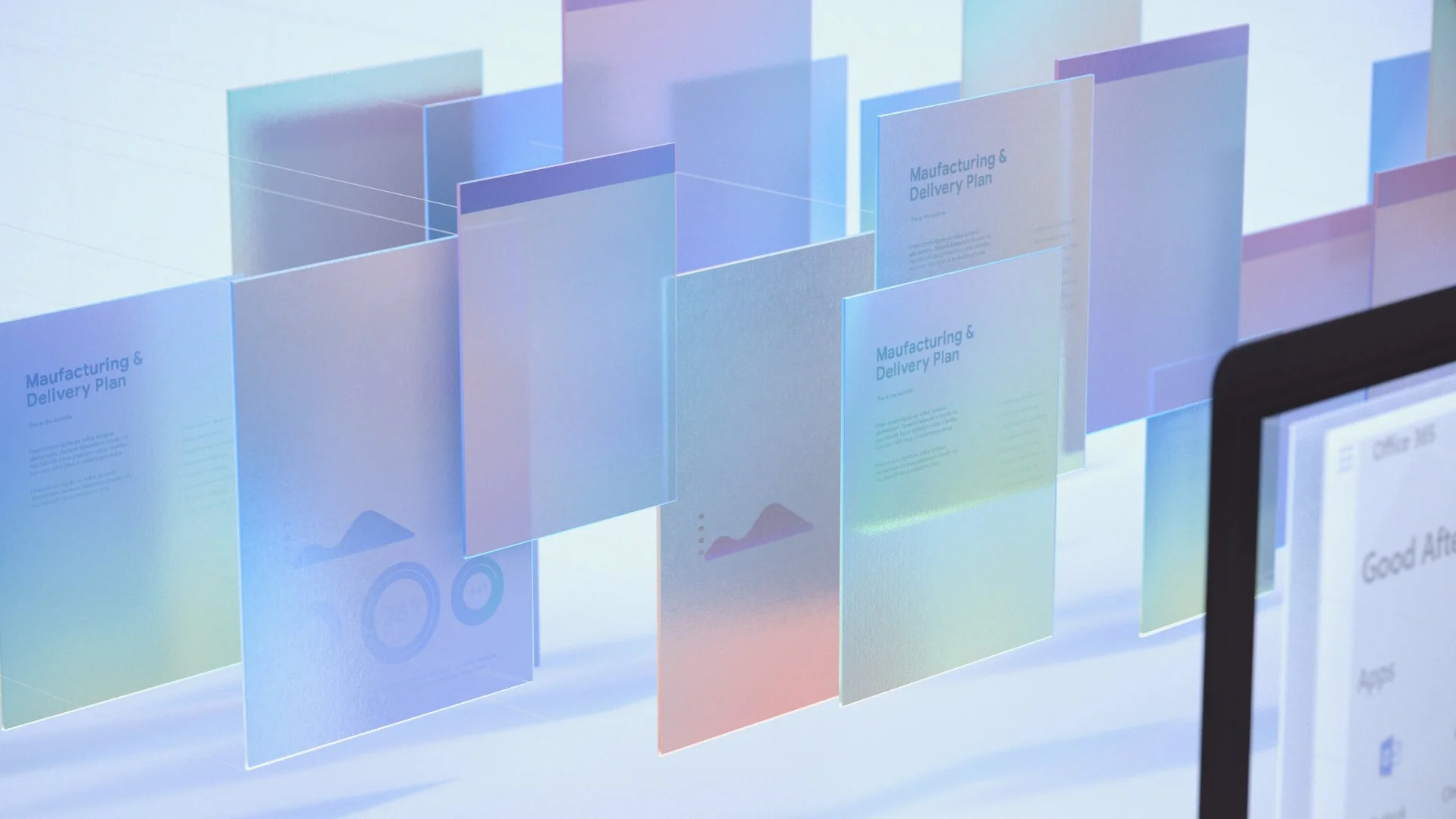
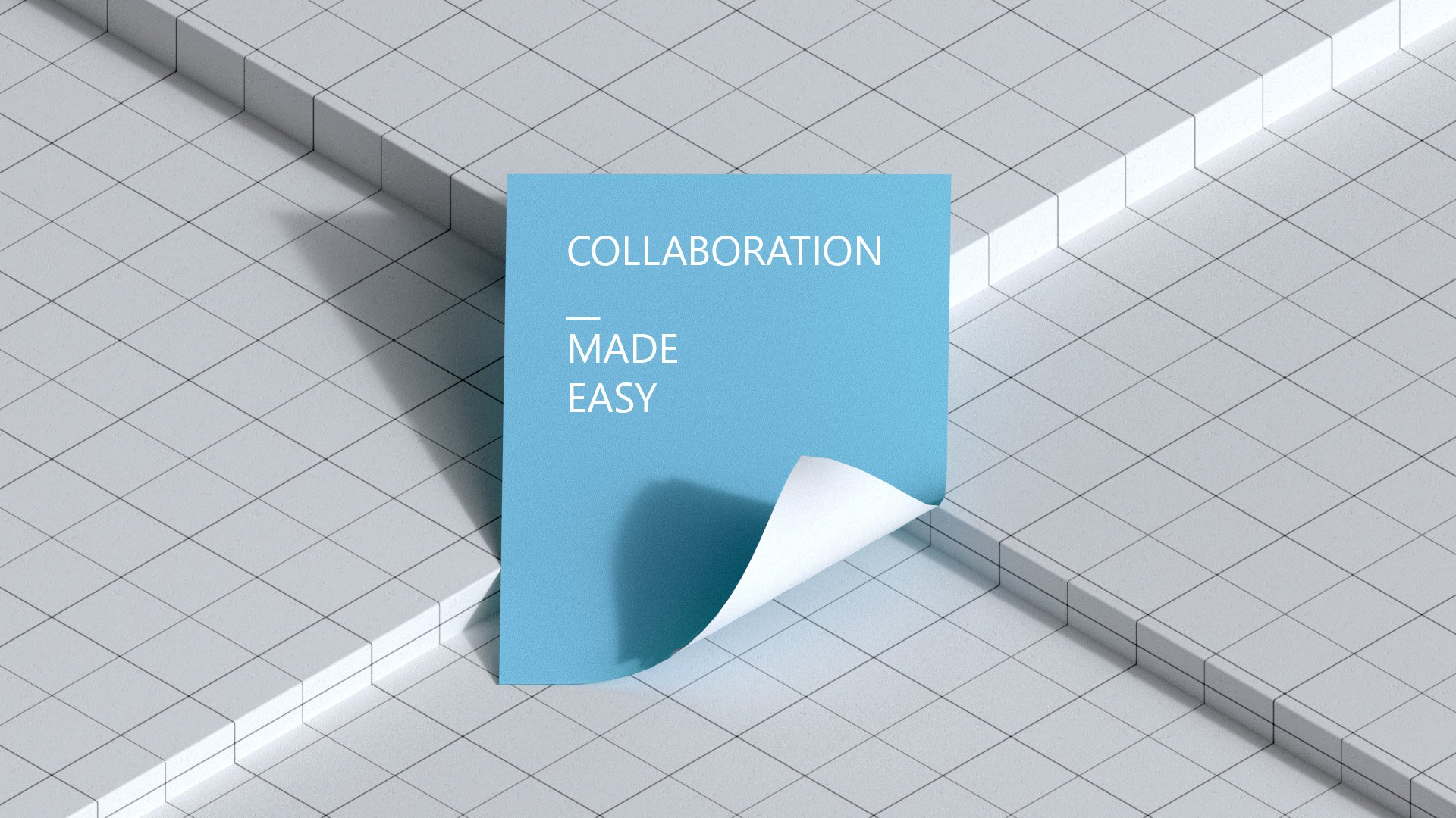
We initially wanted the film to have a series of title cards for each and every section. As the story evolved, we simplified it and ultimately only kept a few. Below are some of the initial explorations for other topics not seen in the final story.


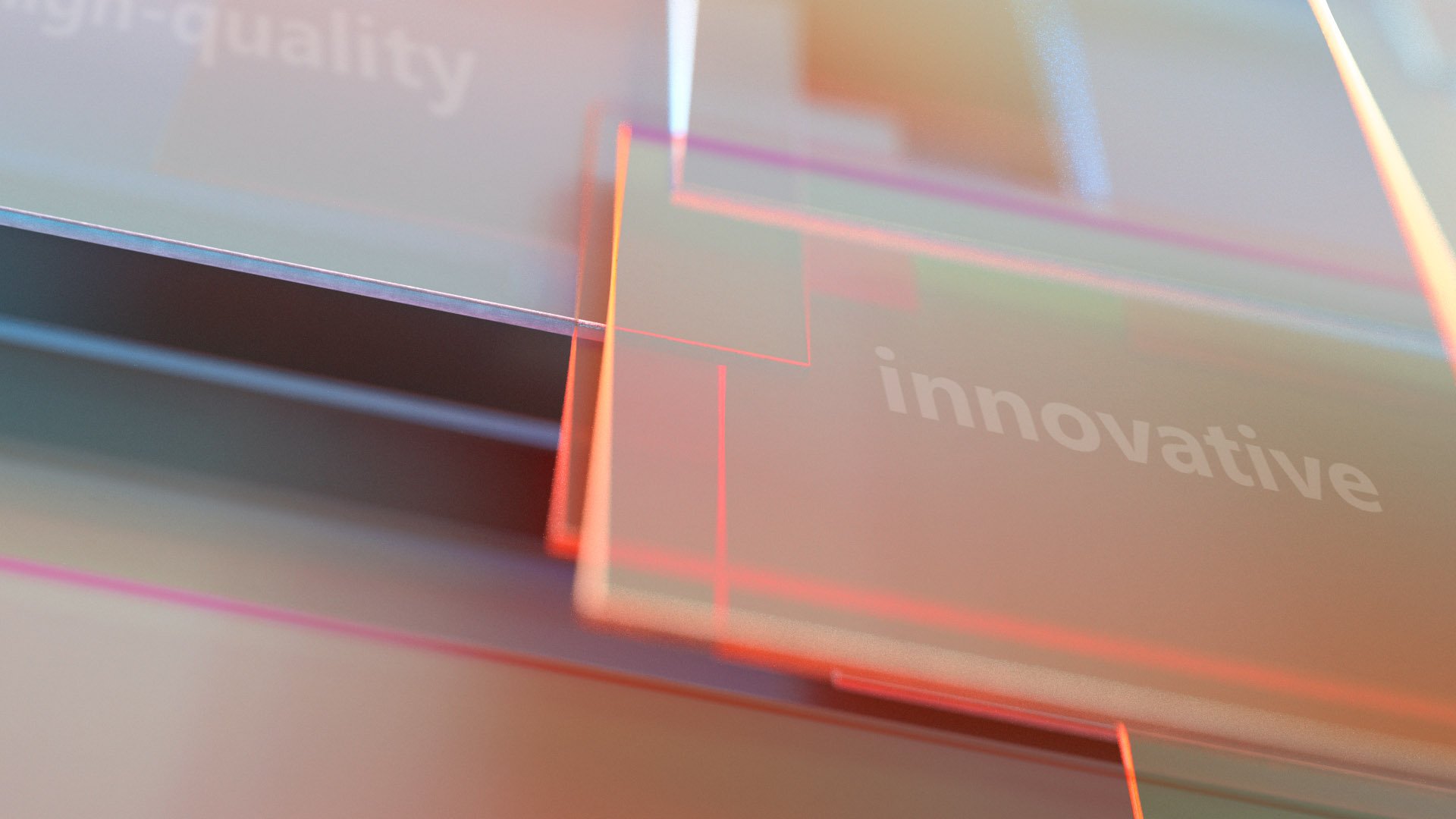
“Speed” - One of the concept we wanted to convey in the film.


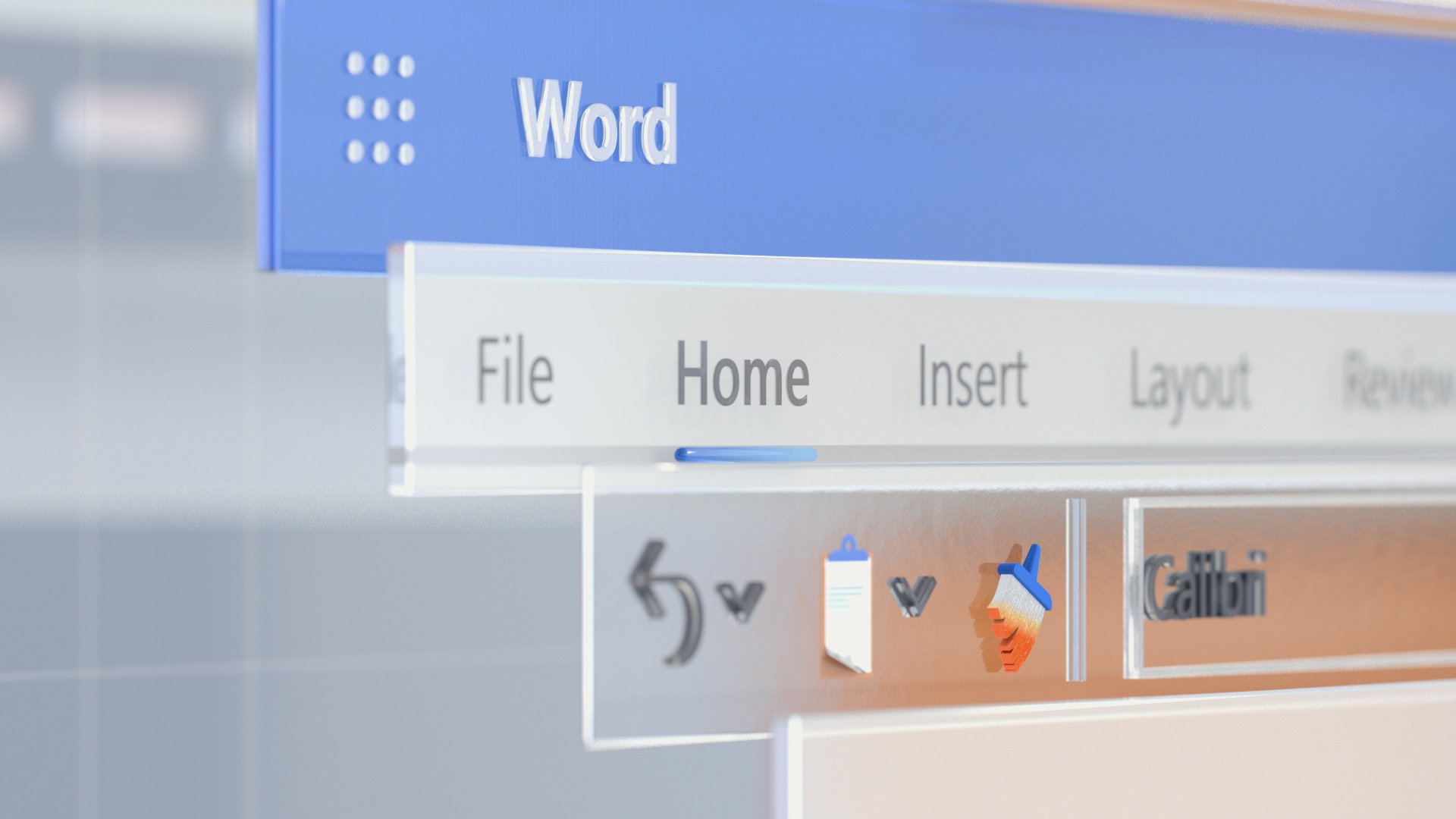
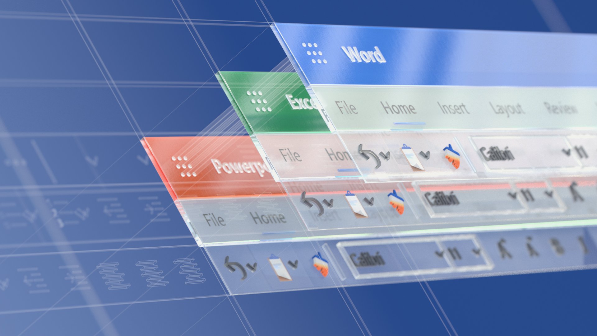
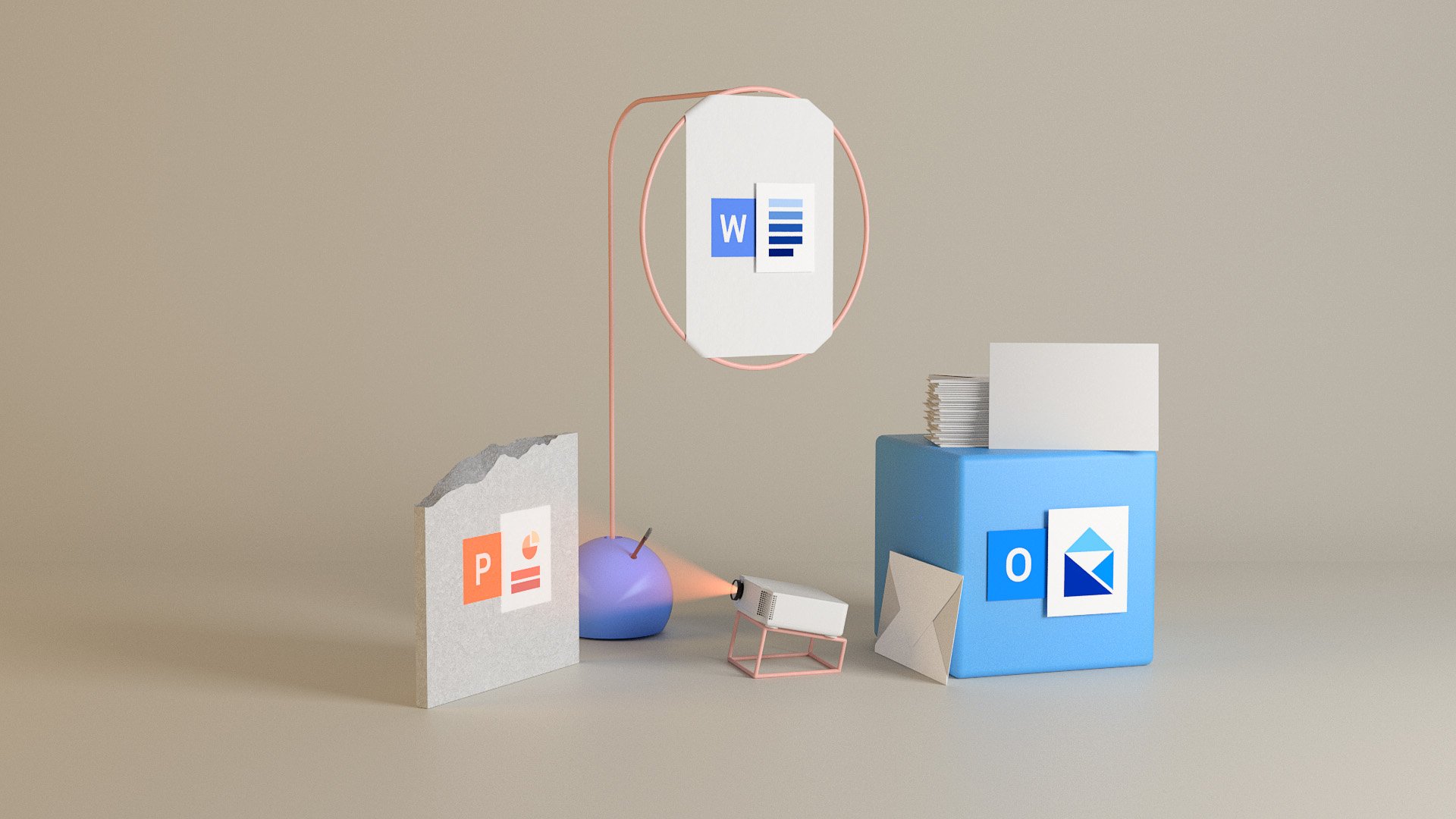
During the production of this film, we were in fact still deciding which Office icon designers to go with. Seen here are some of the early designs for Word, Excel and PowerPoint apps in a dimensional format, something we have adopted more widely since.


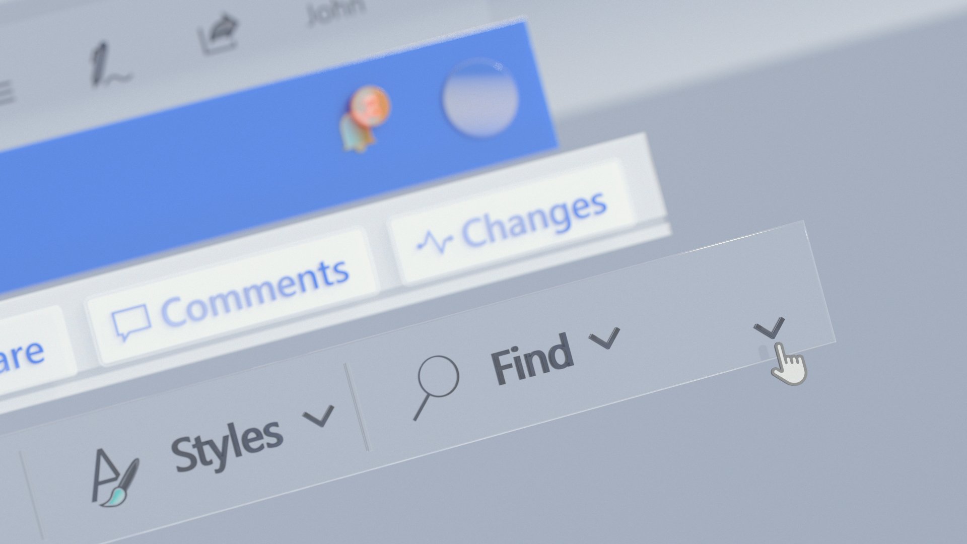
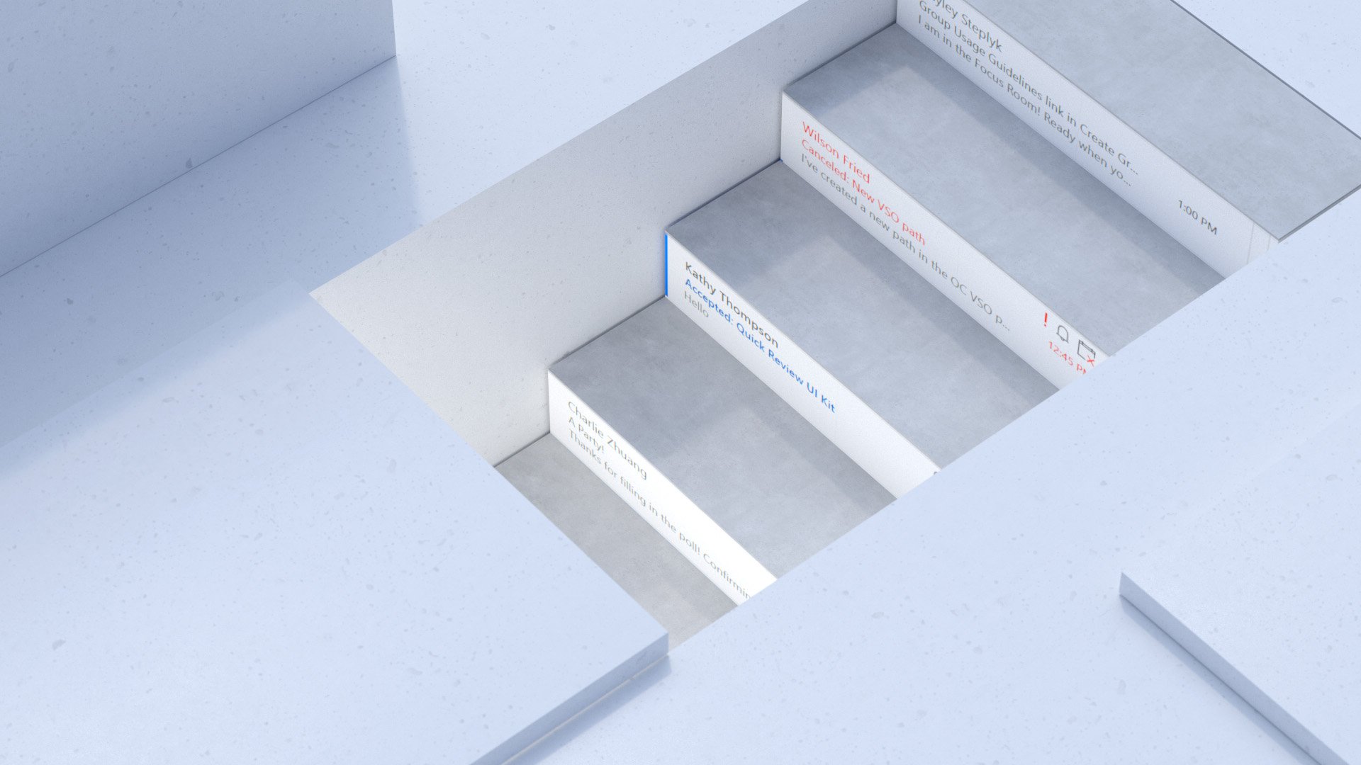
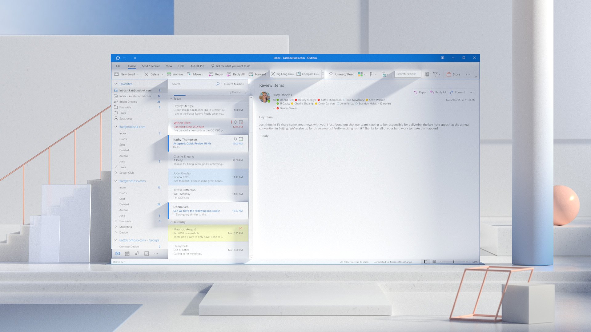
This image is part of a sequence that aims at telling the story of our search feature. On the left we see data representative of people, documents, comments, conversations and shared files that are being sifted through and presented in a more simplified and intelligent way on the right.


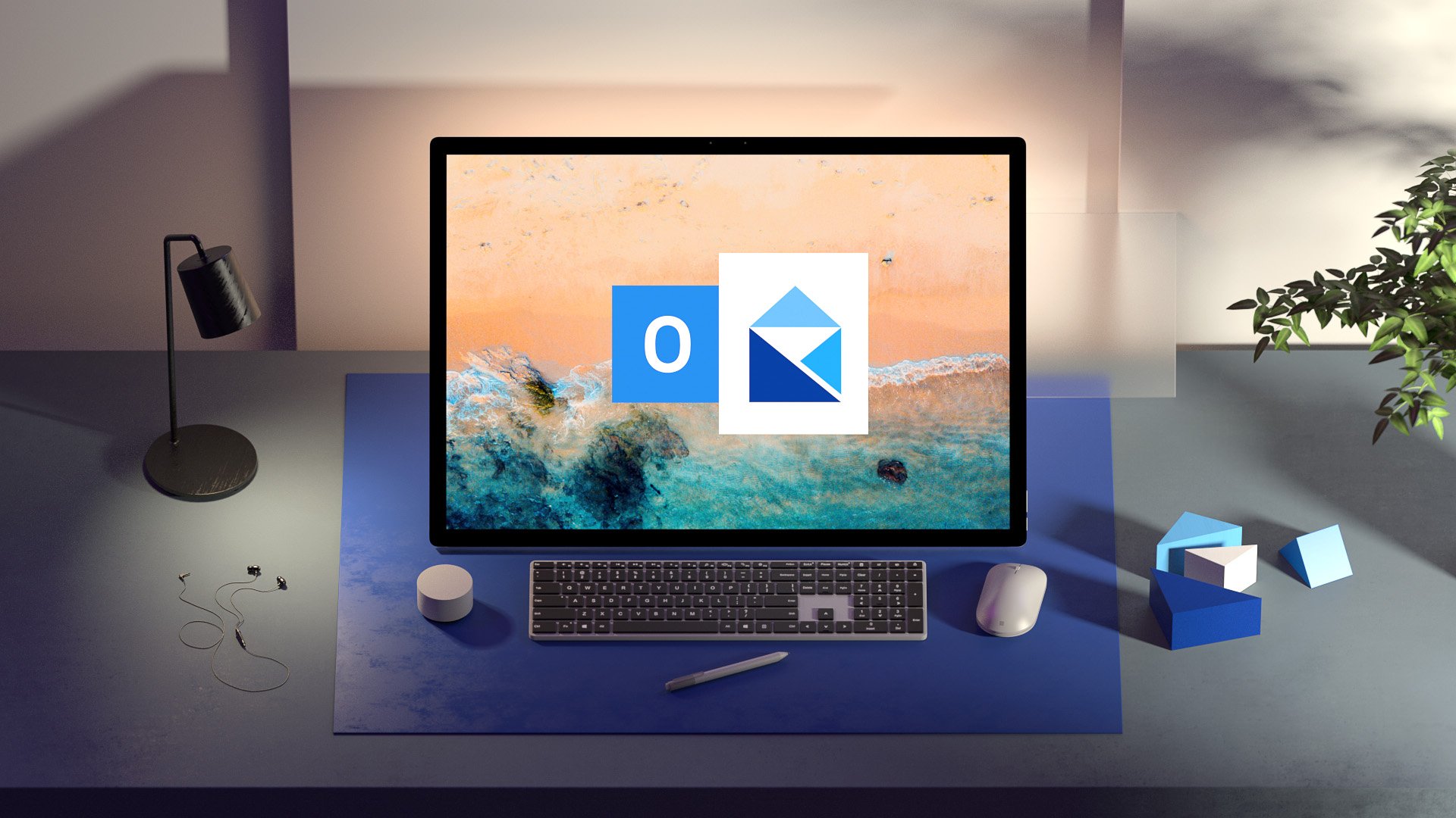
Early renders for our newly adopted Fluent icons.

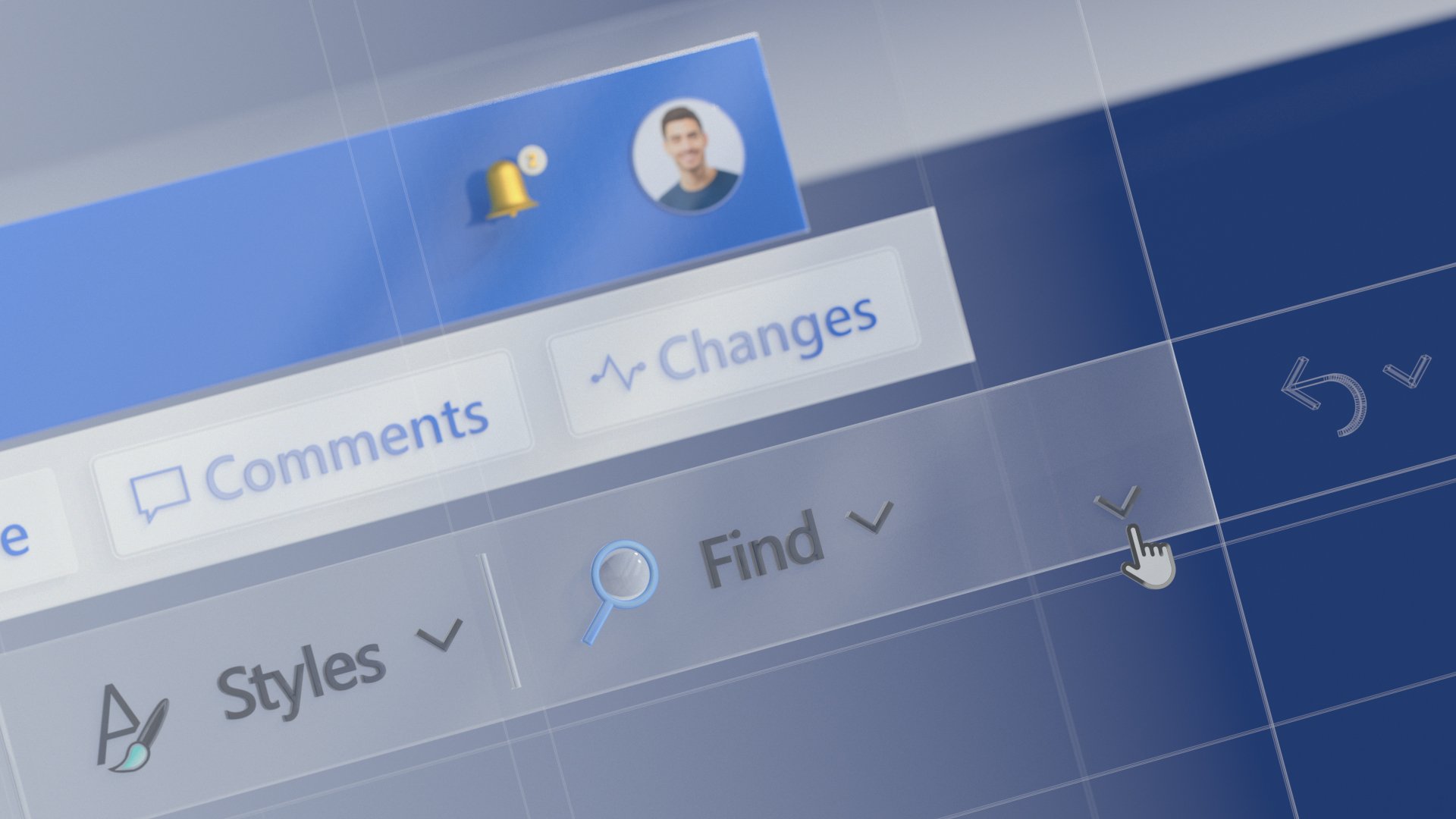
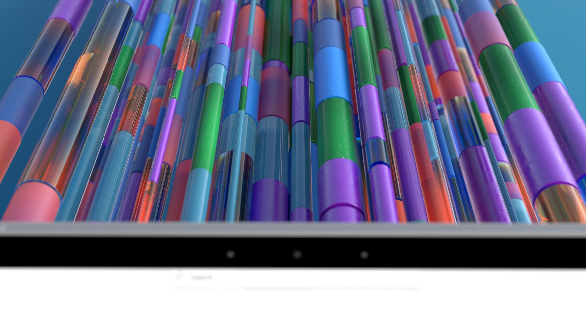
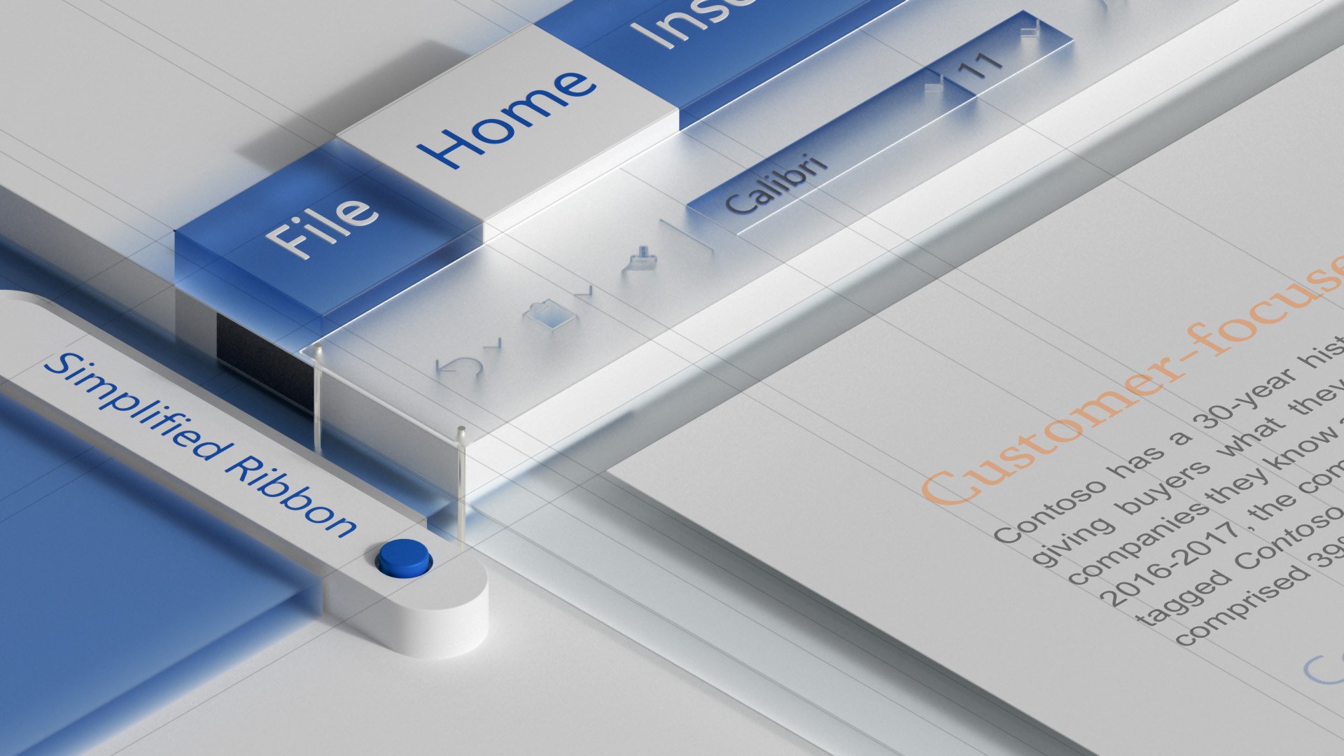
In our search for the appropriate aesthetic for Office, the team tried a wide variety of metaphors and looks. We landed on some beautiful solutions and you can see some of them below.


Thank You!
Thanks to the team of designers at Office for the partnership in crafting this story. There are so many, so I will focus on thanking Jon Friedman for creating the opportunity that led me to direct this film and Rachel Romano for writing the story. This was the very first UX film of many more that followed.
Thanks Tendril Studio and Zelig Sound for working together on our very first Microsoft UX film. This changed everything!