Microsoft Fluent Emoji System
Yes! A brand-new emoji system! Leading this effort has been by far one of my favorite experiences at Microsoft.
It all began in the Fall of 2020 during a hackathon project when we began to revisit our system with the very important goal of introducing skin tone choices to reactions and emoji. From there, it quickly grew to explore a new aesthetic as well.
It was then that our cross-company v-team began the journey of revisiting the Microsoft emoji system. A system that had been divided for some time, with different aesthetics in Windows, Microsoft Teams and Skype. While the system had plenty of personality, it hadn't yet caught up to the latest developments of Fluent Design.
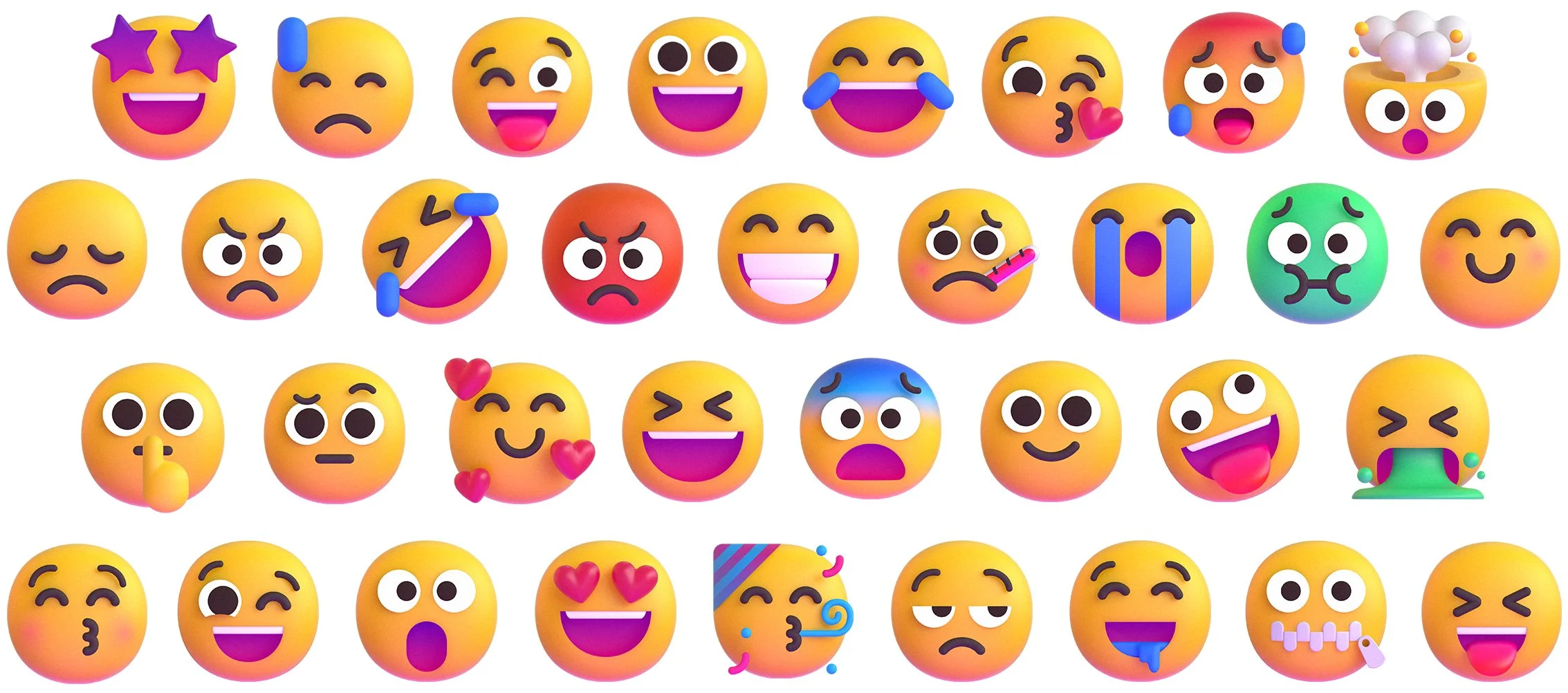
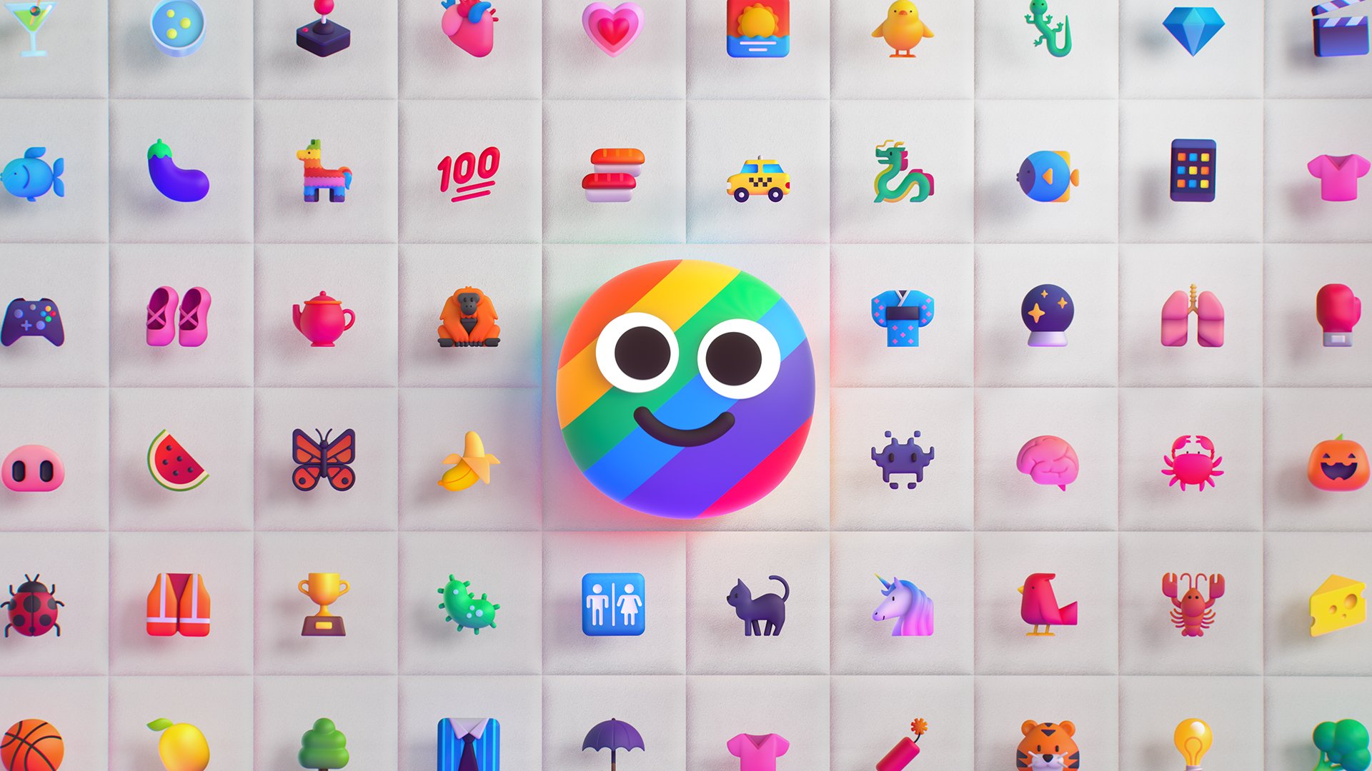
As group of designers from various teams, we partnered with the creative agency Tendril to explore and define this new system. Below is a snapshot of the system’s smileys showing off this refreshed aesthetic, which we wanted to be exemplary of one Fluent Design principles: “Unmistakably Microsoft”.
Below is a quick summary of the work. For more details, please refer to this article we’ve published: “Emotionality at work”, which expands on some of our motivations for updating the aesthetics of our system, as well as this one I wrote on LinkedIn, detailing some of our creative and production processes: “The Making of Fluent Emoji”.
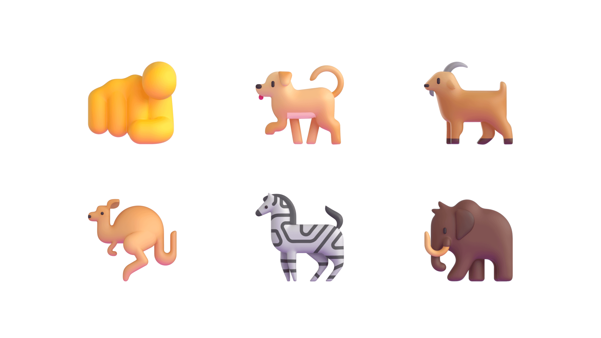
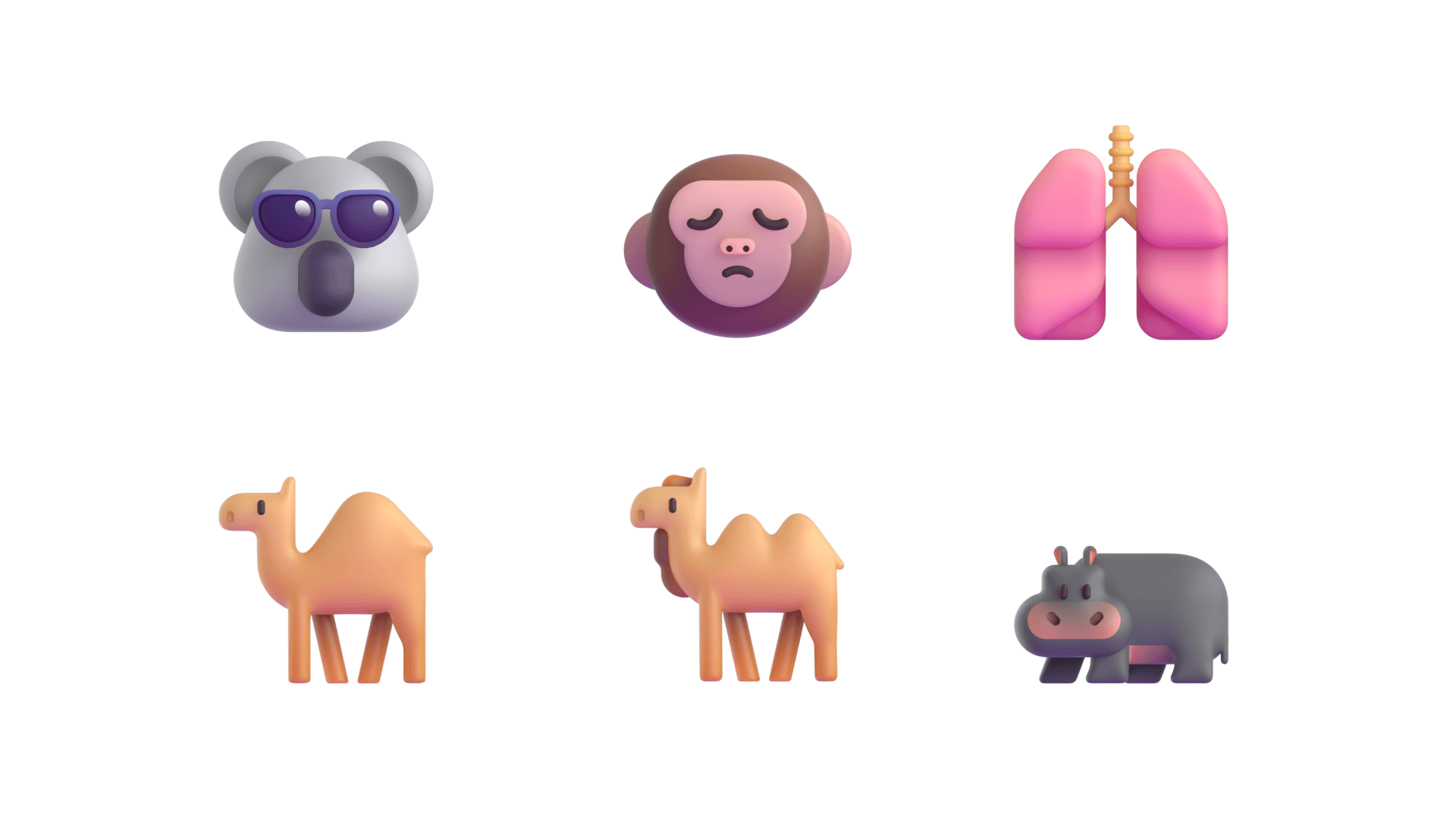
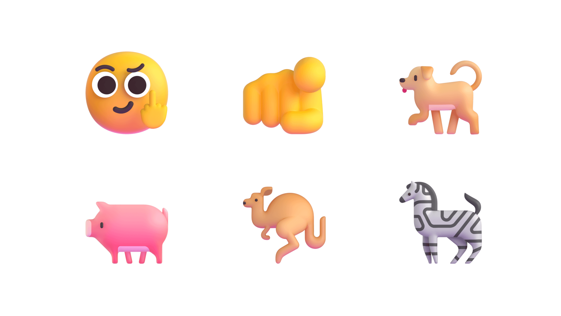
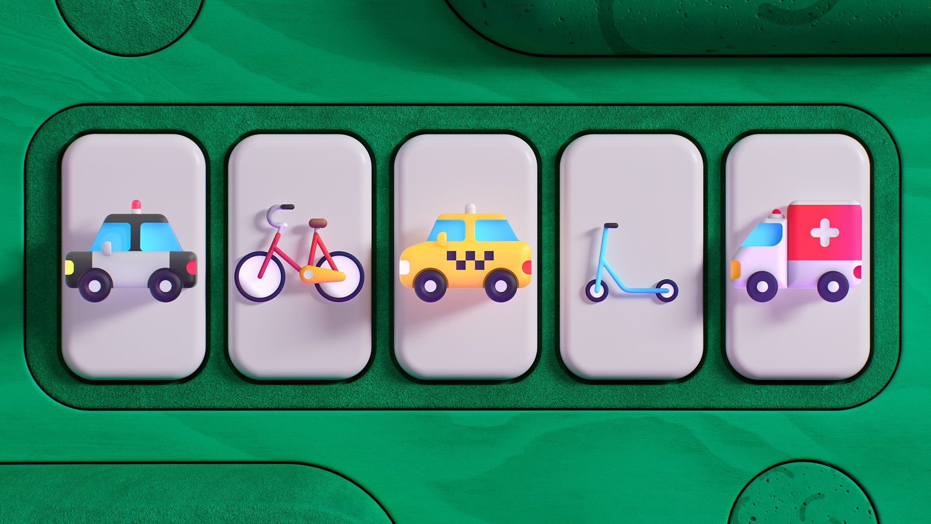
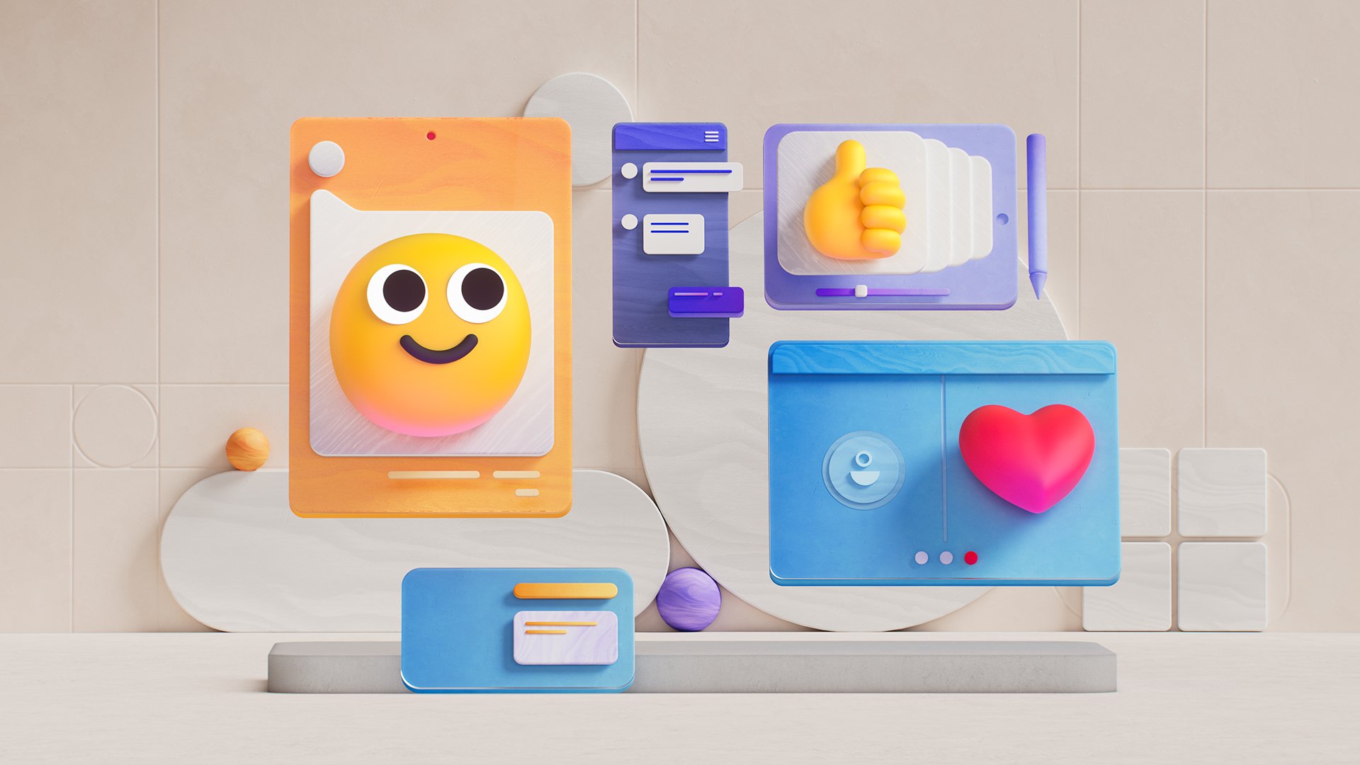
Once we had established the look for the set of smileys, which acted as the baseline for the complete library of 1888 emojis we designed, we continued to expand the system. We used a simple set of principles and guidelines to get us there, below are some of my favorite elements of our approach.

Imperfect Circle
We wanted every smiley to convey a more humanistic quality. After exploring a variety of designs, we landed on the subtle, yet effective detail of embracing a slightly irregular silhouette. This subtlety helped us celebrate our own human imperfections, and yet respect the geometric look and feel of the whole emoji collection.
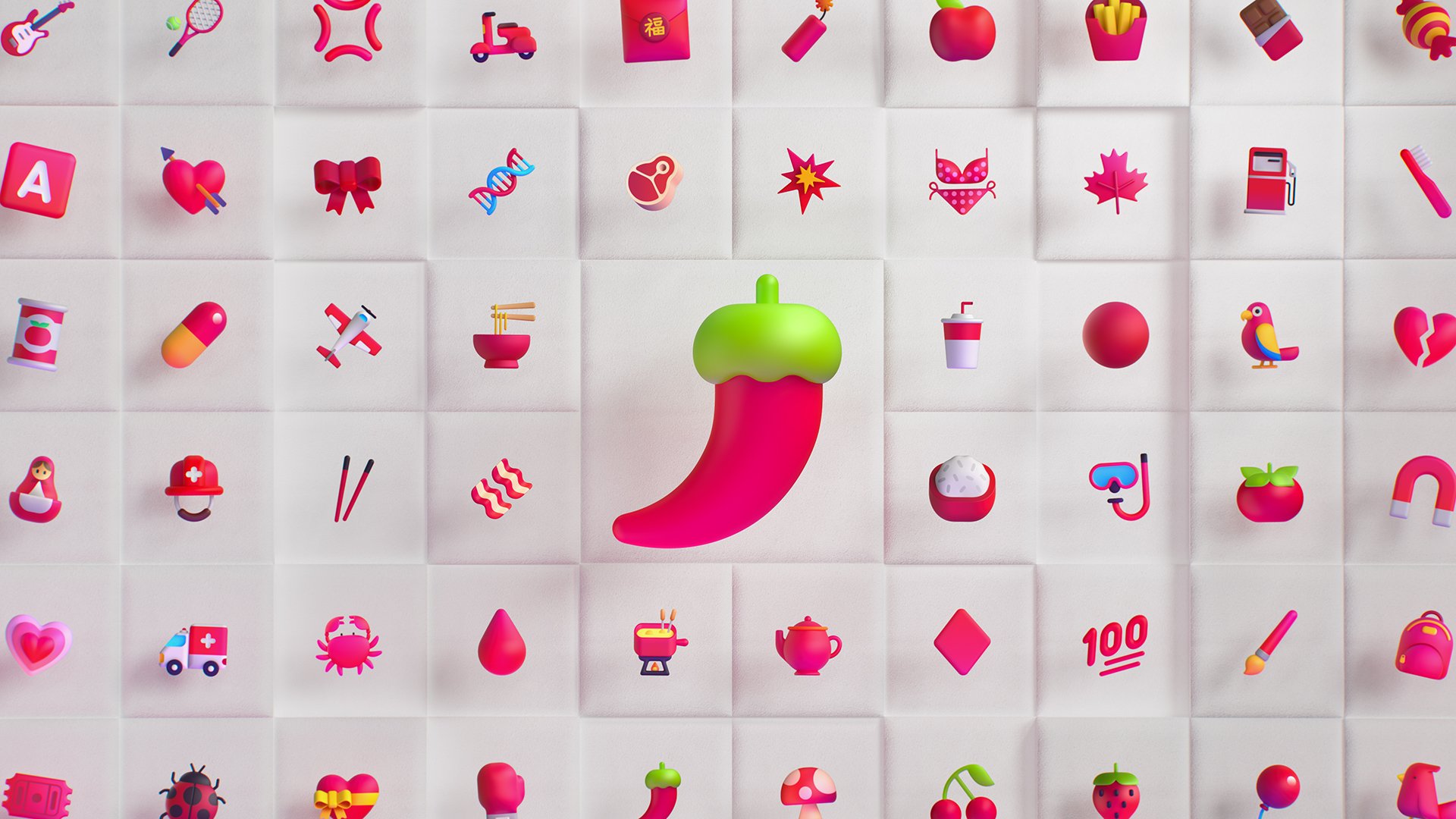
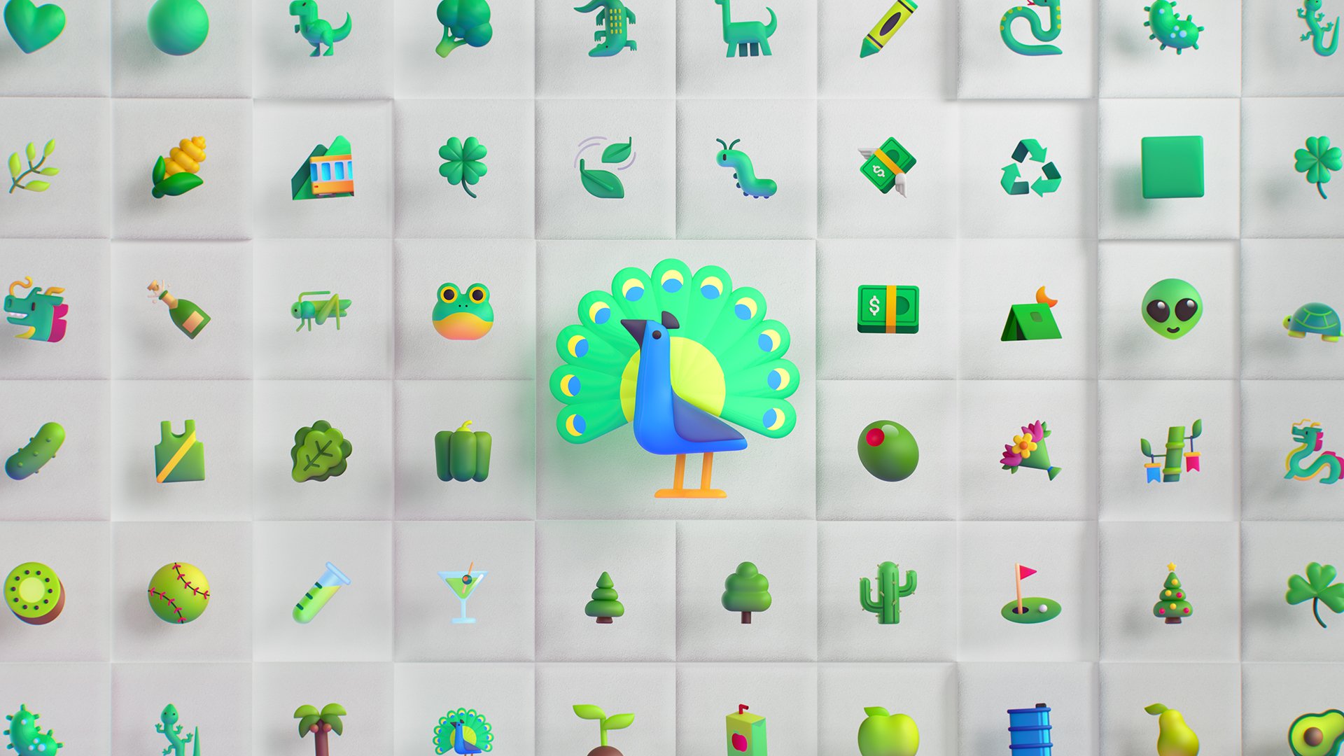
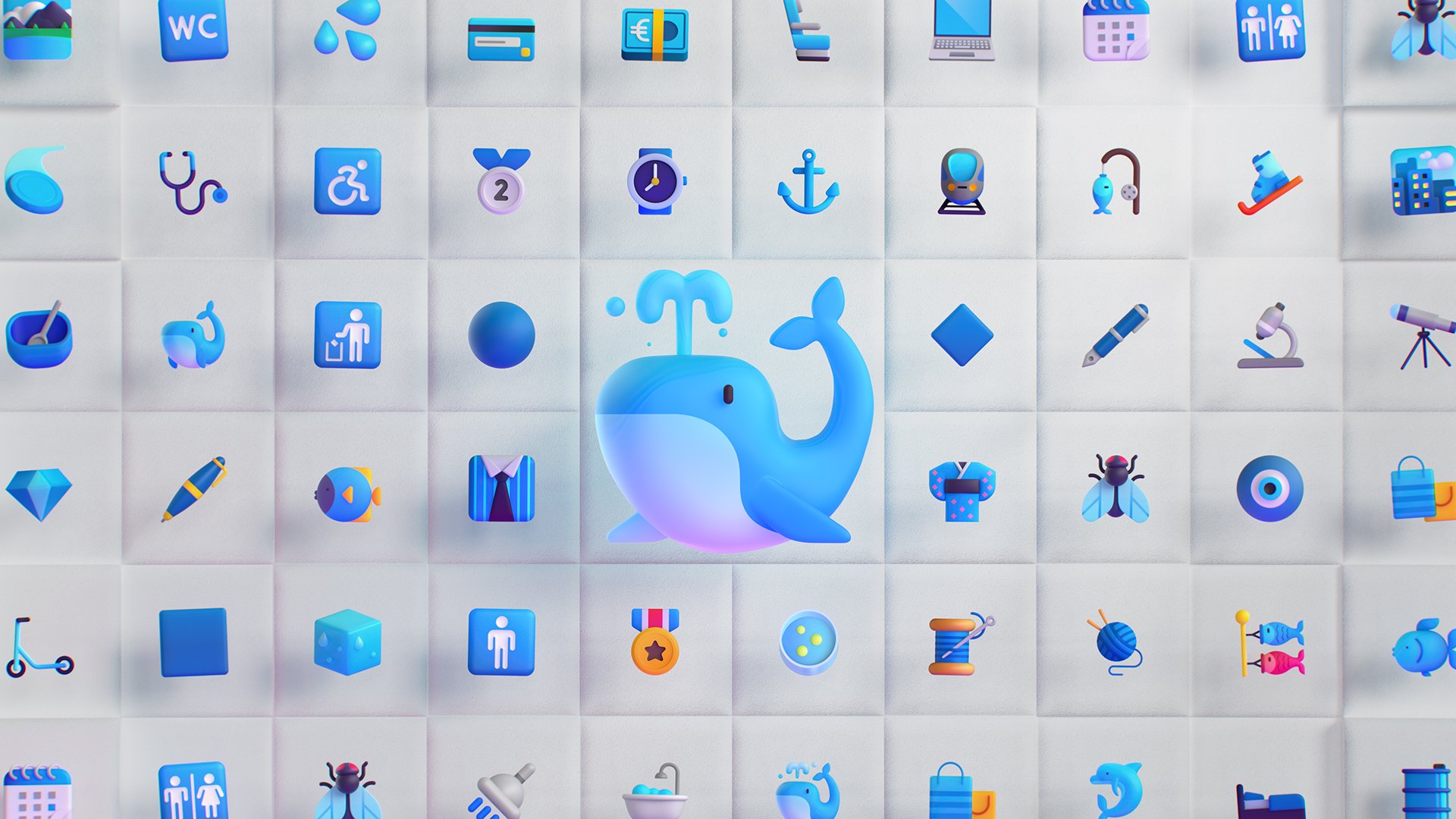
Bold Shapes & Colors
Vibrant colors played an important role in achieving the level of expression we had hoped for the whole system. It also fit naturally within the graphical quality of the designs, giving them a fresh and playful look and feel while preserving the elegance we were aiming for.
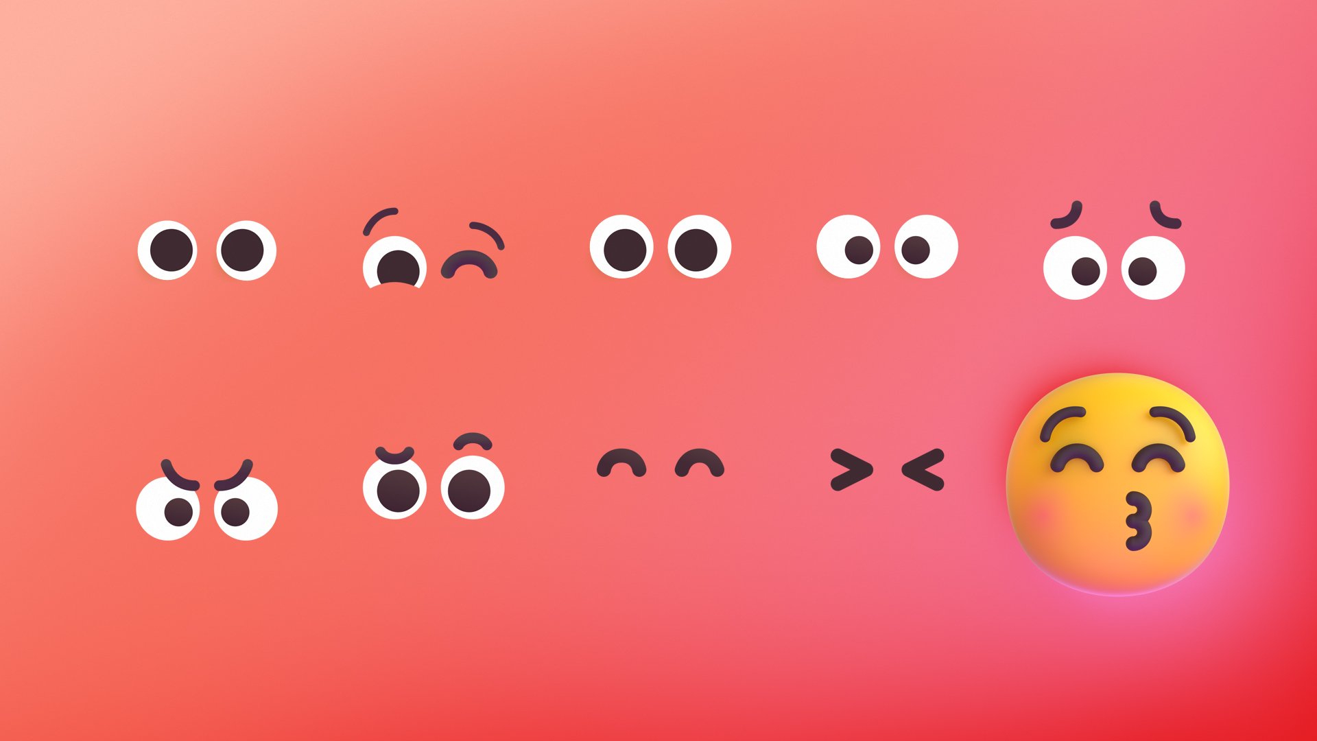
A Scalable System
The system of smileys benefitted from a set of interchangeable parts that made sets of expressions feel more connected and each emotion more recognizable.


Getting to these iconic forms meant that we needed to start with very simple geometry. Almost every emoji part derived from squares, circles and triangles that were softened, curved, and bent to take on new forms as this little Pumpkin emoji demonstrates.
Below is a look at how our emojis were initially created as two-dimensional designs, and later modeled and animated in 3D.


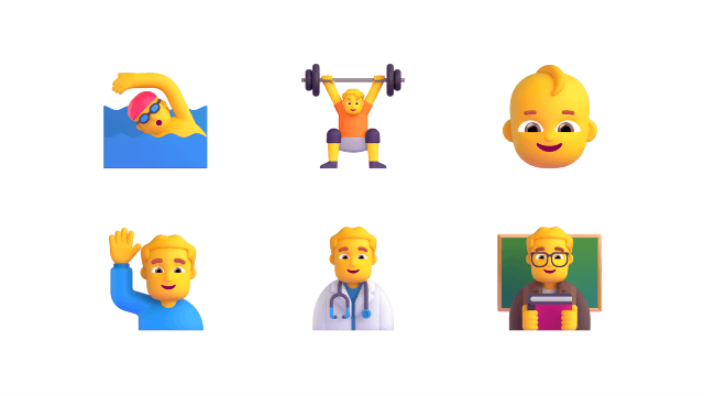
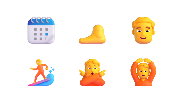
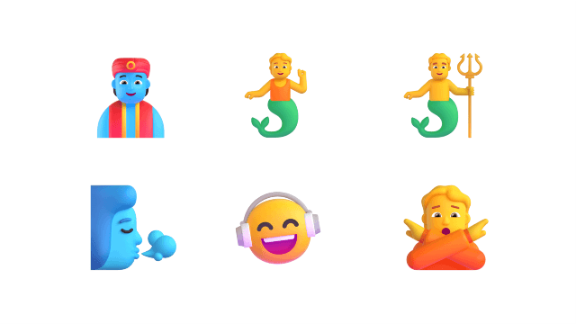
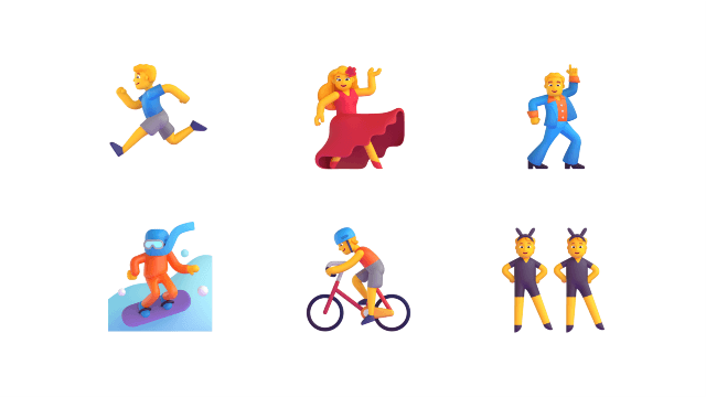

Our most challenging category was undoubtedly People. Remaining inclusive in every design choice, while capturing universal human characteristics proved to be a difficult, but also very rewarding challenge. After iterating heavily and consulting many voices, we landed on the above designs and moved to scale up the category as seen in the animated sets below.


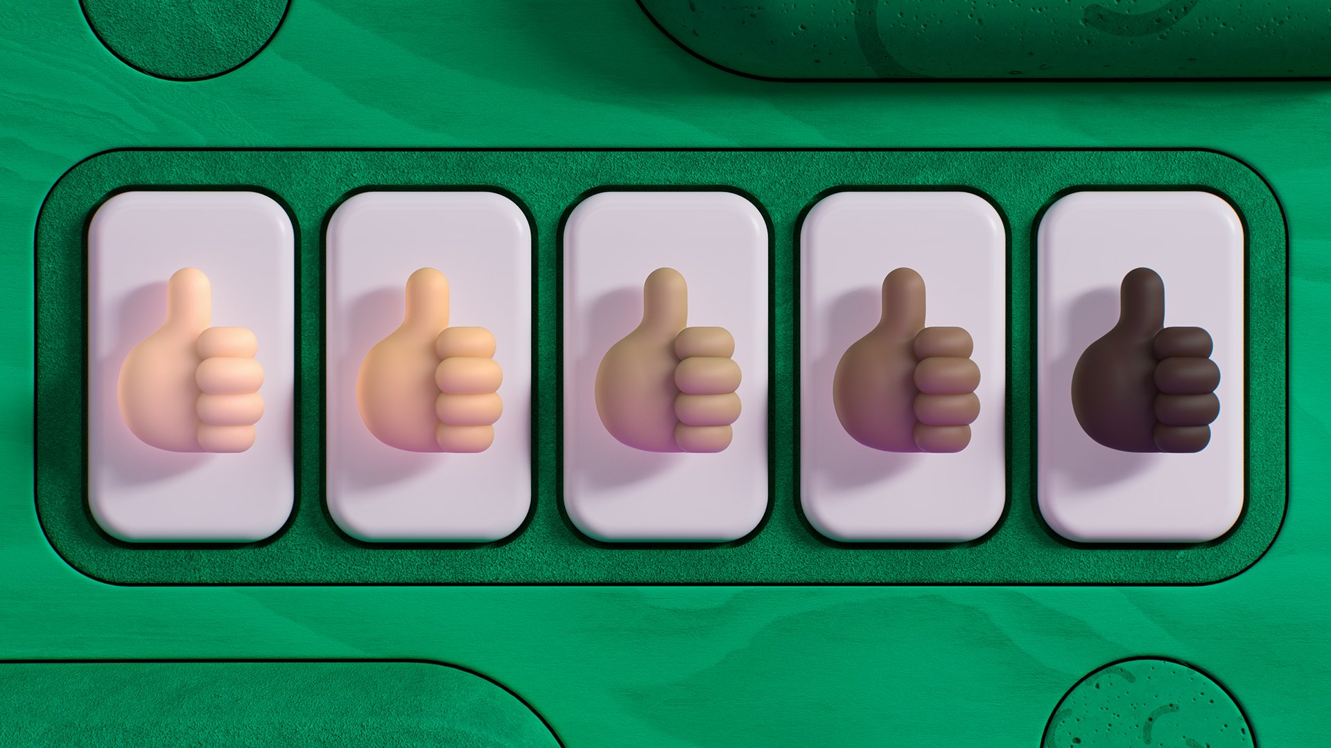
Available in Fitzpatrick’s scale of five skin tones, every person emoji aimed to empower every customer to express themselves authentically in their communication with friends, family and colleagues. ✌🏻✌🏼✌🏽✌🏾✌🏿
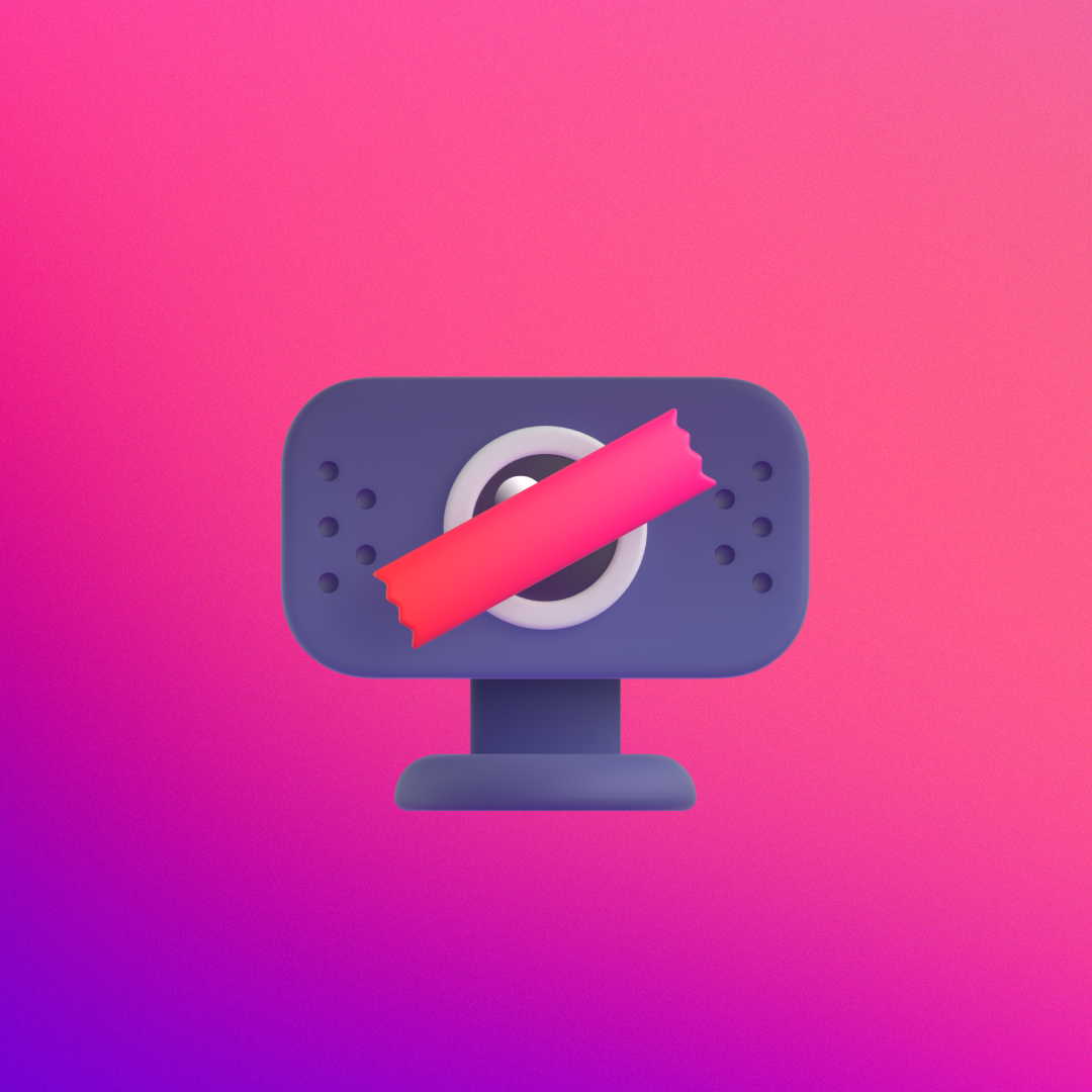
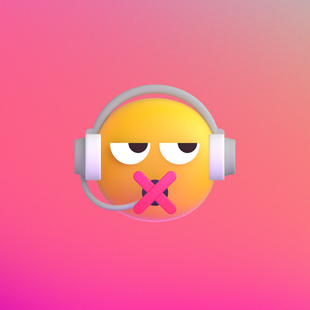
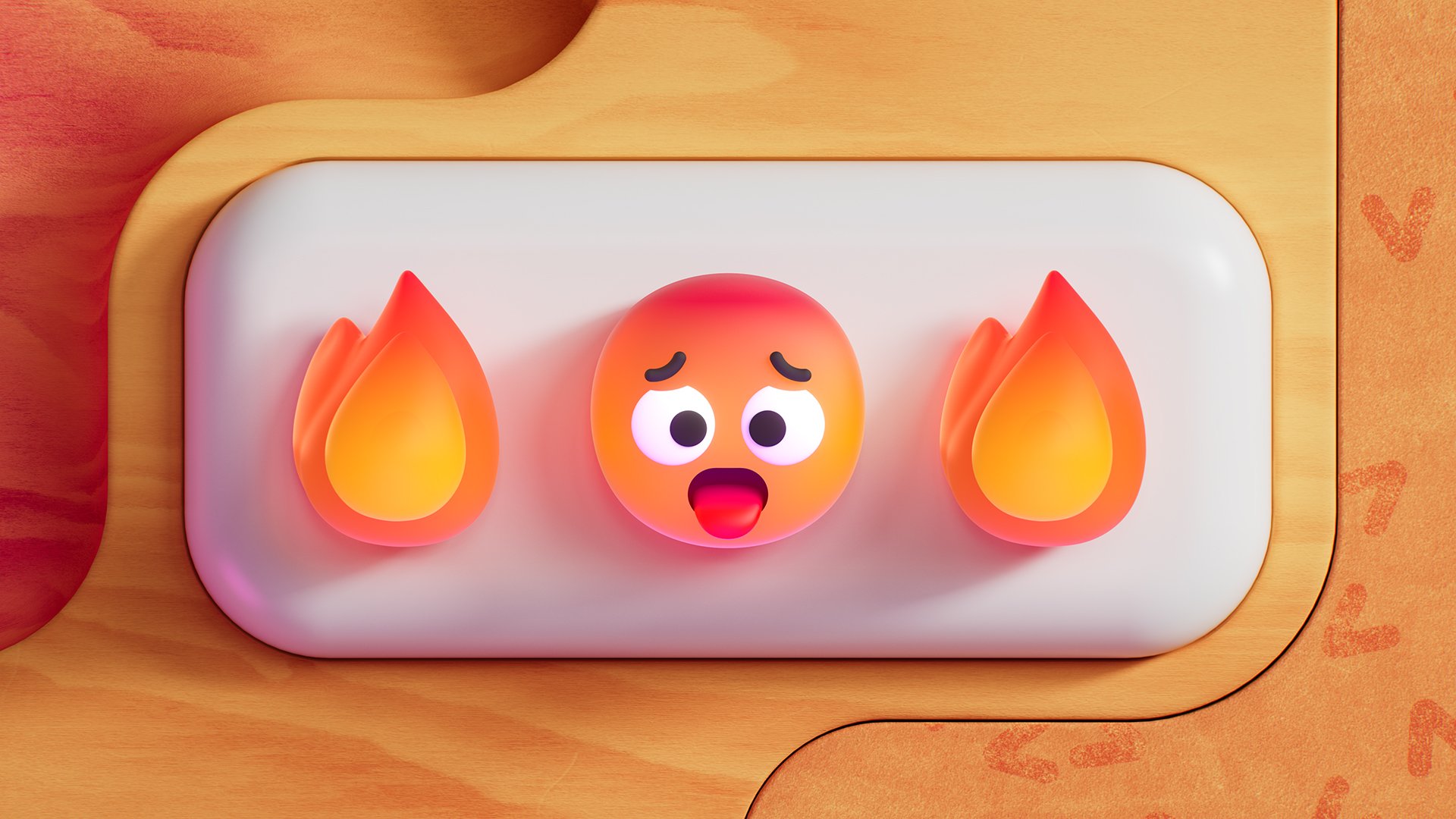
In addition to the traditional set of UNICODE emojis, we also created Microsoft unique ones. Starting in the upper left we celebrate “No camera day” and everyone’s experience of learning they’re mic is muted when they are trying to speak. Lastly on the right we acknowledge how much we are all juggling and multitasking while working from home.
In the lower row we expand that idea of juggling personal and work lives with our kids and pets and finally in the middle a playful combination of pajama pants and a suit.

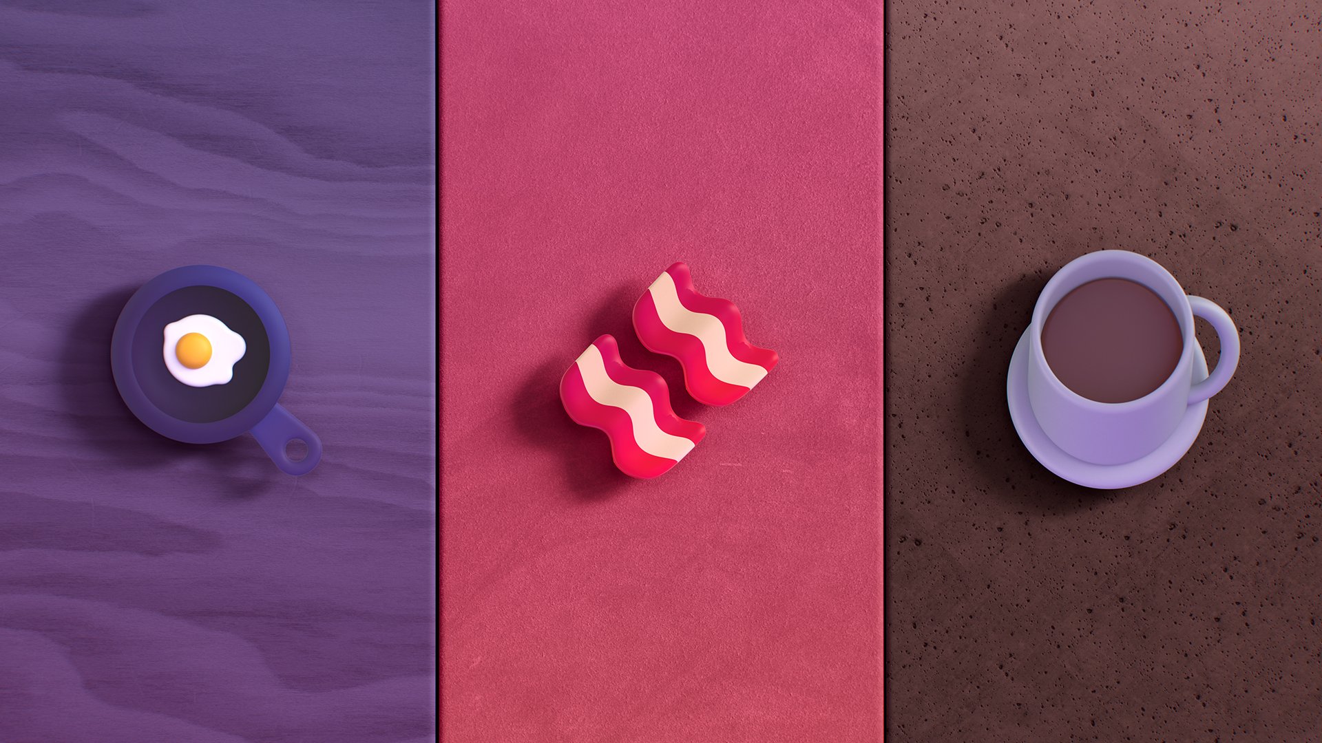
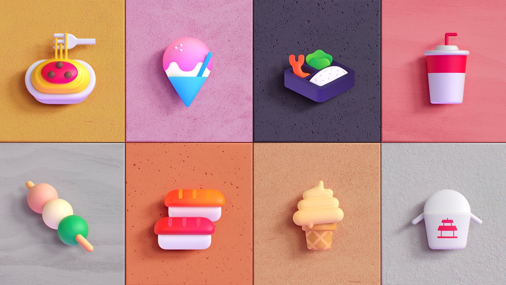
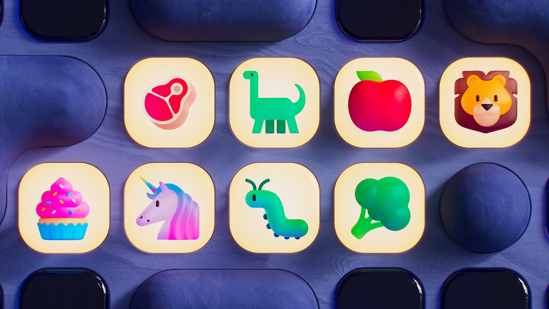
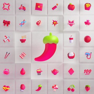
As this image illustrates, sticking to a relatively strict color palette allowed our new emojis to feel connected as a whole and stand apart from our competitors.


It’s time to celebrate!
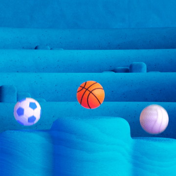
We partnered with Tendril Studio to create this celebratory film for the new emojis. In this piece, we chose to embrace the aesthetics of the emojis themselves, expanding them into an animated universe that took their motion behavior, texture, lighting and materiality to a new level.


Thank you!
At Microsoft
This has been such a labor of love for so many, and indeed a very large cross company effort. So, I’d like to thank everyone who has contributed their expertise, most notably my colleagues Cassie Klingler, Claire Anderson, Christina Koehn, Colin Day, Jason Custer, Jon Friedman, Judy Safran-Aasen, Katherine Lu, Mike Lajoie, Peter Wilkinson, Rudy Vessup, Tanel Vari, Sam Cundall and Spencer Nelson.
At Tendril
Thank you also to our dear collaborators at Studio Tendril for their partnership over the good part of a year in creating these exciting designs together. We could not have done it without you. Thank you also to Zelig Sound for your perpetually inspiring audio contributions to our products and stories.