App Store Presence
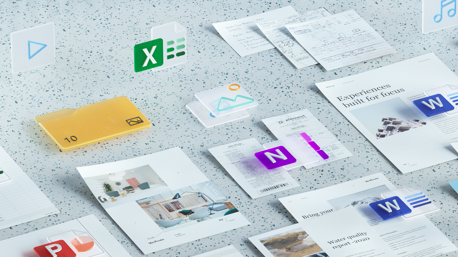
One of the latest efforts I have been involved with at Microsoft is to revamp the design aesthetic of how our apps show up across iOS, iPad OS and Android stores. I believe these surfaces are one of the front doors of our experiences, often one of the first moments many of Microsoft’s customers learn about its apps.
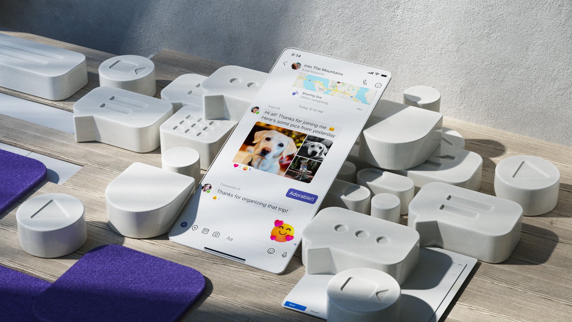
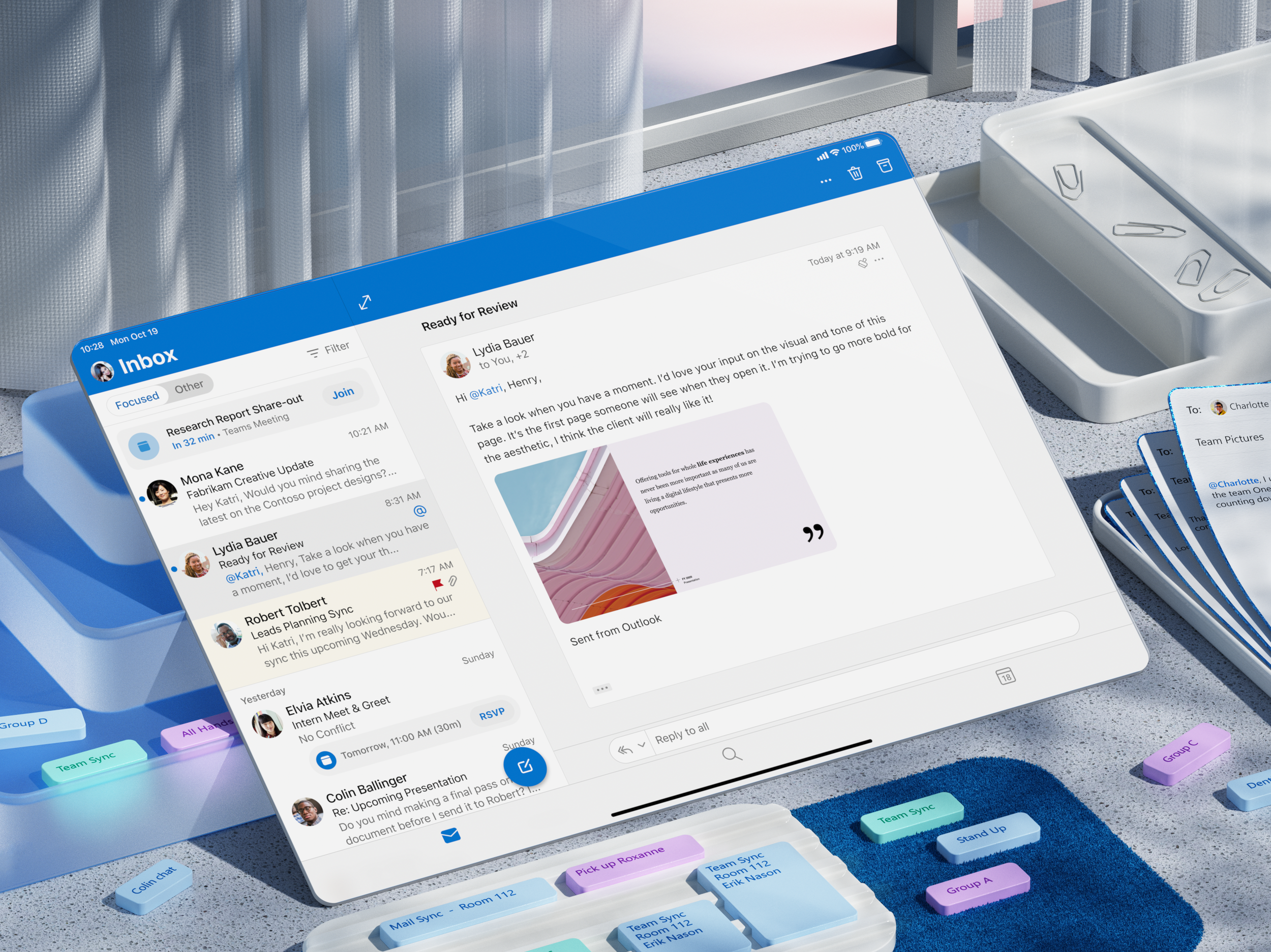
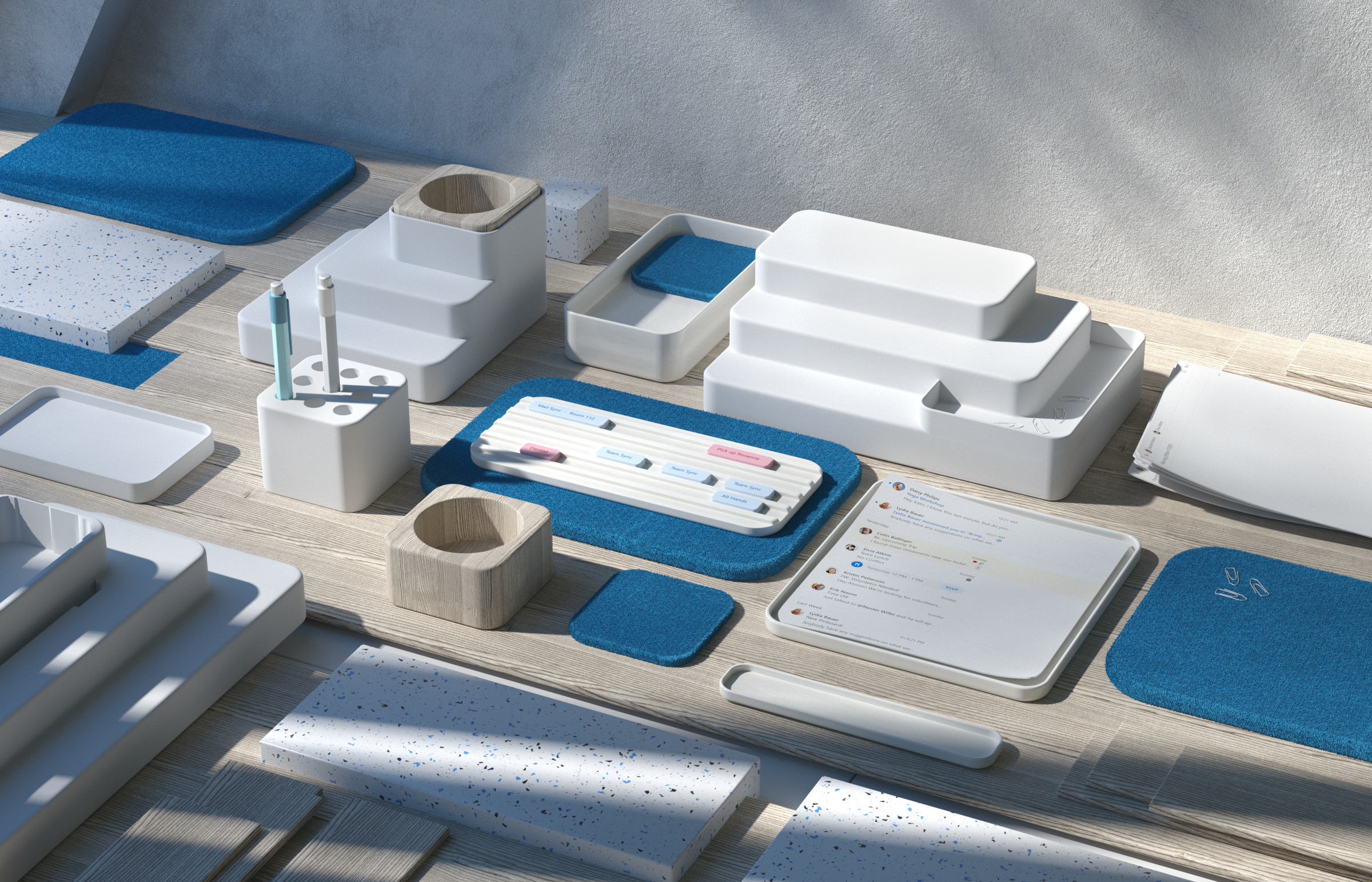
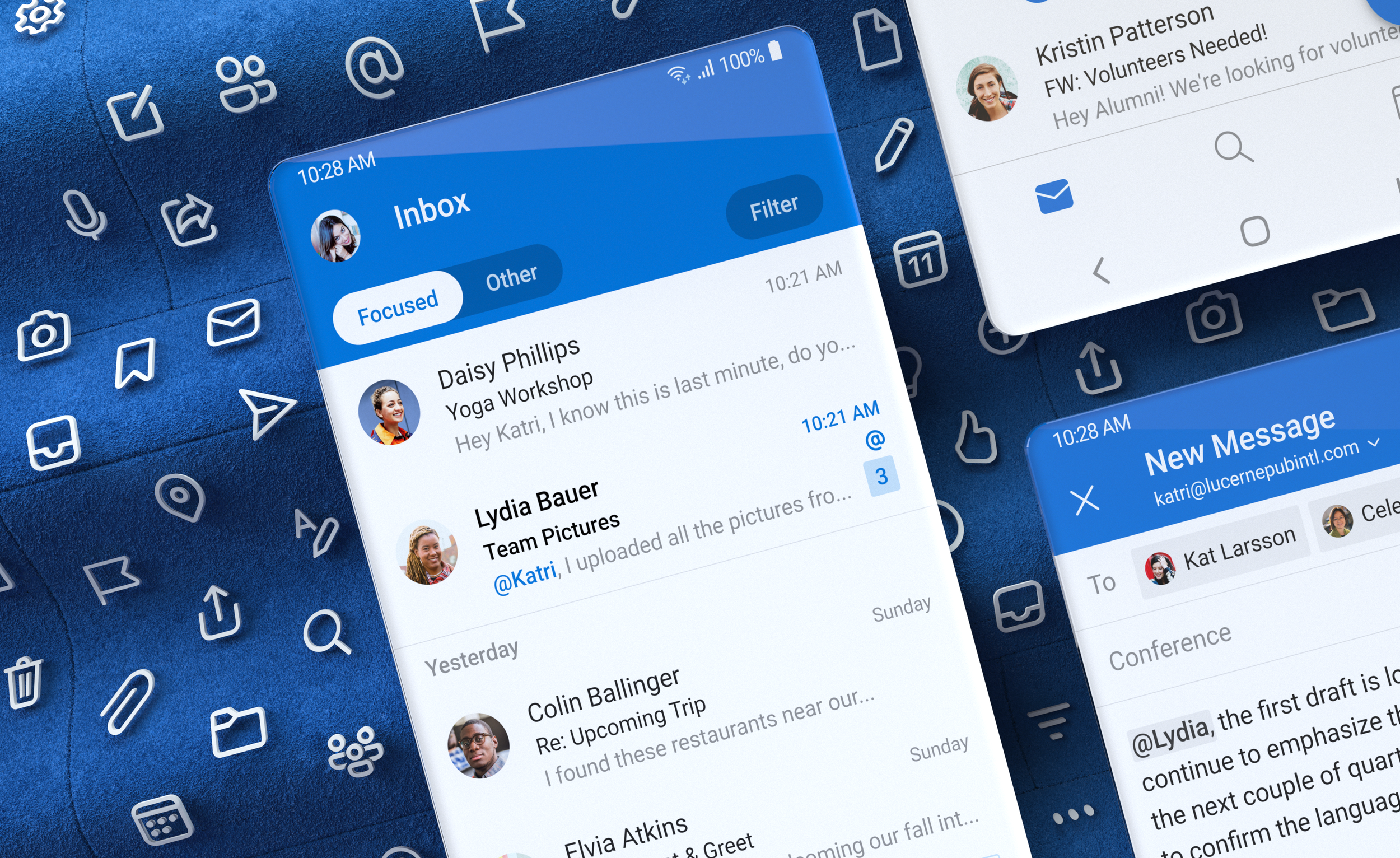
We chose to lean on 3D as a medium, continuing to build on the moment we have had with our UX films, modernizing the look of Microsoft 365 apps on the store and effectively making them stand apart from the competition.

Our approach for representing each app began with exploring ways to illustrate the product and brand essence of that particular experience.
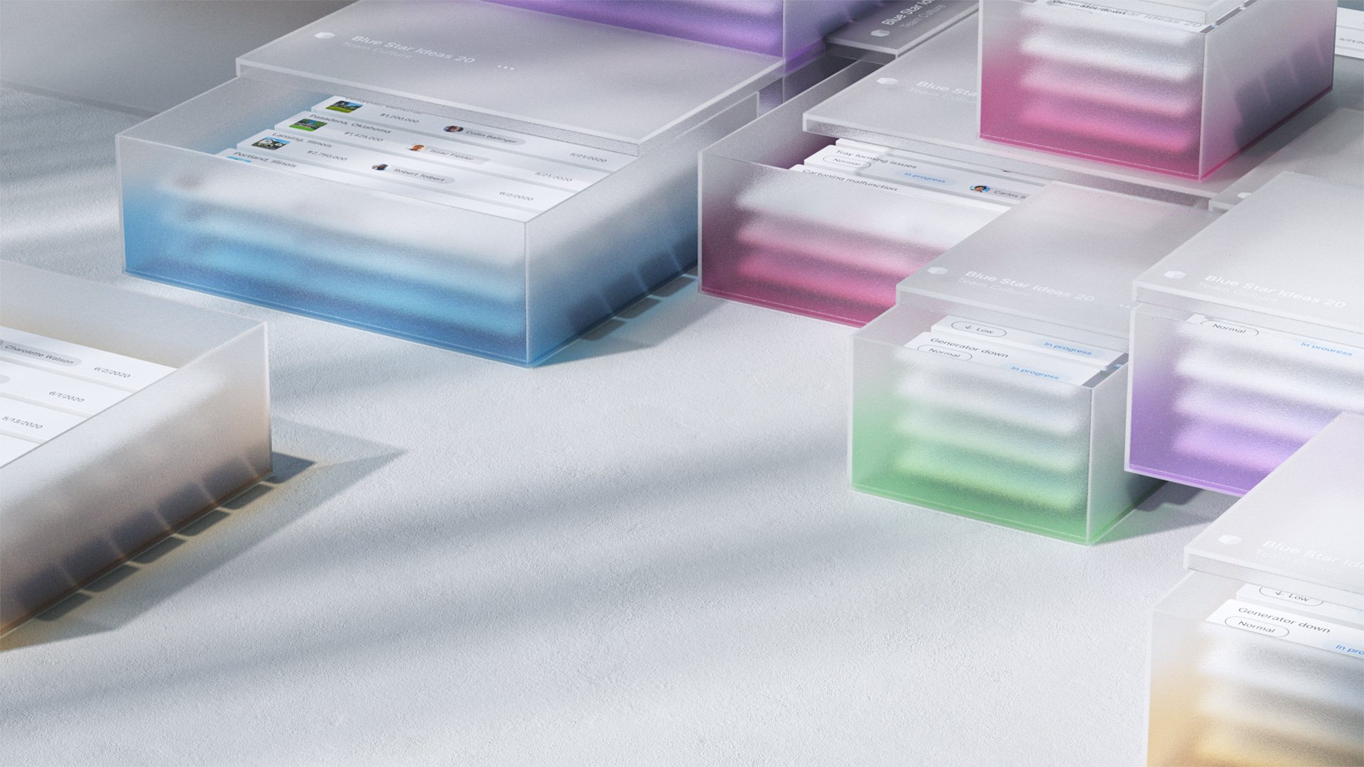
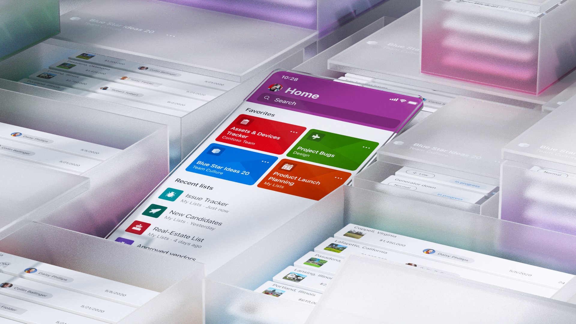
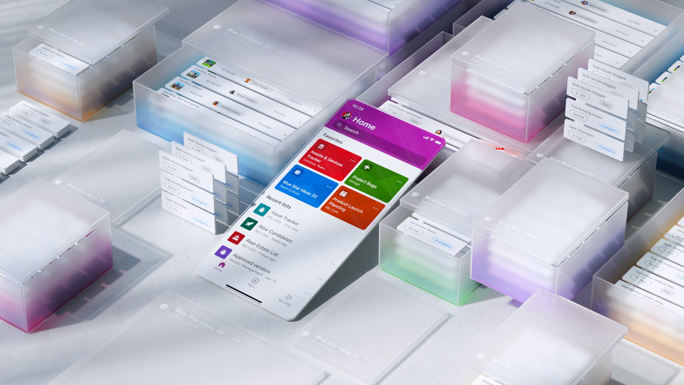
This example for instance was for Microsoft Lists, an app for organizing working and tracking information with bold, colorful branding represented here in the tinted boxes.


At look at how these illustrations for the Microsoft Lens experience came to life in the iOS app store.


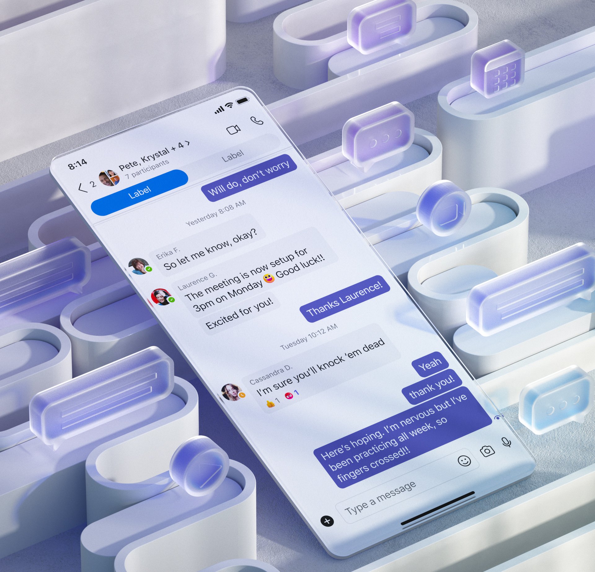
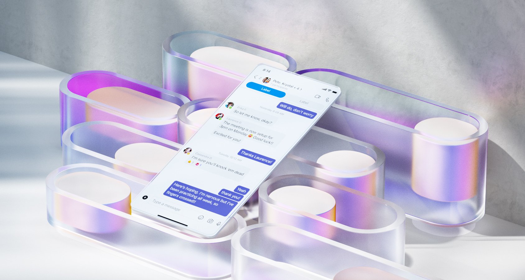
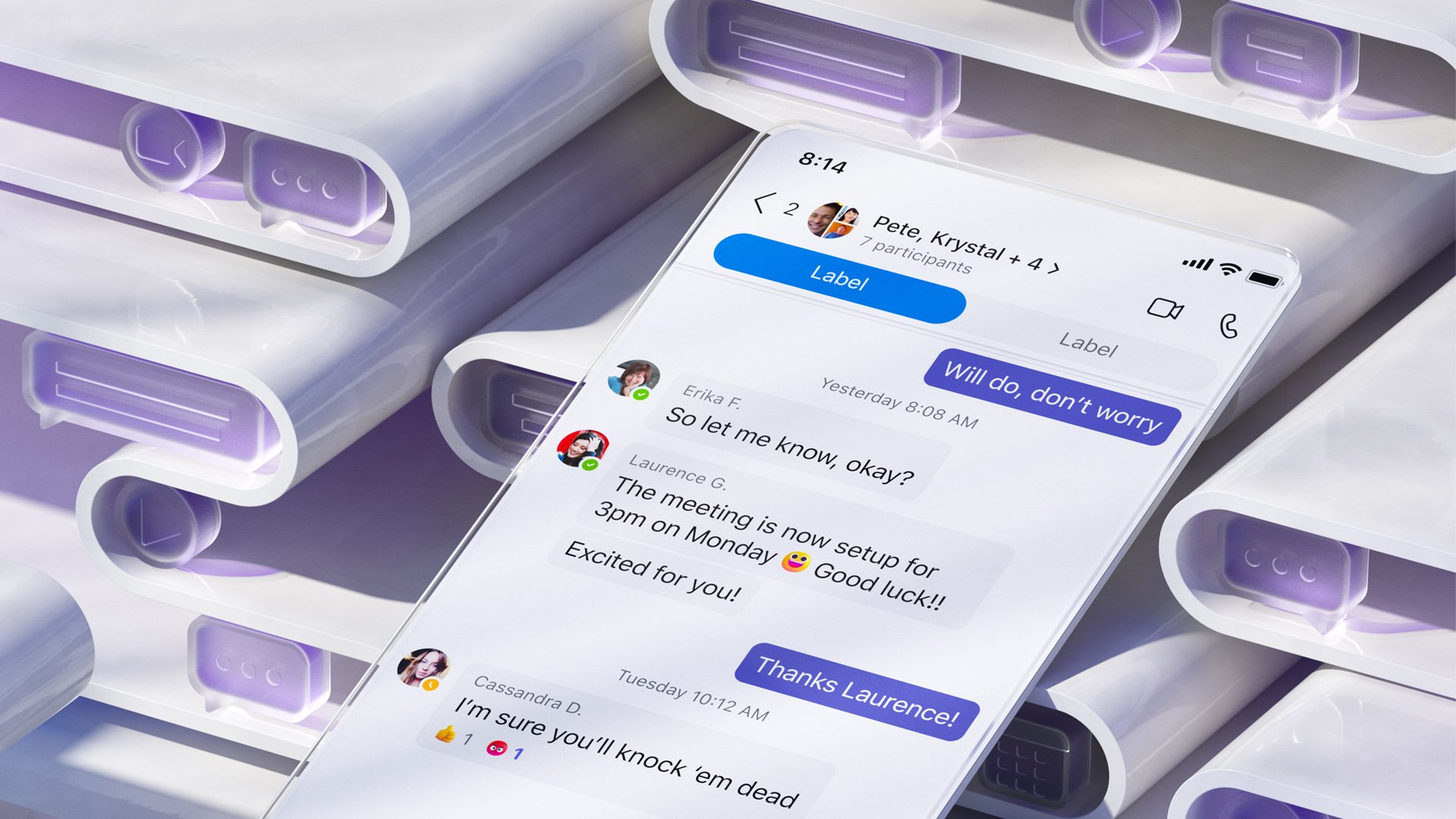
Some of our explorations for Microsoft Team’s store presence look and feel.


Thank you!
Thanks to Microsoft Designer Ryan Gagnier for partnering with me and working so thoroughly across these designs. Your attention to detail is what made these so special.
Thanks to all of my partners across product and marketing teams for embracing this direction and helping us amplify across all storefronts.