Premium Fonts in Office
This art film is dedicated to celebrating the unmatched role that fonts play in bringing our everyday ideas to life.
I was lucky to set the direction for this piece in close partnership with Zelig Sound and Six N. Five to showcase 5 expressive fonts, available as part of Microsoft 365’s premium subscription. Fonts such as Avenir Next, Biome, Modern Love, The Hand and Walbaum, all have unique characteristics that encourage our customers to say what they want, how they want.

We wanted a film that was representative of an artist’s restlessness and desire to create. A creator that was ready to challenge him/herself and go beyond previous limits and would use words to convey these feelings.
My concept involved the creation of a poem reflective of this tension and it took us a lot of iteration to arrive at a well-balanced story, both for the words, as well as for the visuals.
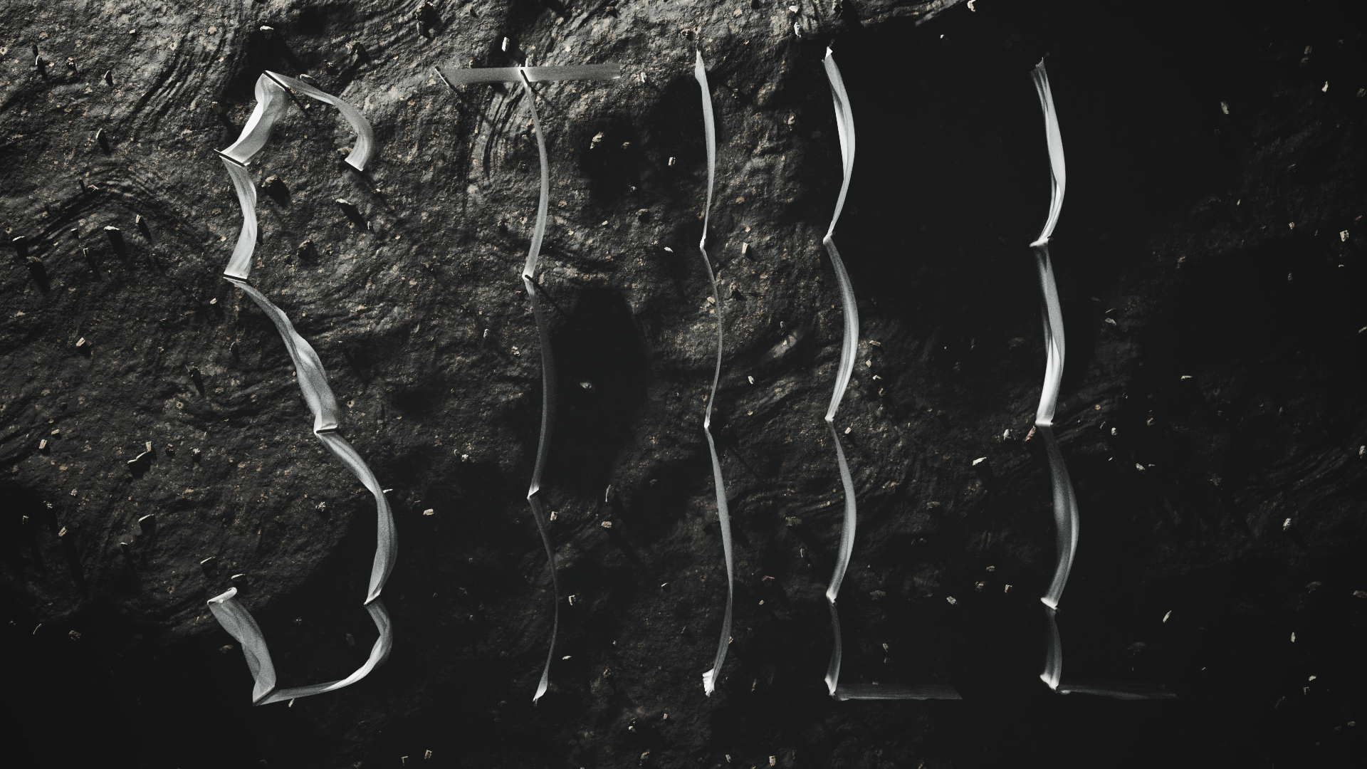
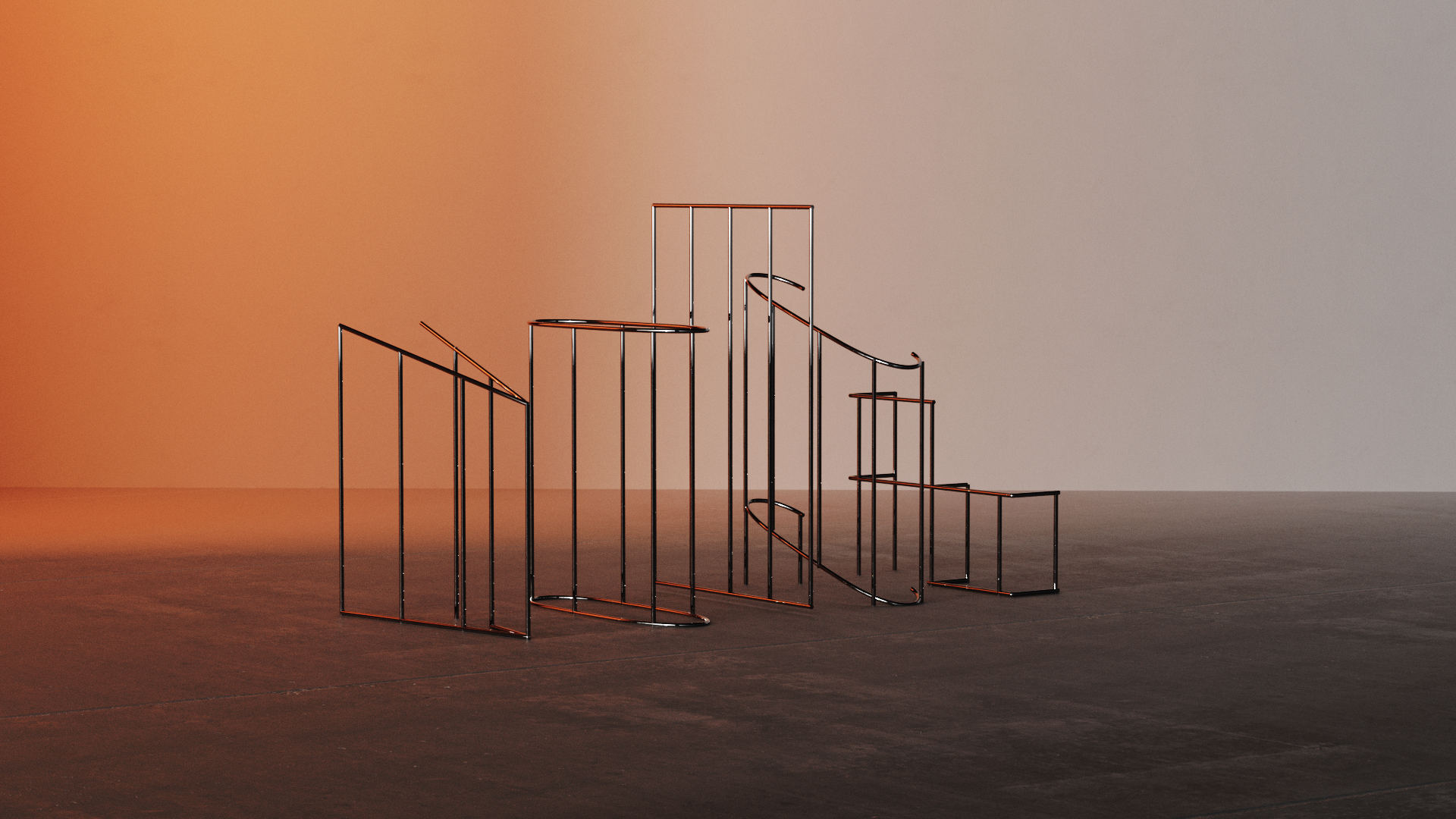
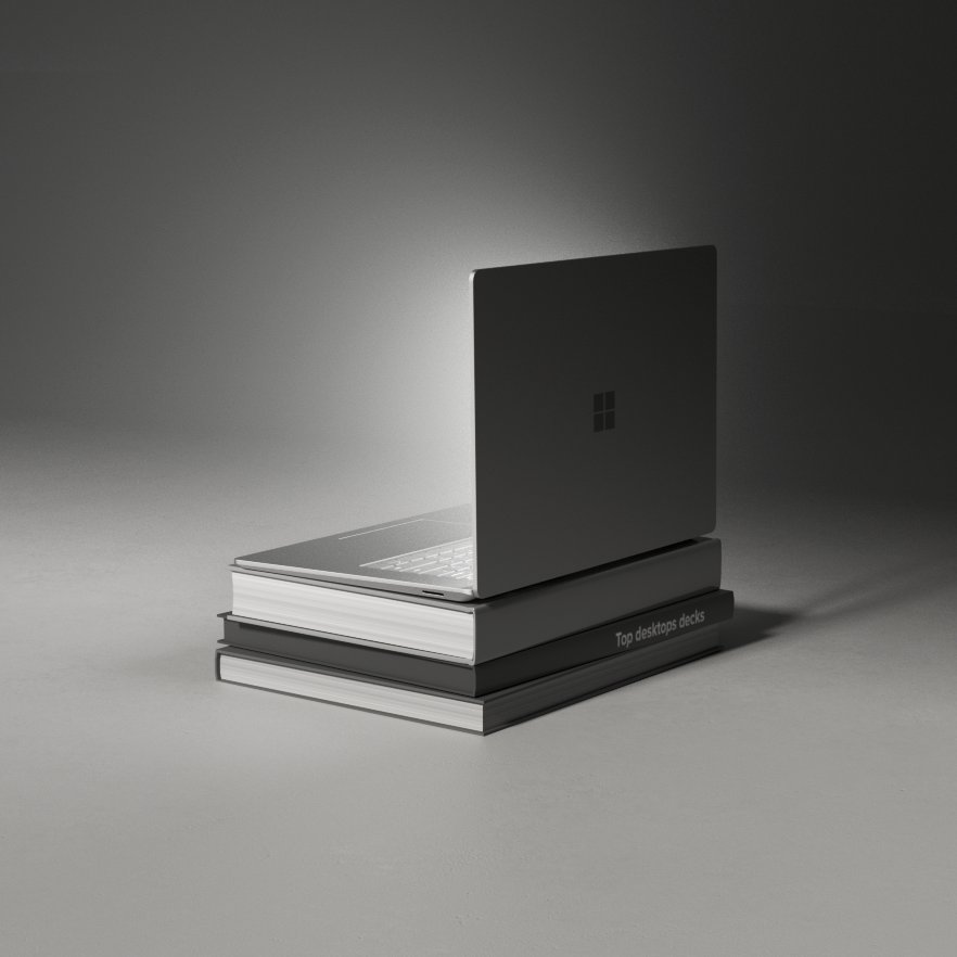
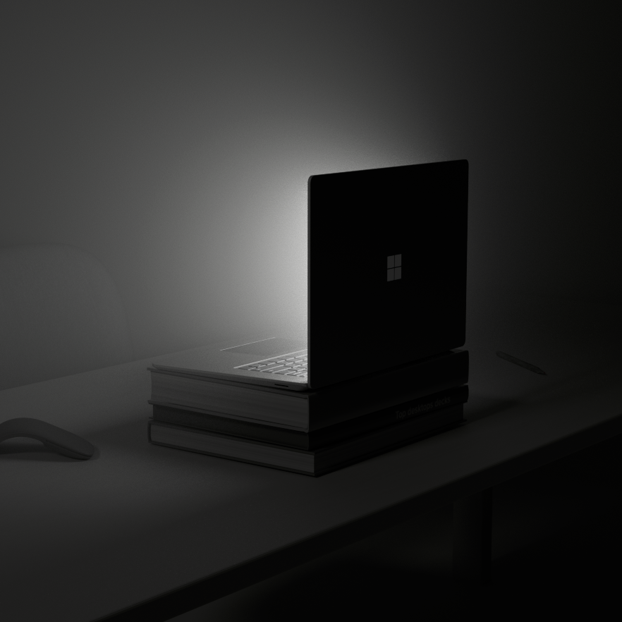
Below are samples of our creative process, many of which never made it into the final film.
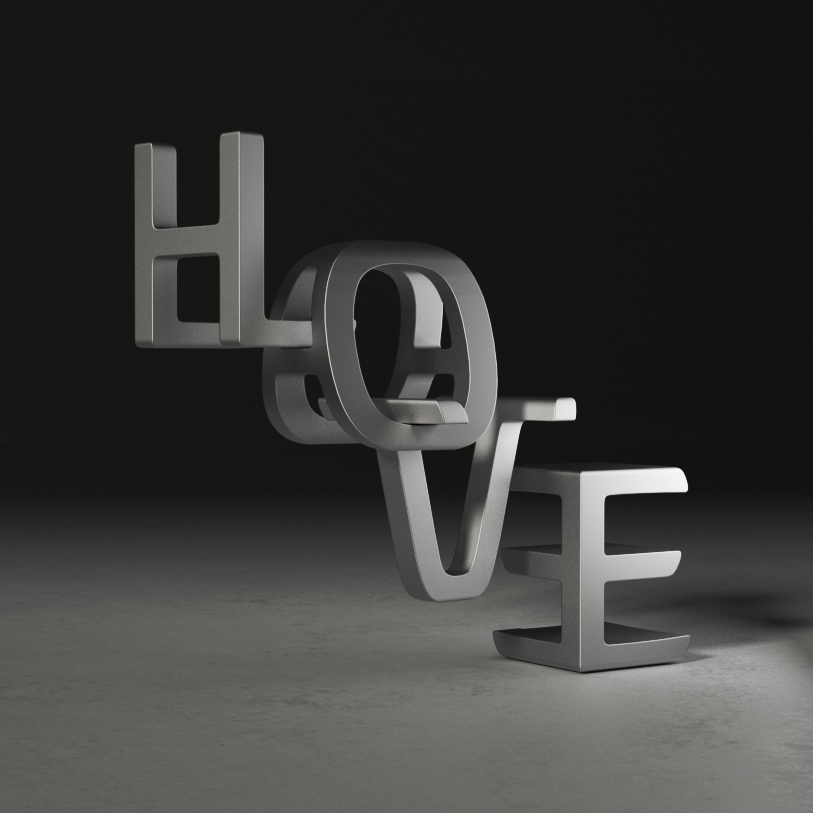
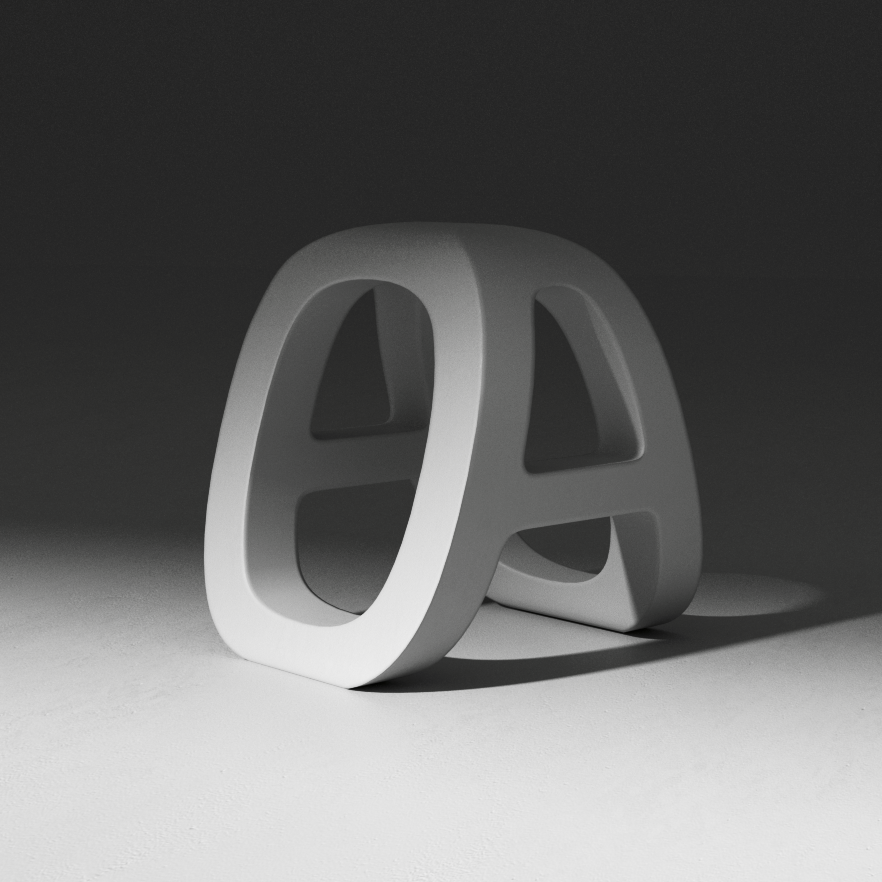
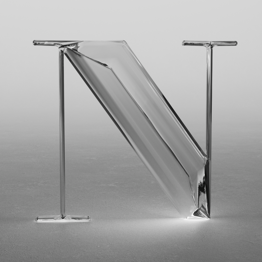


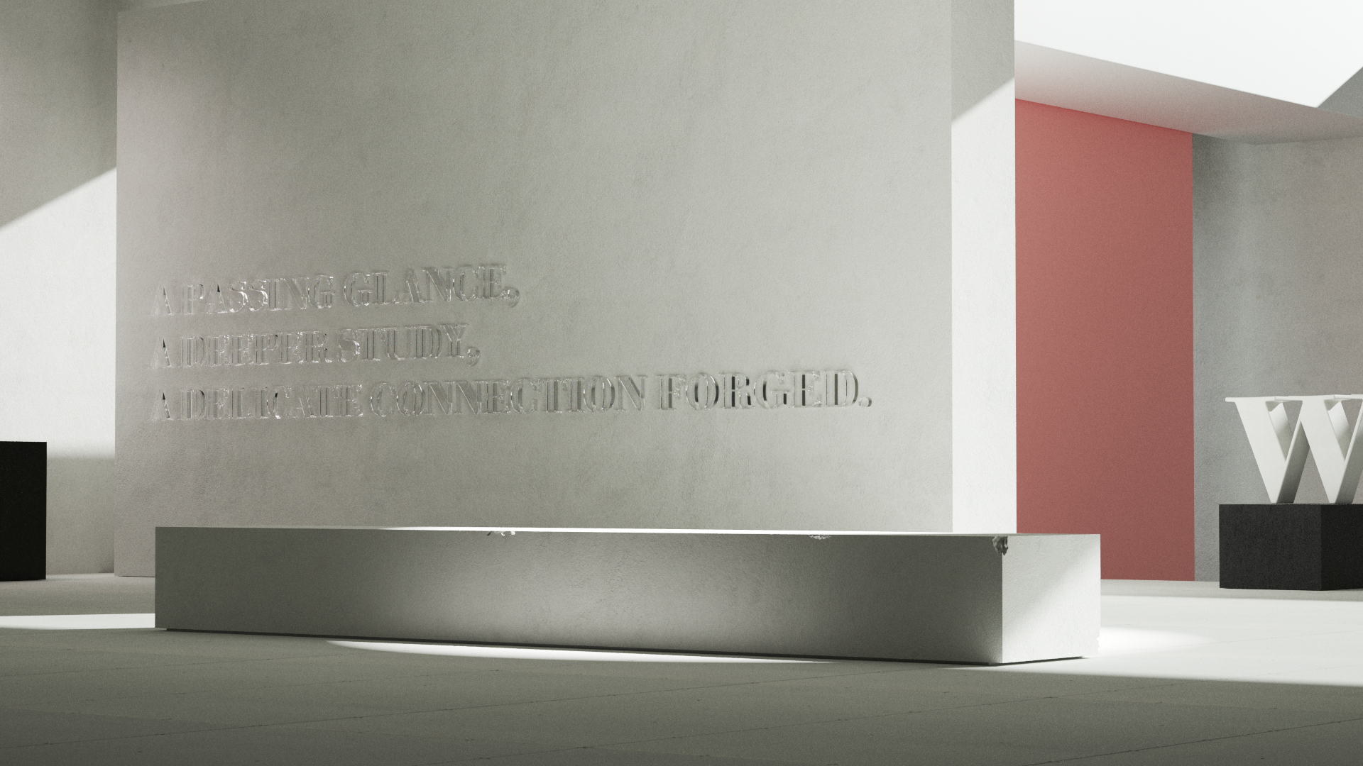

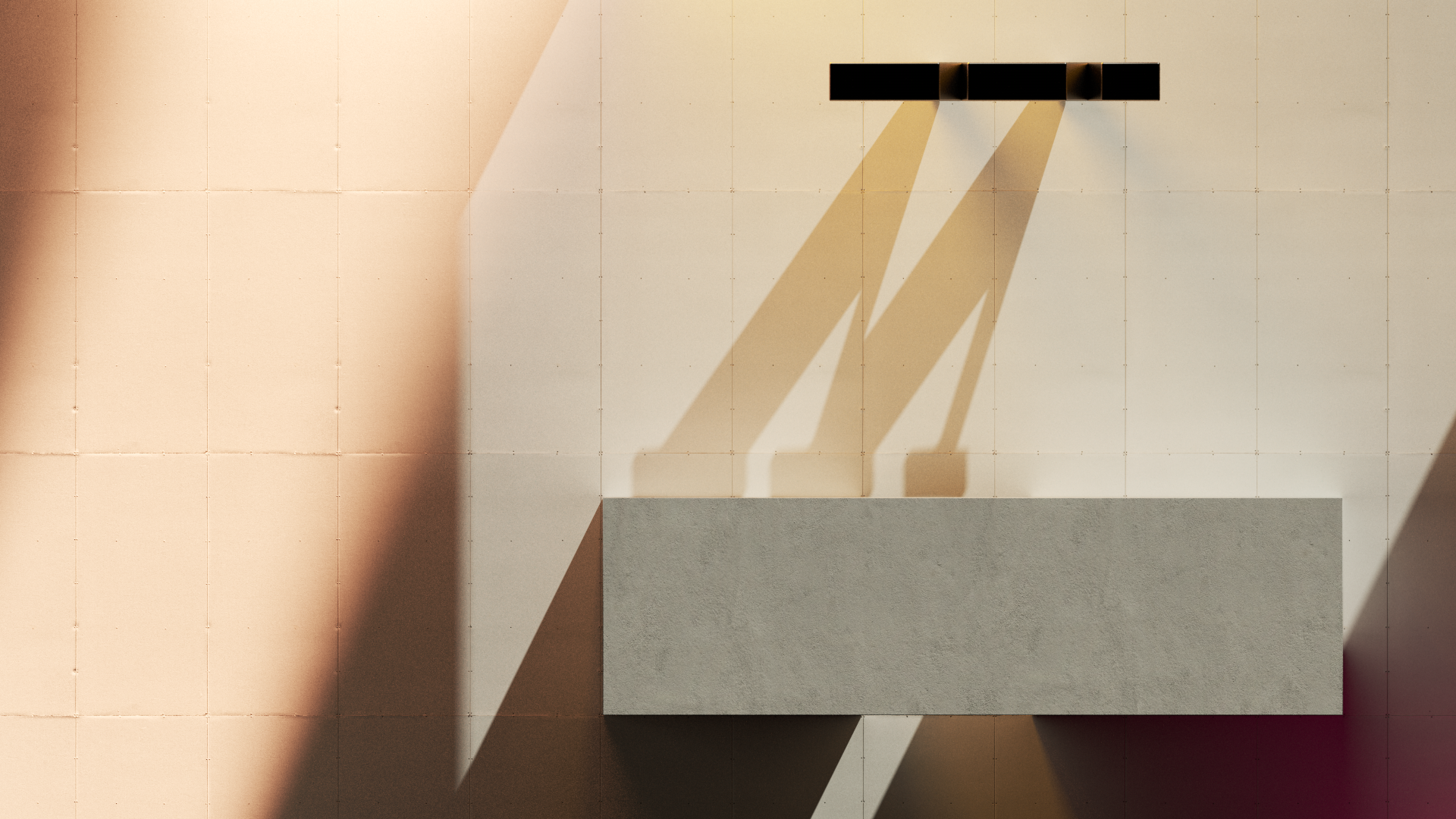
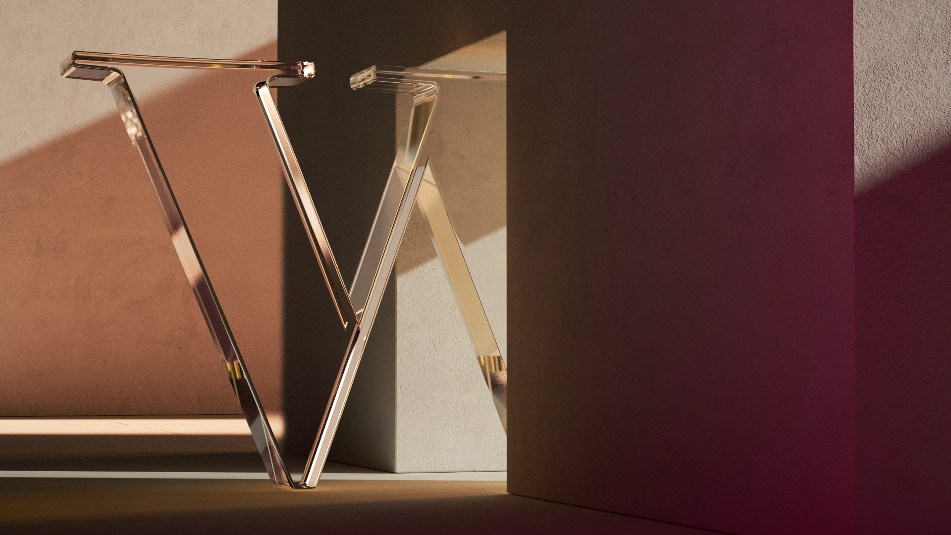
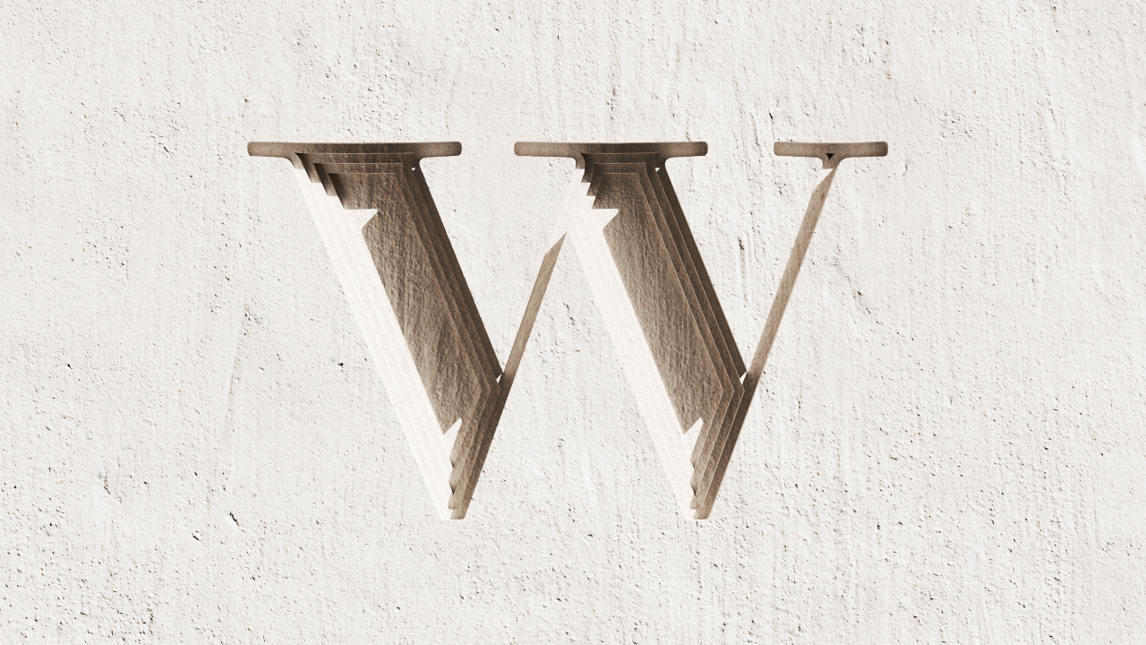

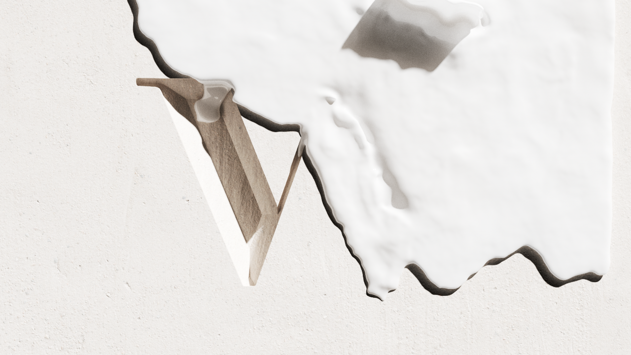

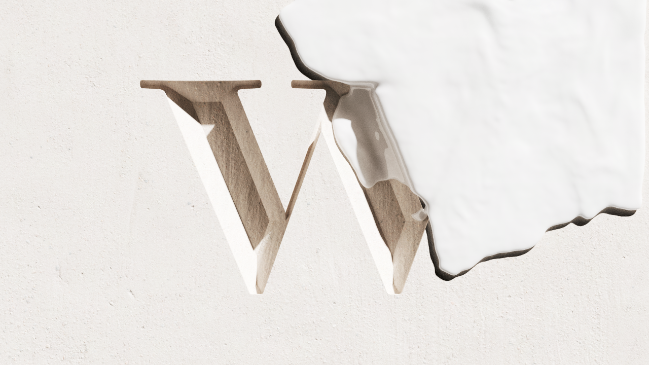
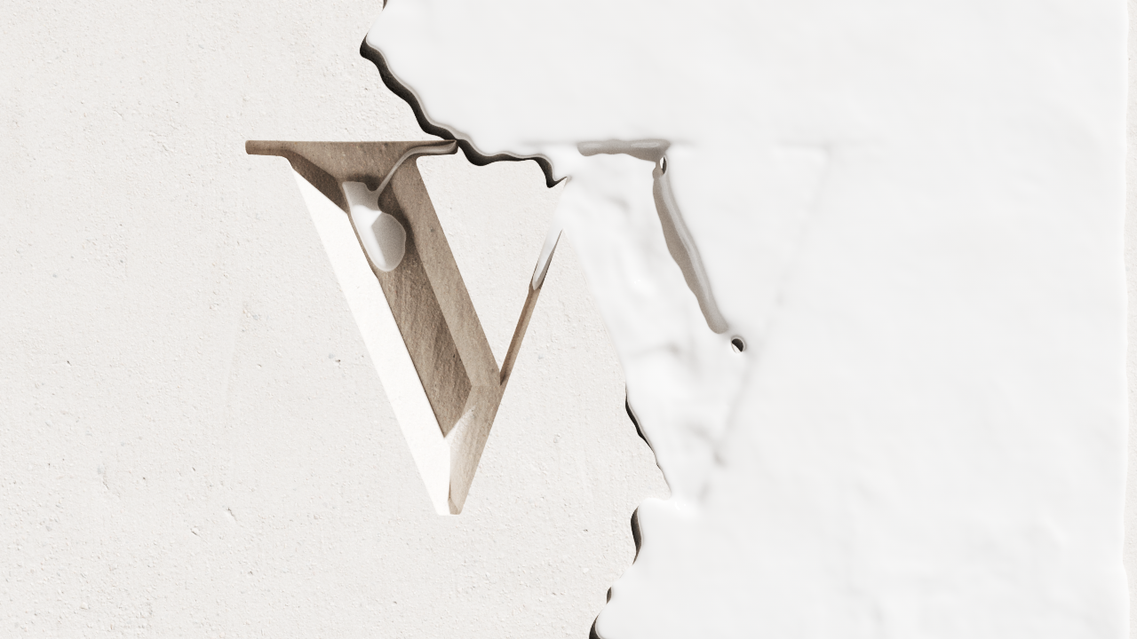

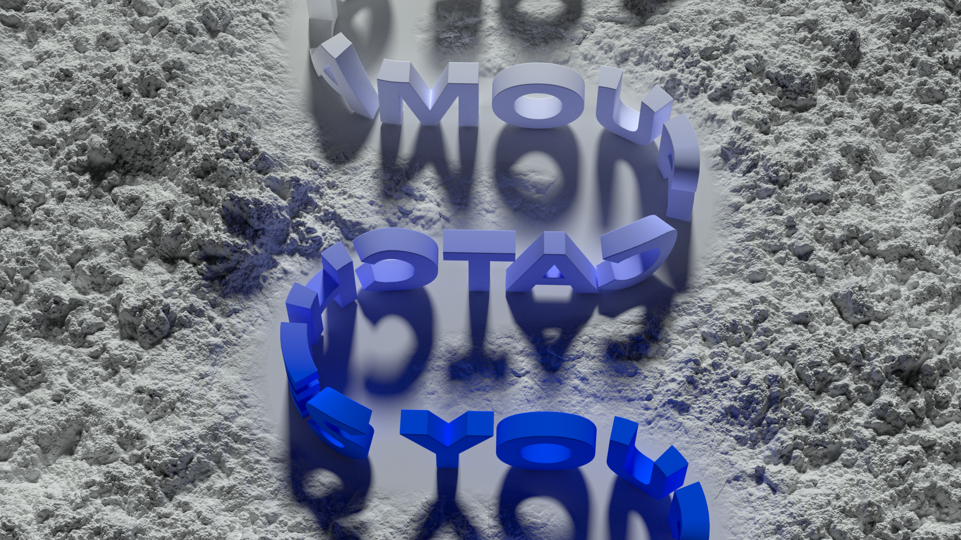
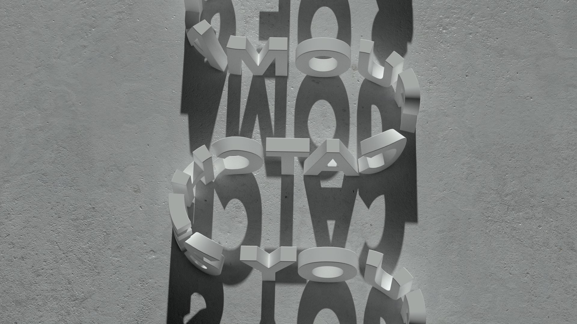
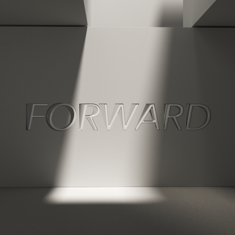
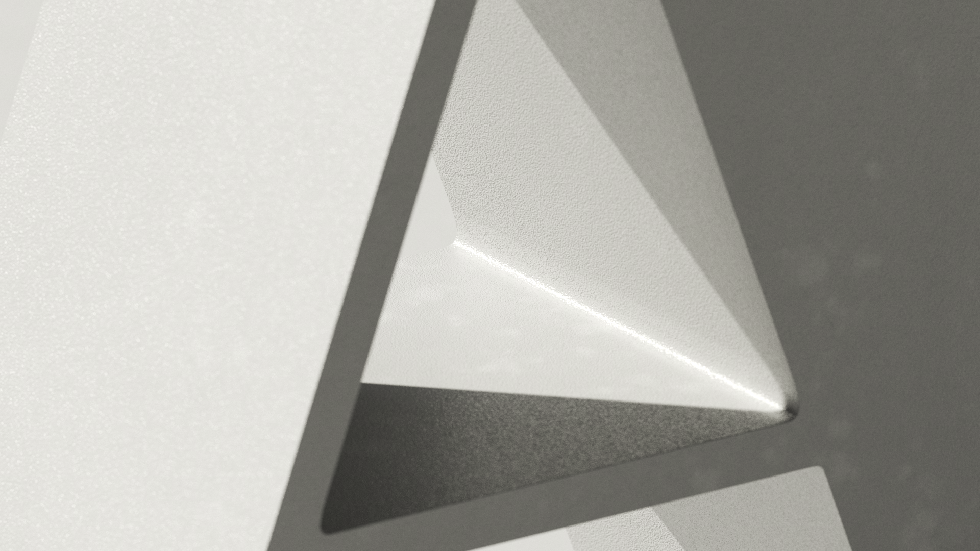
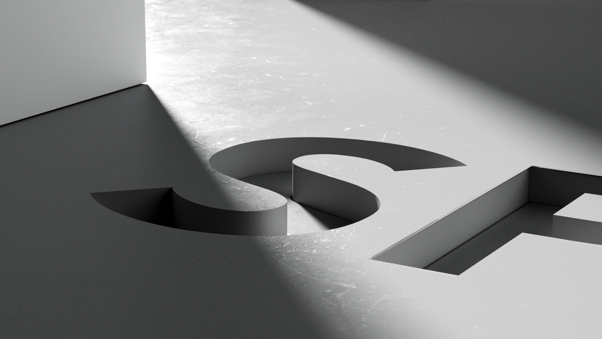
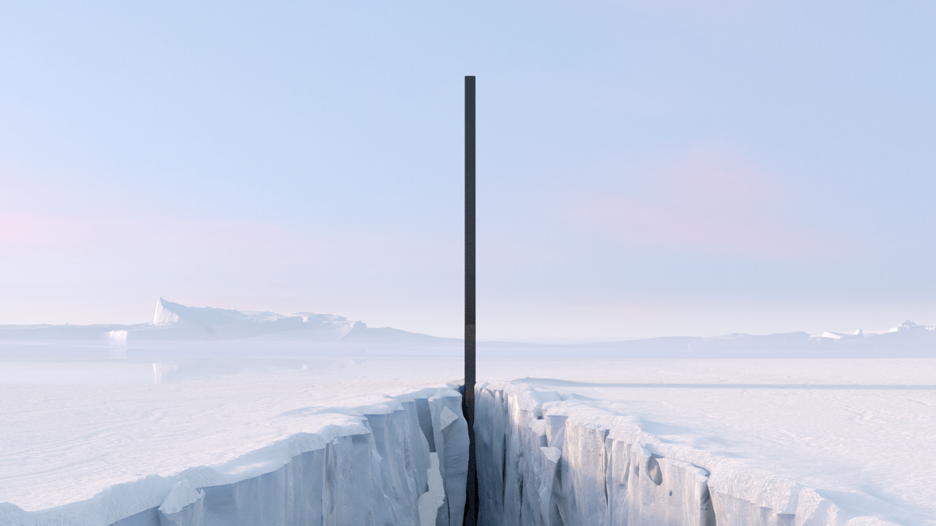
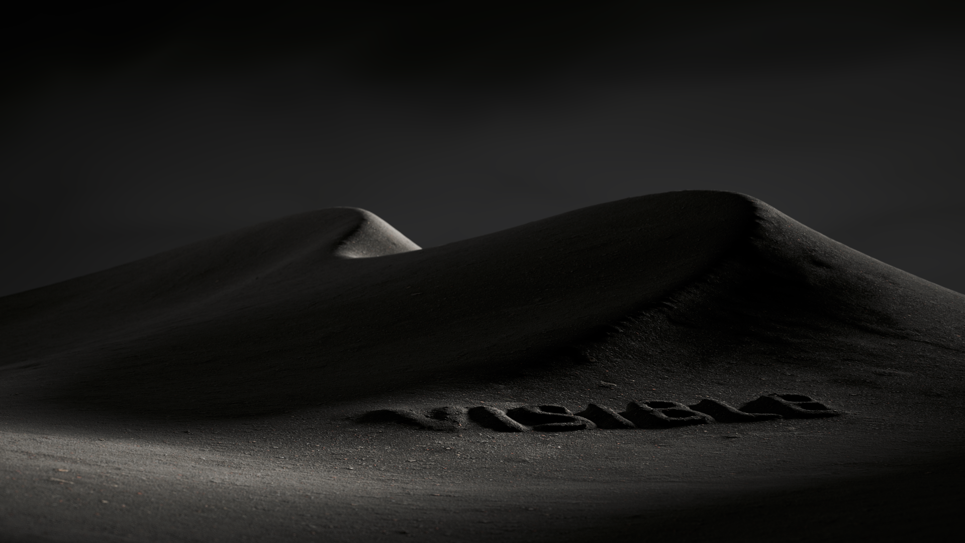
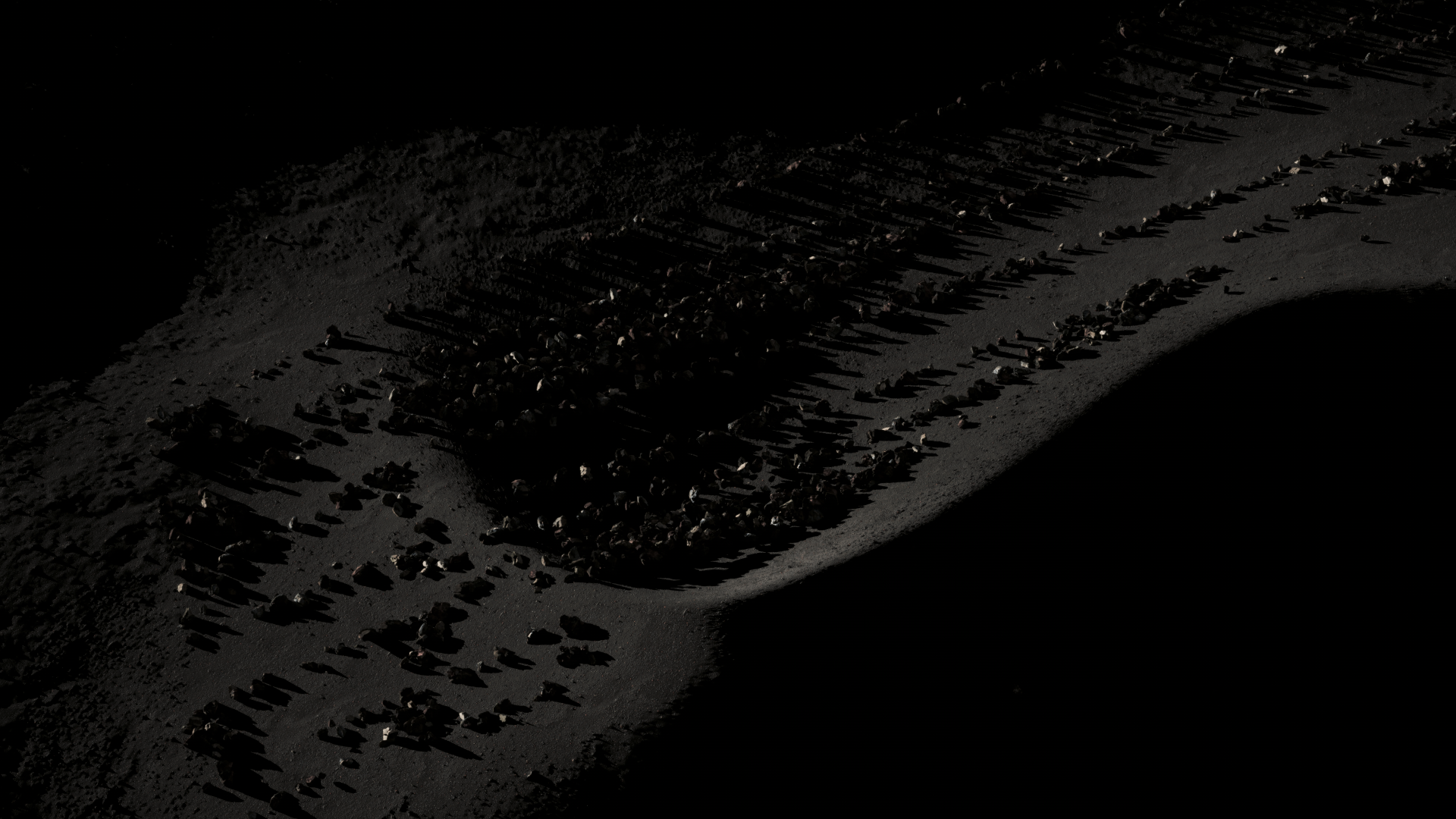
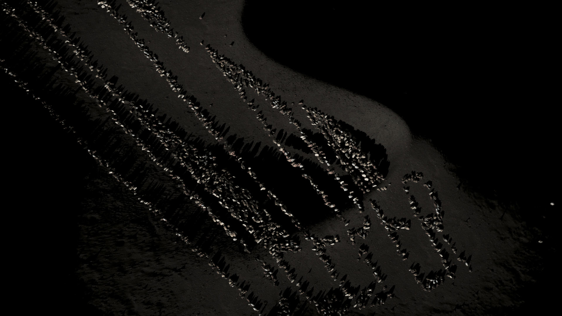
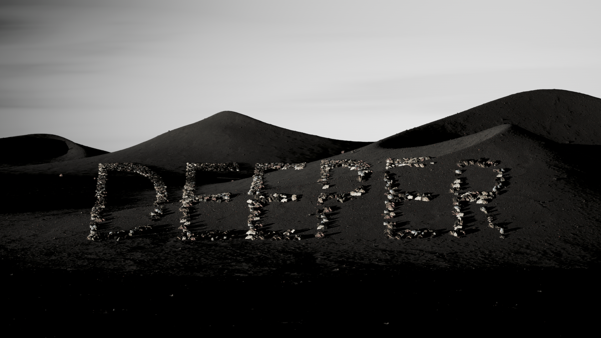
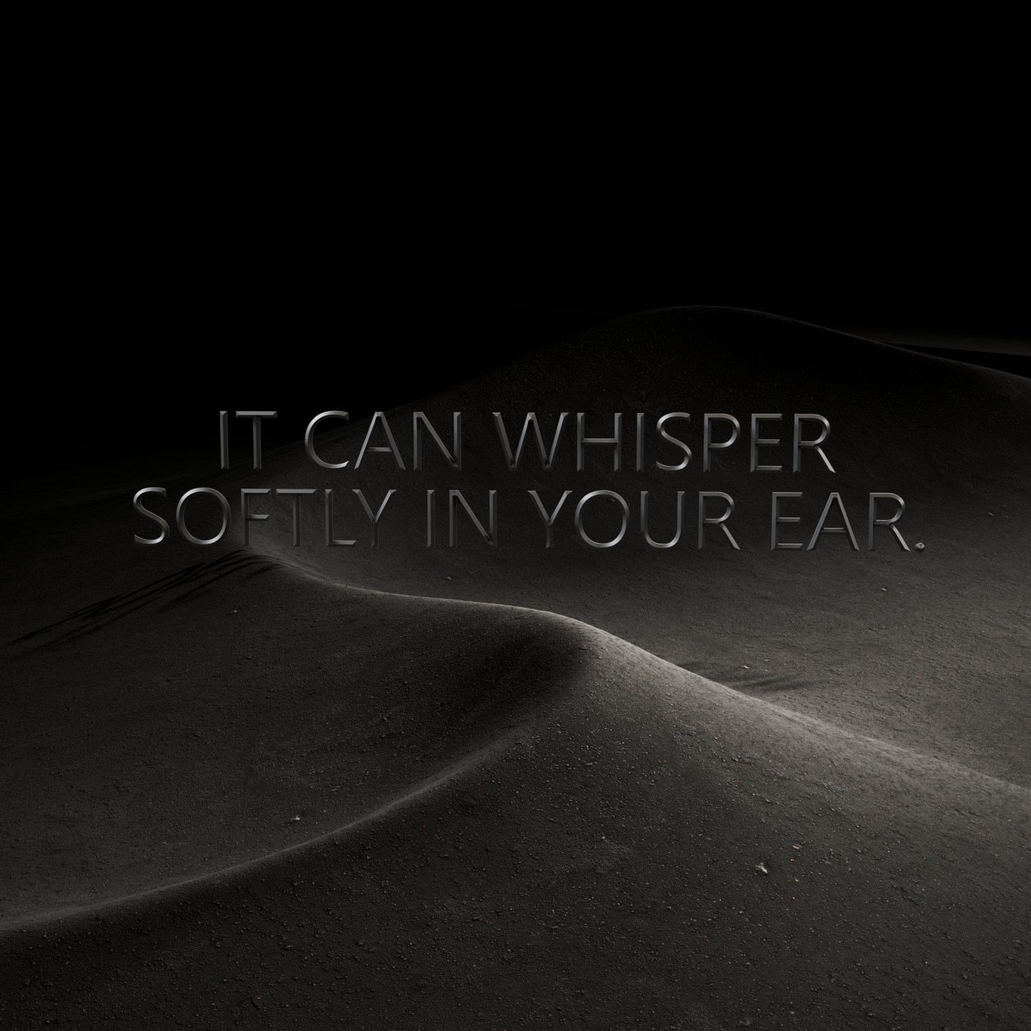
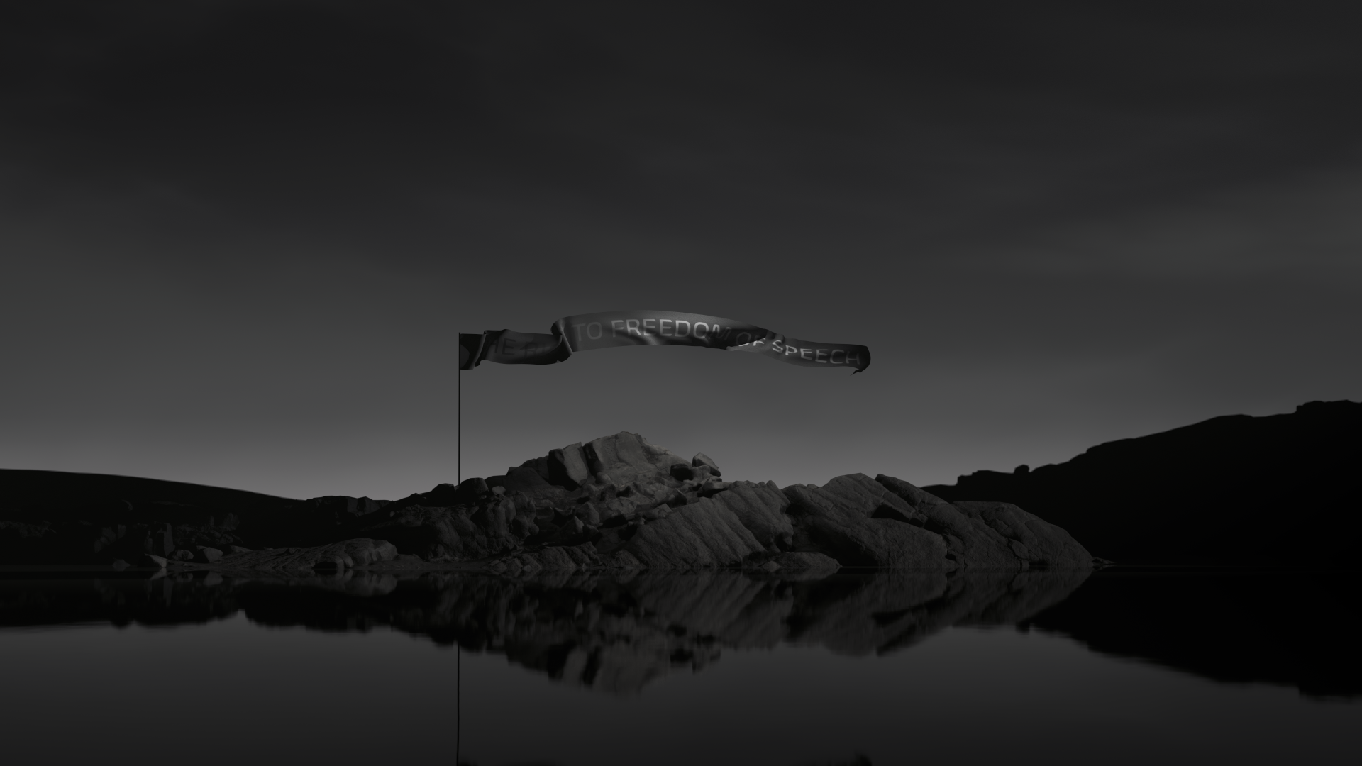
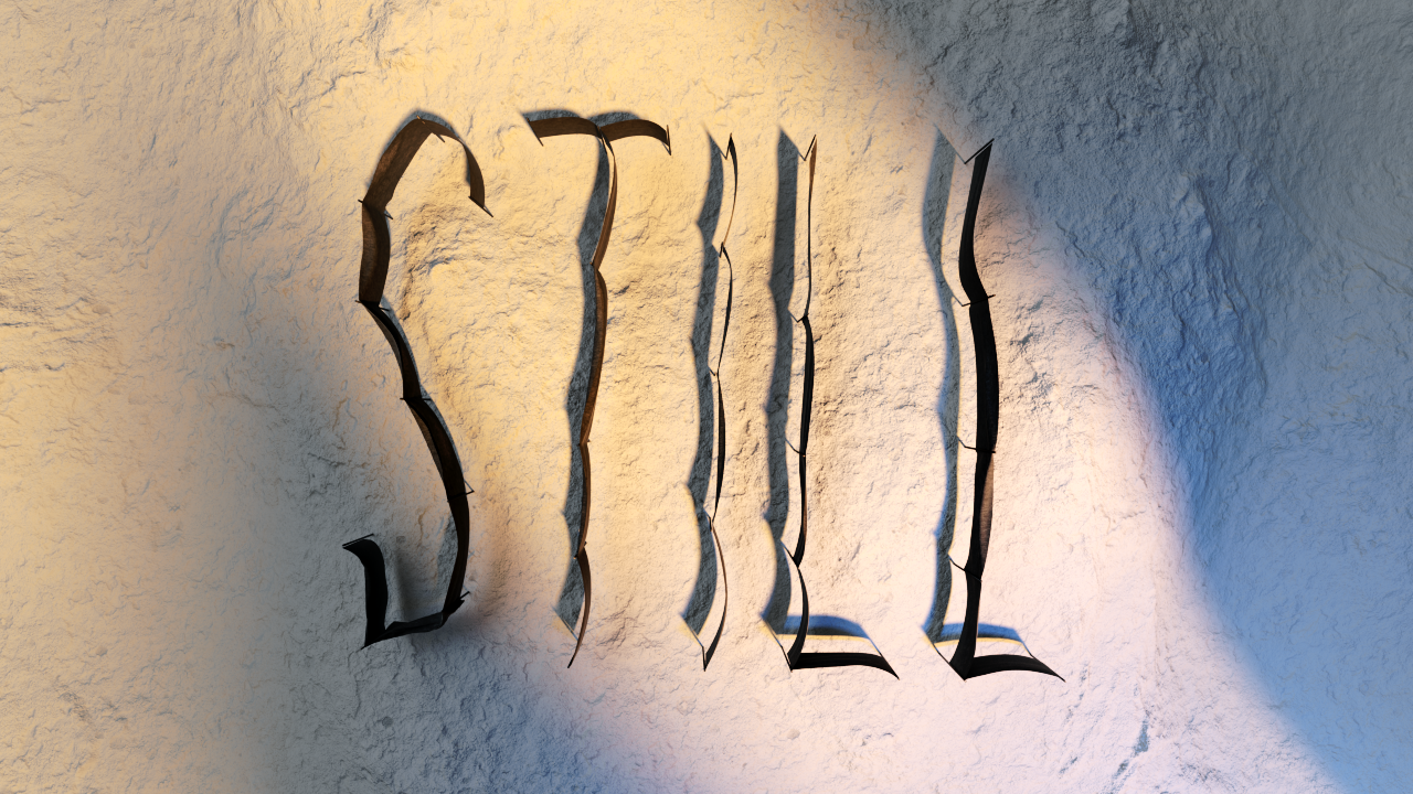
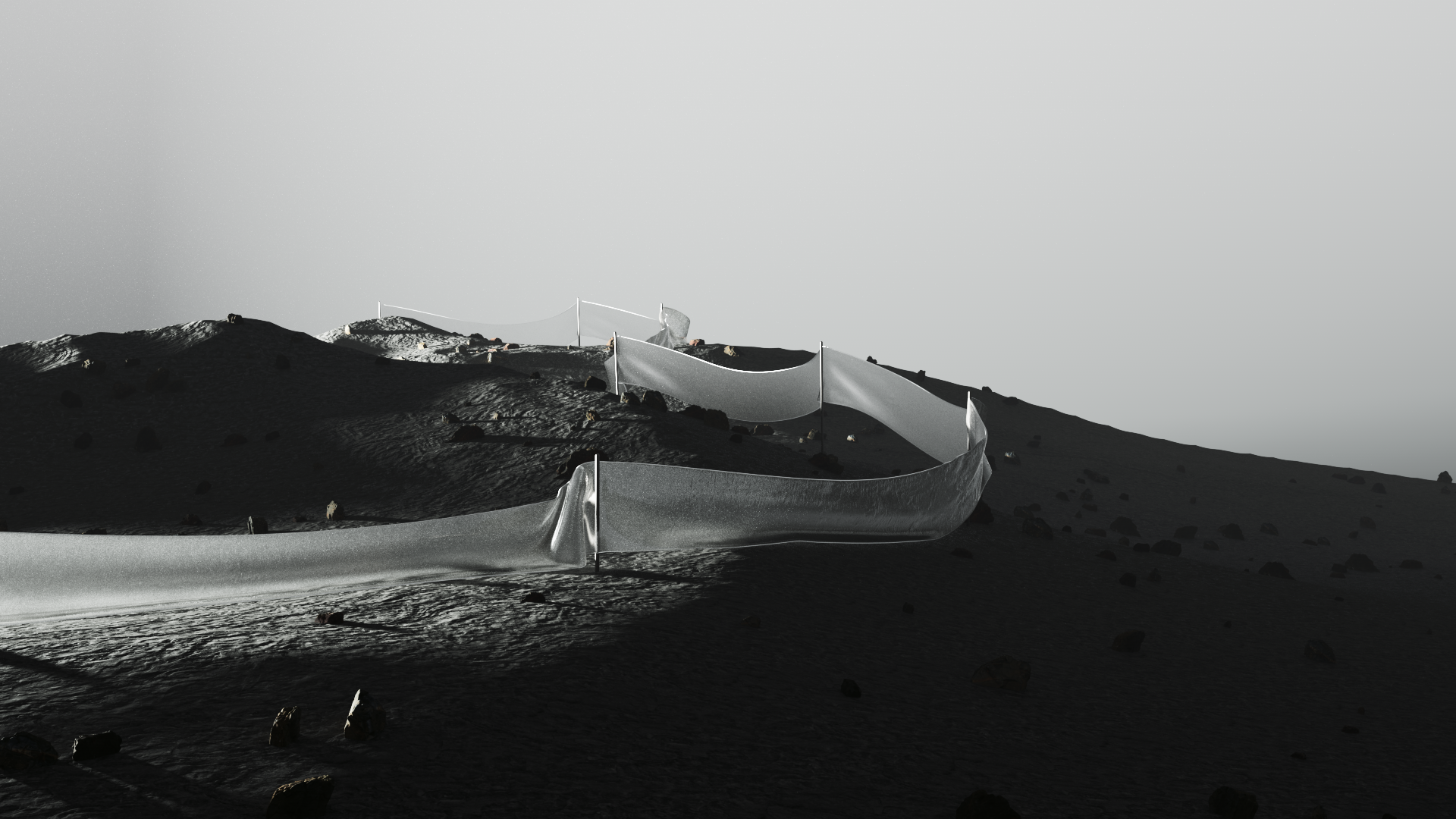
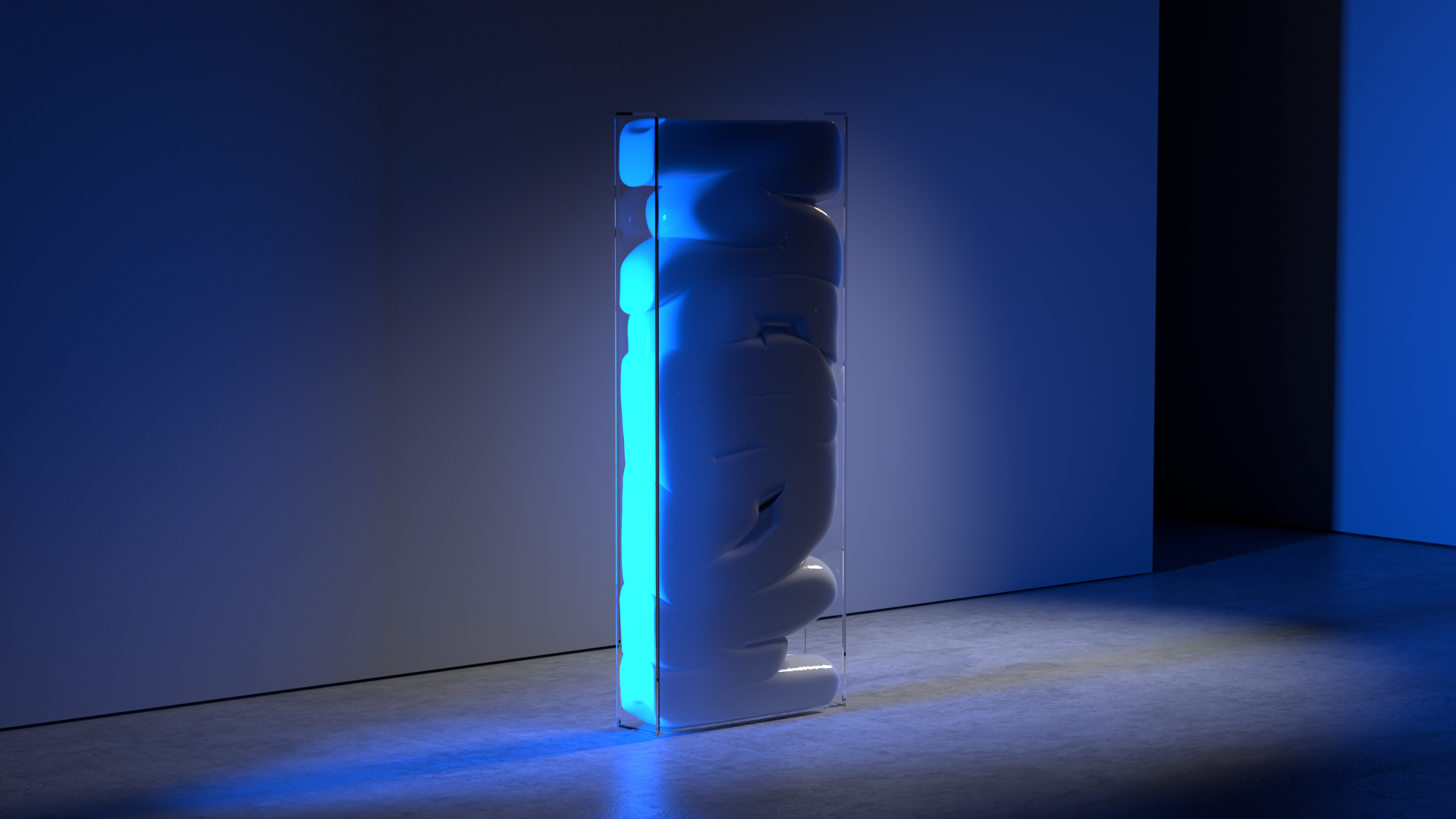
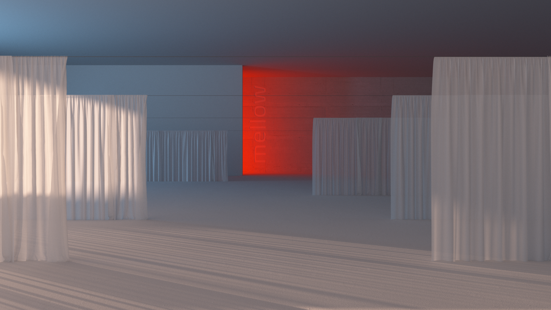
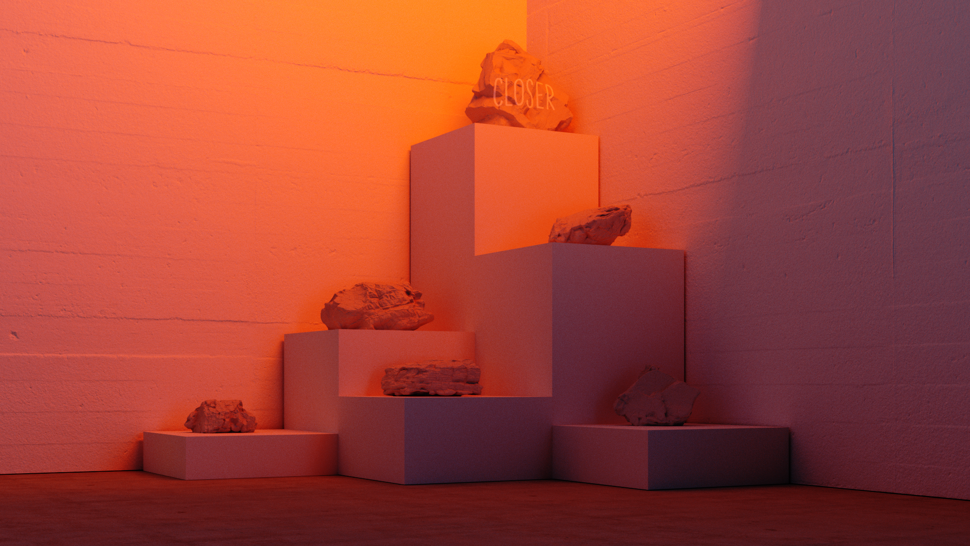
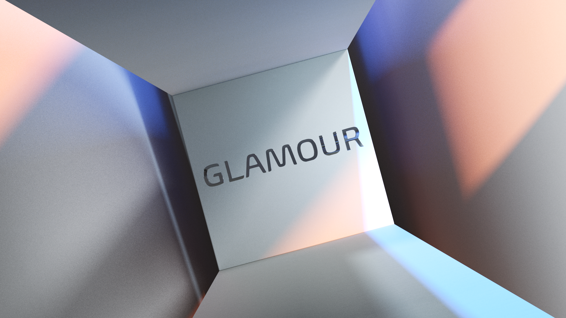
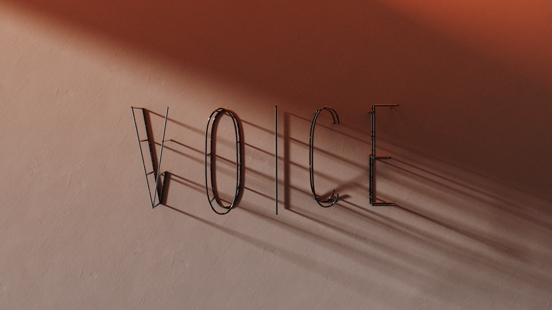
We decided to combine spaces and dimensional typography into one aesthetic direction where key words from the poem would appear weaved throughout imaginary landscapes and spaces. The design details of each space was inspired by the forms of the fonts their represented.
These scenes also helped further illustrate the particular emotions within the poem and were a perfect springboard for music and sound design to shine.


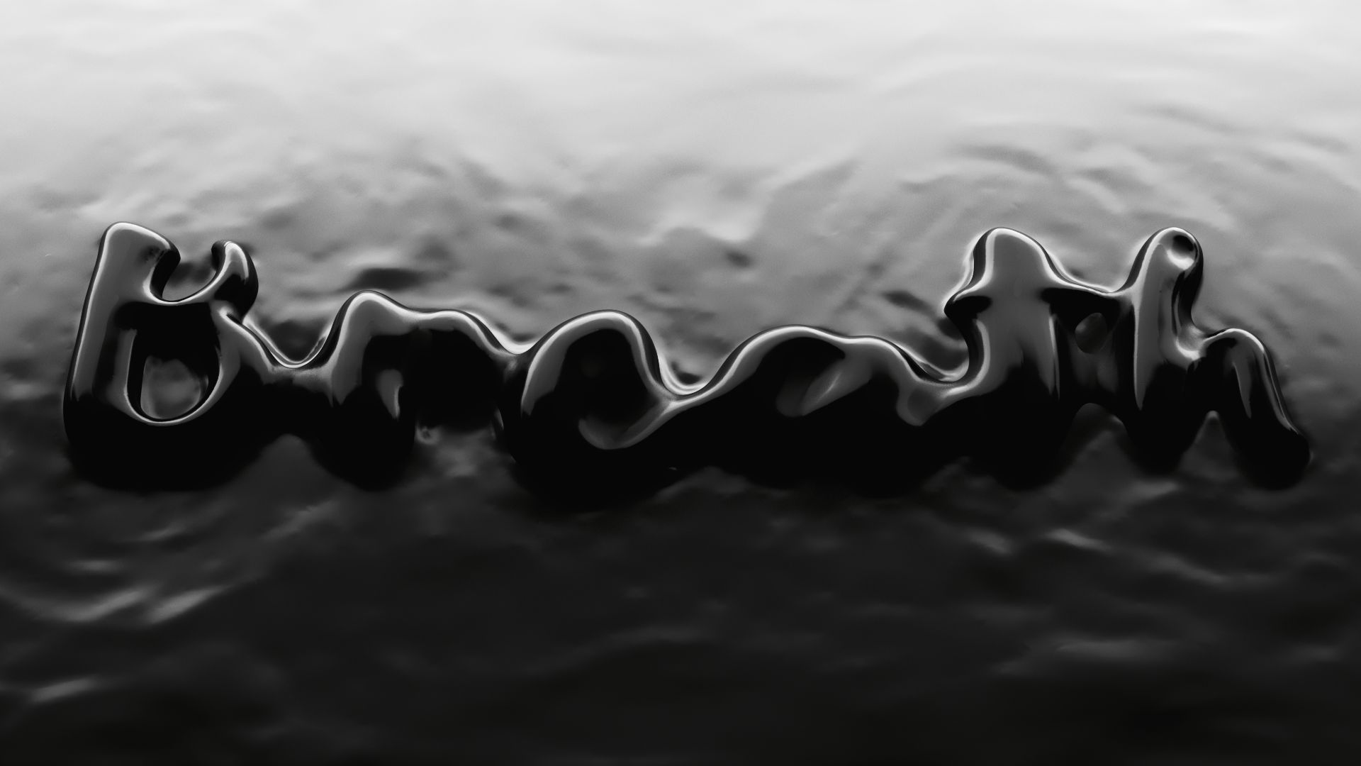


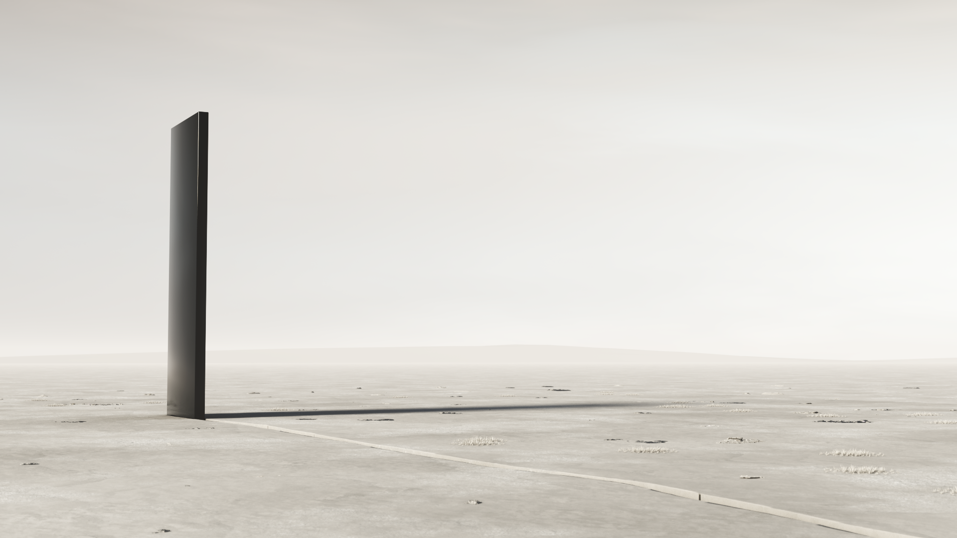
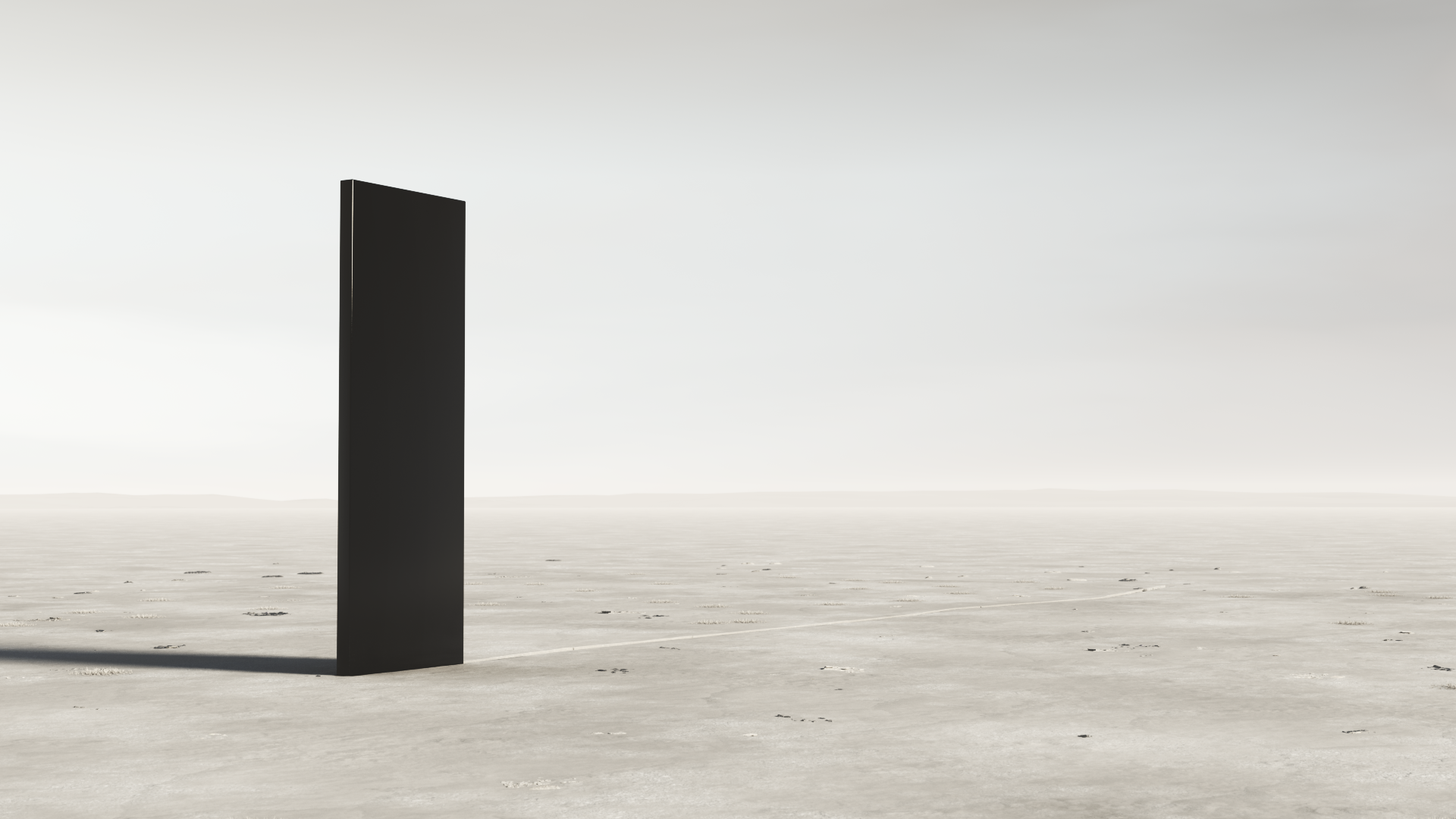
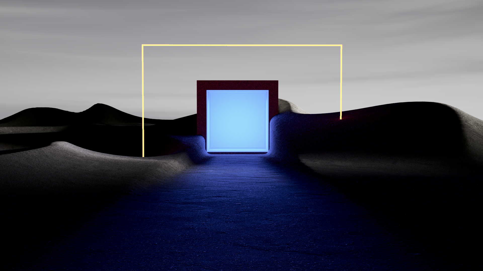
At the start of the film we used a massive monolith in a desert landscape as a representation of for a blinking cursor laying on a blank canvas.
This metaphor turned out to be quite powerful and laid the foundation for other interesting interactions between a landscape and type.


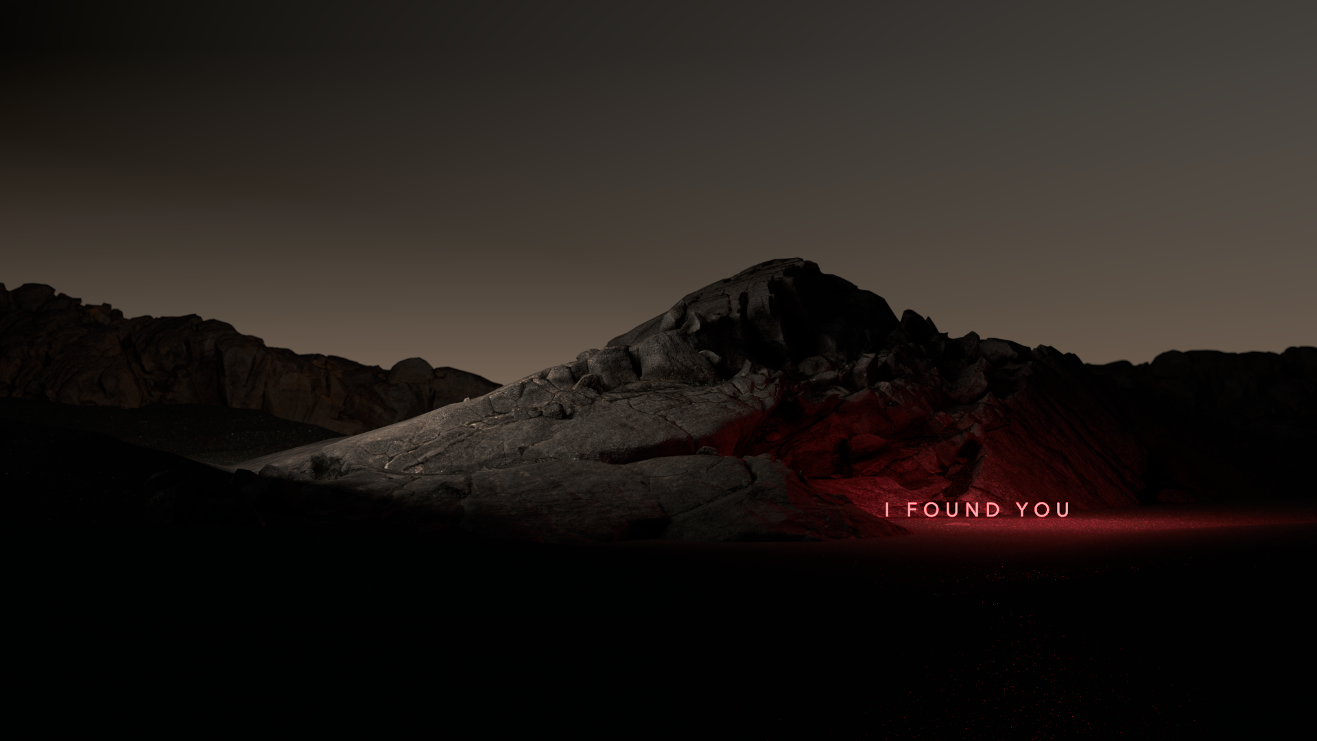


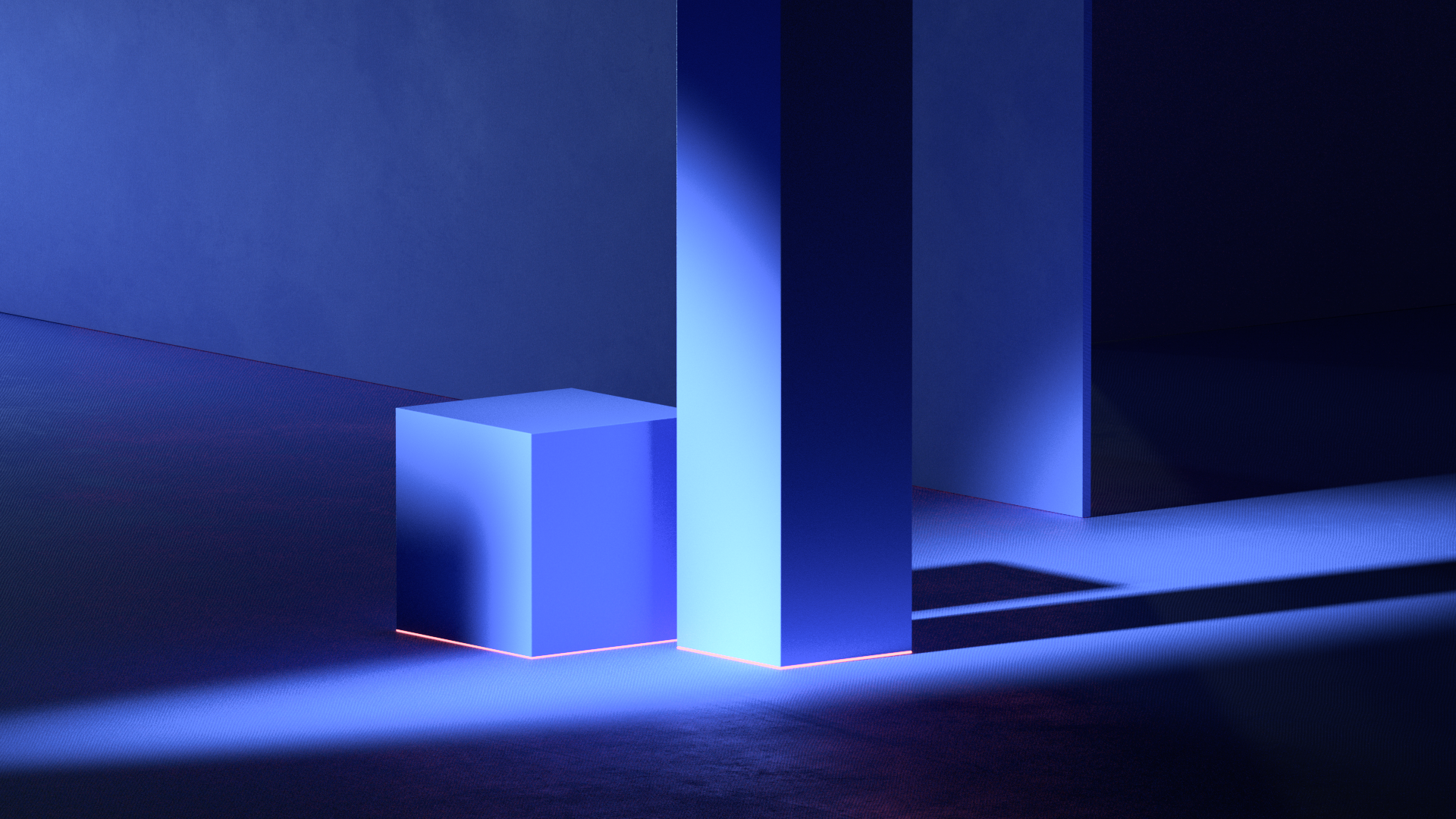
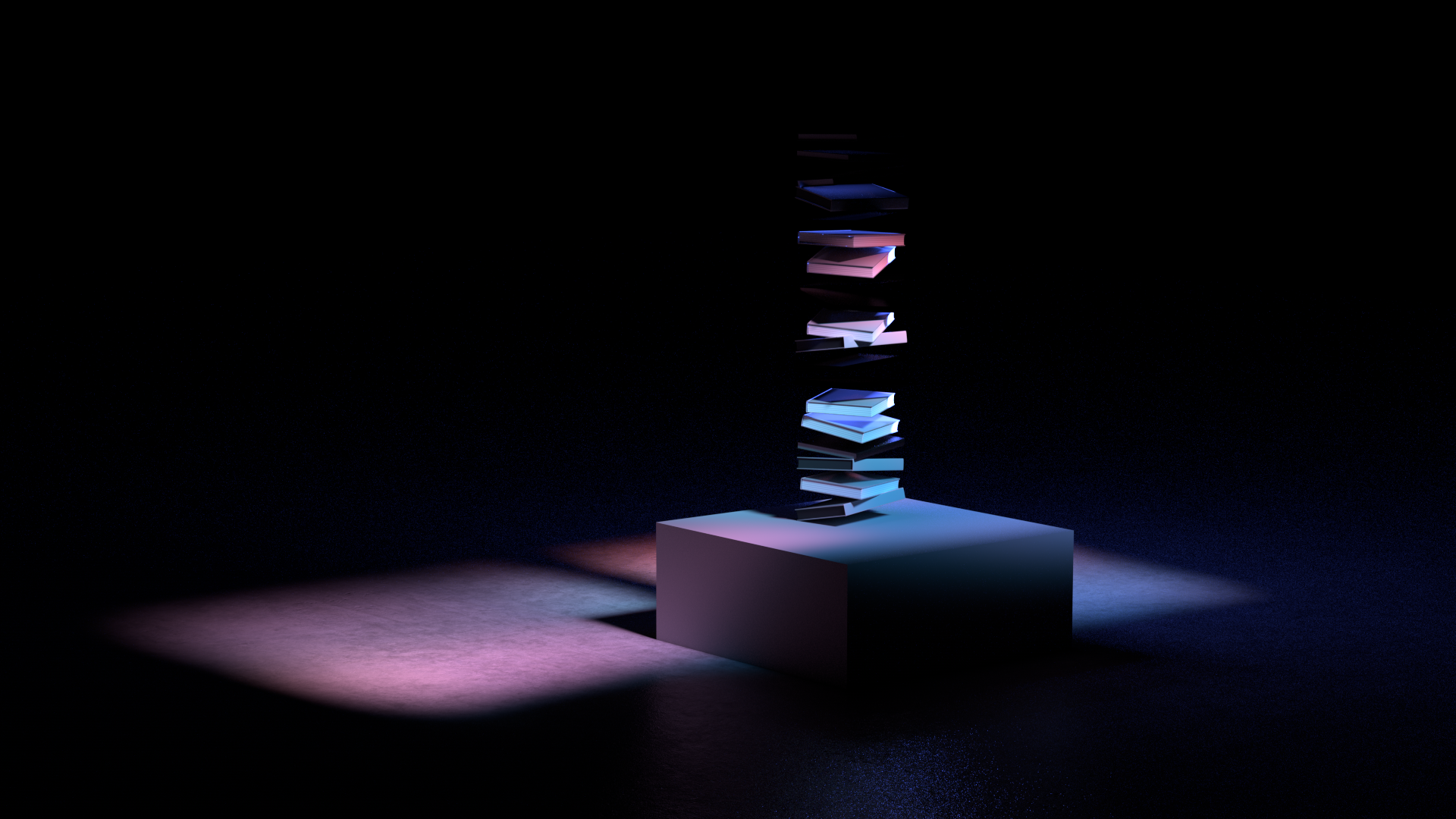
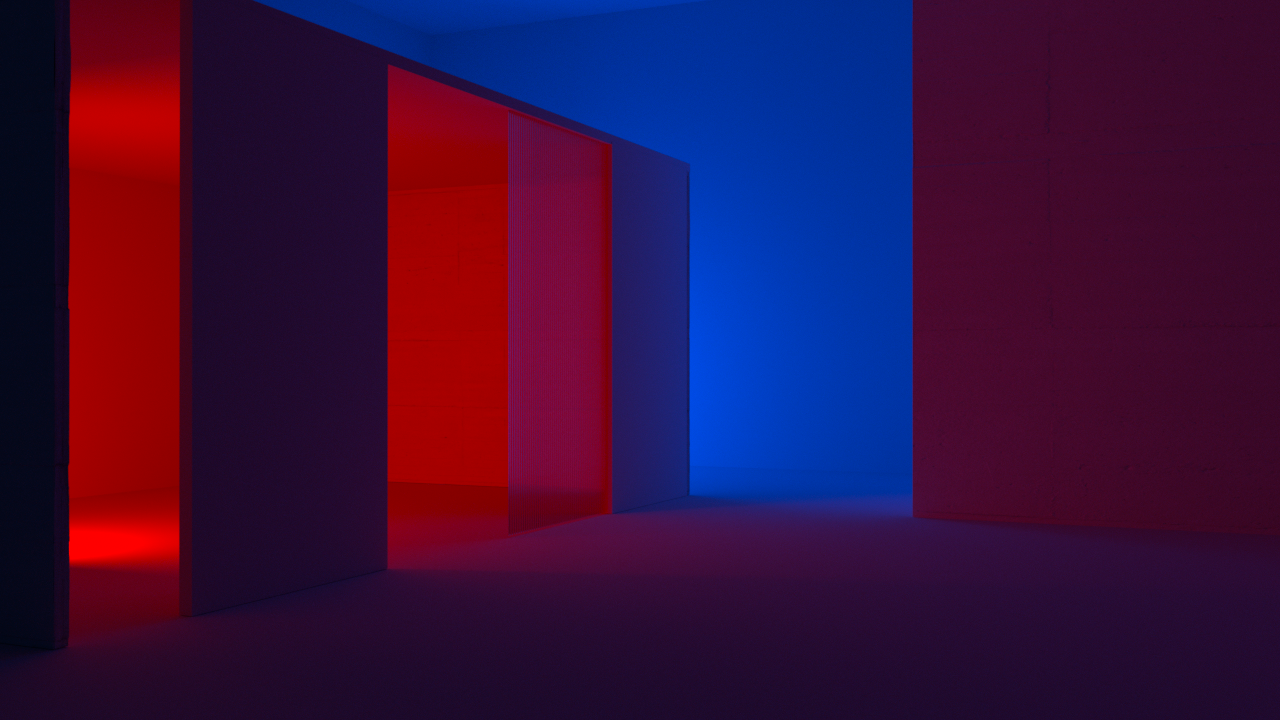
Given the general monochromatic look of the film, color ended up playing a key role in the storyline. These are some of the examples of looks we explored, mostly leaning on stylized lighting as a way to introduce vibrant and intensely saturated tones throughout.

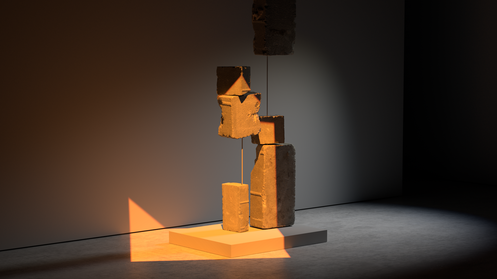


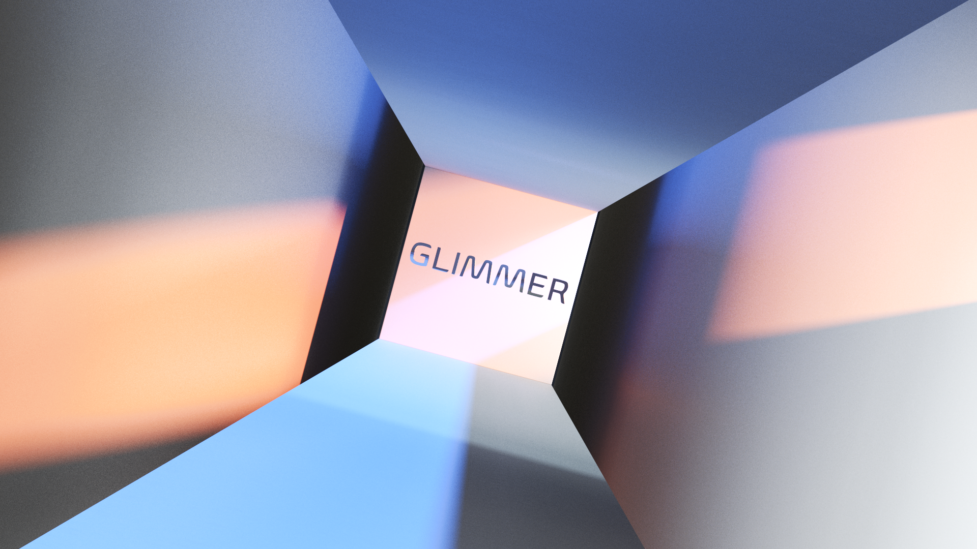
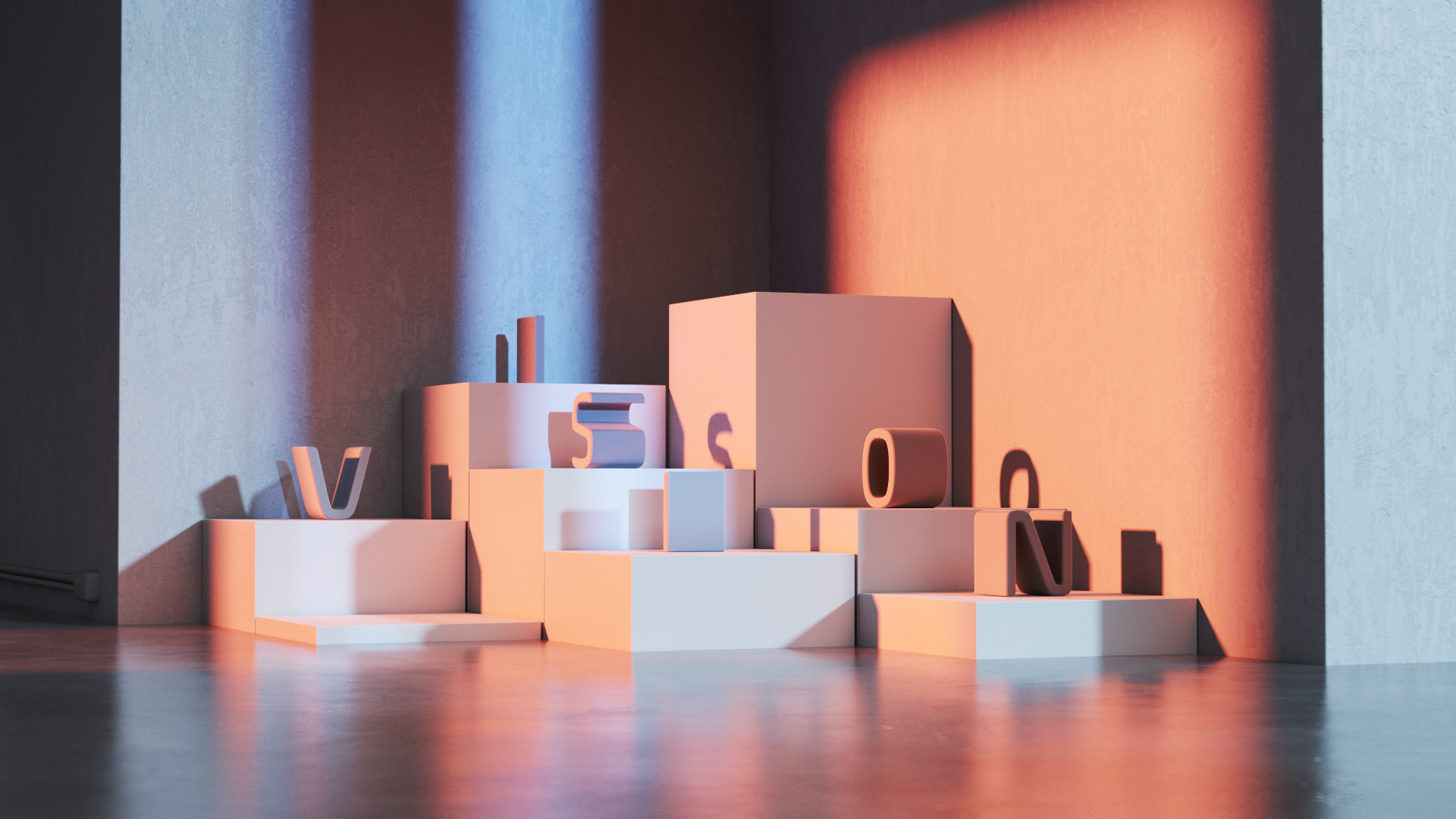


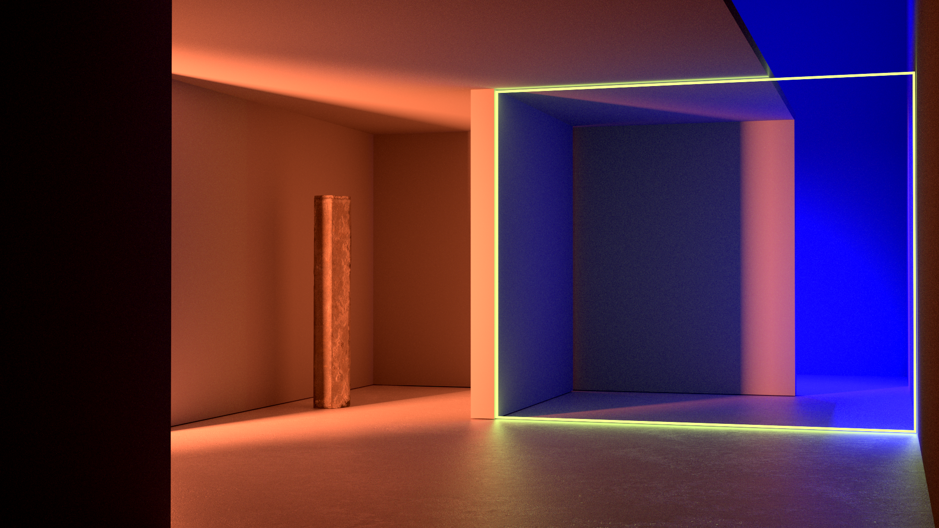

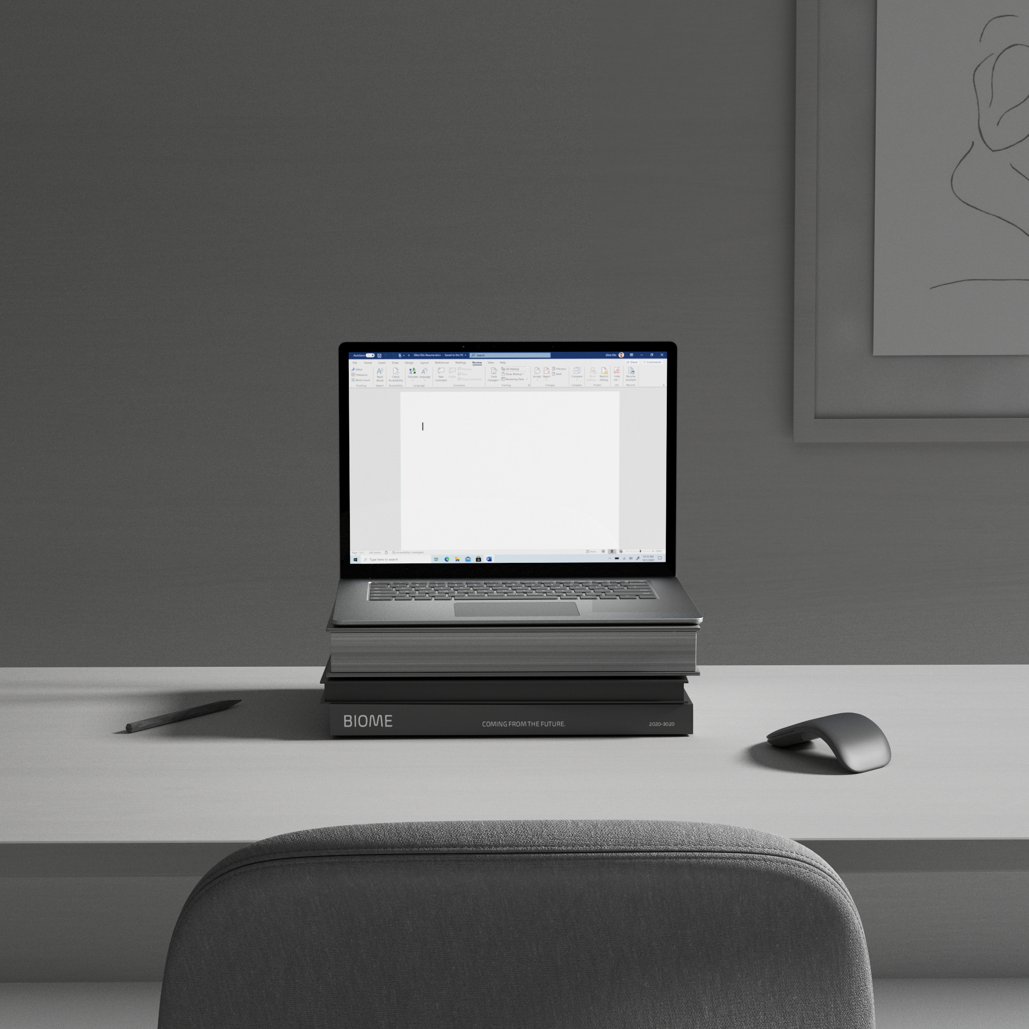
The room that featured the hardware and software we were highlighting ended up become another way of expressing important messages. Many of the posters and objects from the final film were inspired by the fonts themselves.
Thank you!
I’d like to acknowledge all designers, program managers and engineers that made each of these fonts a reality in Microsoft’s products. Without their effort, there wouldn’t be a reason to create this film. Thank you!
Thanks to Joline Tang for crafting this creative poem which in turn was reinterpreted into visual storytelling.
Deep appreciation for the talents of Six & Five and Zelig Sound for being such great partners throughout the production of this one. It’s a highly unusual way to tell a story and I’m thrilled about where we arrived together.